Static maps
Download datasets
Before we start you need to download (and then extract) the dataset zip-package used during this lesson from this link.
You should have following Shapefiles in the Data folder:
population_square_km.shp
schools_tartu.shp
roads.shp
population_square_km.shp.xml  schools_tartu.cpg
population_square_km.shx      schools_tartu.csv
roads.cpg                     schools_tartu.dbf
roads.dbf                     schools_tartu.prj
L6.zip                        roads.prj                     schools_tartu.sbn
roads.sbn                     schools_tartu.sbx
roads.sbx                     schools_tartu.shp             schools5.csv
population_square_km.cpg      roads.shp                     schools_tartu.shp.xml
population_square_km.dbf      roads.shp.xml                 schools_tartu.shx
population_square_km.prj      roads.shx                     schools_tartu.txt.xml
population_square_km.sbn
population_square_km.sbx
population_square_km.shp
Static maps in Geopandas
We have already seen during the previous lessons quite many examples how to create static maps using Geopandas.
Thus, we won’t spend too much time repeating making such maps but let’s create a one with more layers on it than just one which kind we have mostly done this far.
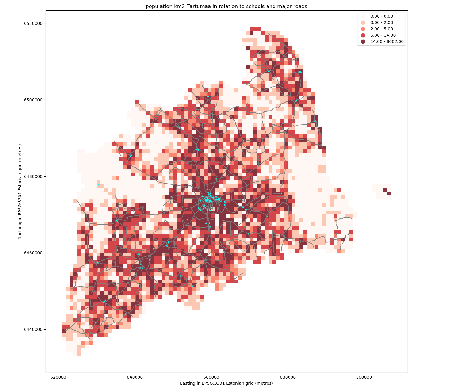
Let’s create a static accessibility map with roads and schools line on it.
First, we need to read the data.
In [1]: import geopandas as gpd

In [2]: import matplotlib.pyplot as plt

# Filepaths
In [3]: grid_fp = "source/_static/data/L6/population_square_km.shp"

In [4]: roads_fp = "source/_static/data/L6/roads.shp"

In [5]: schools_fp = "source/_static/data/L6/schools_tartu.shp"

# Read files
In [6]: grid = gpd.read_file(grid_fp)

In [7]: roads = gpd.read_file(roads_fp)

In [8]: schools = gpd.read_file(schools_fp)
Then, we need to be sure that the files are in the same coordinate system. Let’s use the crs of our travel time grid.
In [9]: gridCRS = grid.crs

In [10]: roads['geometry'] = roads['geometry'].to_crs(crs=gridCRS)

In [11]: schools['geometry'] = schools['geometry'].to_crs(crs=gridCRS)
Finally we can make a visualization using the .plot() -function in Geopandas. The .plot() function takes all the matplotlib parameters where appropriate.
For example we can adjust various parameters
axif used, then can indicate a joint plot axes onto which to plot, used to plot several times (several layers etc) into the same plot (using the same axes, i.e. x and y coords)columnwhich dataframe column to plotlinewidthif feature with an outline, or being a line feature then line widthmarkersizesize of point/marker element to plotcolorcolour for the layers/feature to plotalphatransparency 0-1legendTrue/False show the legendschemeone of 3 basic classification schemes (“quantiles”, “equal_interval”, “fisher_jenks”), beyond that use PySAL explicitlyknumber of classes for above scheme if used.`` vmin`` indicate a minimal value from the data column to be considered when plotting (also affects the classification scheme), can be used to “normalise” several plots where the data values don’t aligh exactly
`` vmax`` indicate a maximal value from the data column to be considered when plotting (also affects the classification scheme), can be used to “normalise” several plots where the data values don’t aligh exactly
# in Jupyter Notebook don't forget to enable the inline plotting magic
import matplotlib.pyplot as plt
%matplotlib inline
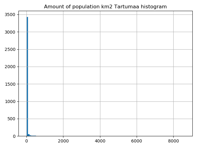
Let’s check the histgram first:
# Plot
In [12]: grid.hist(column="Population", bins=100)
Out[12]:
array([[<matplotlib.axes._subplots.AxesSubplot object at 0x00000215F13F25C0>]],
      dtype=object)

# Add title
In [13]: plt.title("Amount of population km2 Tartumaa histogram")
Out[13]: Text(0.5, 1.0, 'Amount of population km2 Tartumaa histogram')

In [14]: plt.tight_layout()

In [15]: fig, ax = plt.subplots(figsize=(15, 13))

# Visualize the population density into 5 classes using "Quantiles" classification scheme
# Add also a little bit of transparency with `alpha` parameter
# (ranges from 0 to 1 where 0 is fully transparent and 1 has no transparency)
In [16]: grid.plot(column="Population", ax=ax, linewidth=0.03, cmap="Reds", scheme="quantiles", k=5, alpha=0.8, legend=True)
Out[16]: <matplotlib.axes._subplots.AxesSubplot at 0x215f13eada0>

# Add roads on top of the grid
# (use ax parameter to define the map on top of which the second items are plotted)
In [17]: roads.plot(ax=ax, color="grey", linewidth=1.5)
Out[17]: <matplotlib.axes._subplots.AxesSubplot at 0x215f13eada0>

# Add schools on top of the previous map
In [18]: schools.plot(ax=ax, color="cyan", markersize=9.0)
Out[18]: <matplotlib.axes._subplots.AxesSubplot at 0x215f13eada0>

# Remove the empty white-space around the axes
In [19]: plt.title("population km2 Tartumaa in relation to schools and major roads")
Out[19]: Text(0.5, 1, 'population km2 Tartumaa in relation to schools and major roads')

In [20]: ax.set_ylabel('Northing in EPSG:3301 Estonian grid (metres)')
Out[20]: Text(190.84722222221734, 0.5, 'Northing in EPSG:3301 Estonian grid (metres)')

In [21]: ax.set_xlabel('Easting in EPSG:3301 Estonian grid (metres)')
Out[21]: Text(0.5, 113.72222222222219, 'Easting in EPSG:3301 Estonian grid (metres)')

In [22]: plt.tight_layout()

outfp = "static_map.png"
plt.savefig(outfp, dpi=300)
This kind of approach can be used really effectively to produce large quantities of nice looking maps (though this example of ours isn’t that pretty yet, but it could be) which is one of the most useful aspects of coding and what makes it so important to learn how to code.
Launch in the web/MyBinder: