P-values and Statistical Tests
In this exercise session, we study basic statistical analysis tools, such as point estimates and statistical tests.
- You will learn how to manipulate table-like data in GNU R.
- You will learn how to compute basic descriptive aggregate statistics.
- You will learn how to perform various statistical tests.
- You will learn how to test whether the statistical test is applicable
The aim of the exercise session is not to give comprehensive theoretical overview of the underlying statistical techniques, rather we give a practical recipe for conducting the study. Feel free to study all intricacies by yourself.
What is GNU R?
GNU R is a programmable statistical environment similar to Matlab or Scilab. As such, it can be used in two modes: interactive and batch mode. In the interactive mode, GNU R performs like a calculator with extended data types and processing routines---pretty much like an interactive Python session. In the batch mode, GNUR behaves like a computer that read in code executes it and finally outputs the results. Throughout, the exercise session, we use the interactive mode. However, we still advise to write commands into separate text file, then it is much easier to keep track what has happened and later convert the session into a script that can be run in batch mode. In most cases, such interactive programming is the best way to write scripts. In the following text, we present all code snippets in separate boxes
[1] "Hello world"
> library(ggplot2)
Error in library(stat) : there is no package called 'stat'
Basics of data manipulation
Data frames. In the context of statistical analysis, data frames are the most commonly used data structure in GNU R. Shortly put, data frame is a table with row and column names. The entries of a data frame can be either strings or real numbers. Data frames are commonly formed form column vectors. For instance, following commands
> genders <- c("Female", "Male", "Male", "Female")
> heights <- c(153, 178, 169, 190)
> tbl <- data.frame(Name = names , Sex = genders, Height = heights)
> tbl
Name Sex Height
1 Alice Female 153
2 Adam Male 178
3 Charlie Male 169
4 Elisa Female 190
> dim(data)
[1] 294 15
Side remark. To follow the example, you have to download the file medical-data.csv and save it to the working directory of GNU R. Commands getwd and setwd show and modify the working directory. By default the working directory is either the home directory for most graphical interfaces of GNU R and the directory from which the R command was executed in terminal.
Data access. There are several ways to access the data stored into a data frame. First, we can access a single column by issuing one of the commands
[1] Alice Adam Charlie Elisa
Levels: Adam Alice Charlie Elisa
> tbl$Name
[1] Alice Adam Charlie Elisa
Levels: Adam Alice Charlie Elisa
Side remark. Factor is defined by the list of plausible values (levels) and the actual values. The weird behaviour occurs if you try to compare factors with different levels or assign a value that is not among plausible values. For instance, the following code snippet creates two most common errors
> y <- factor(x, levels = c("Alice", "Bob", "Charlie"))
> z <- factor(x, levels = c("Alice", "Bob", "Eve"))
> y; z
[1] Alice Bob
Levels: Alice Bob Charlie
[1] Alice Bob
Levels: Alice Bob Eve
> y == z
Error in Ops.factor(y, z) : level sets of factors are different
> y[1] <- "Eve"
Warning message:
In `[<-.factor`(`*tmp*`, 1, value = "Eve") : invalid factor level, NAs generated
> y
[1] ‹NA› Bob
Levels: Alice Bob Charlie
Second, it is possible to select several columns or even a single column as a data frame
Name Sex
1 Alice Female
2 Adam Male
3 Charlie Male
4 Elisa Female
> tbl["Name"]
Name
1 Alice
2 Adam
3 Charlie
4 Elisa
Name Height
1 Alice 153
2 Adam 178
3 Charlie 169
[1] 153
> tbl[1, 3]
[1] 153
> tbl[1, ]
Name Sex Height
1 Alice Female 160
Advanced selection operations. Often, it is necessary to select rows that satisfy a certain criterion. As an illustrative example, consider the case when you want to select all male patients that have high blood pressure and are over forty. A quick check with commands colnames(data) and head(data) shows that the data frame data possesses necessary columns. To do the corresponding selection, we must execute the following command
Age Blood.Pressure EKG
85 46 180 ST-T wave abnormality
182 59 180 normal
246 54 200 normal
267 53 180 ST-T wave abnormality
Basics of data aggregation
Standard statistical primitives. Standard univariate analysis is straightforward in GNU R, since many point estimates are accessible as commands: min, max, mean, median, sd, var, quantile and many others. Moreover, they work naturally over the data frames. For instance, the following commands produce means over the columns
Age Sex Chest.Pain Blood.Pressure ...
47.8265306 NA NA NA ...
 > summary(data)
Age            Sex             Chest.Pain
Min.   :28.00  Length:294        Length:294         ...
1st Qu.:42.00  Class :character  Class :character   ...
Median :49.00  Mode  :character  Mode  :character   ...
Mean   :47.83                                       ...
3rd Qu.:54.00                                       ...
Max.   :66.00                                       ...
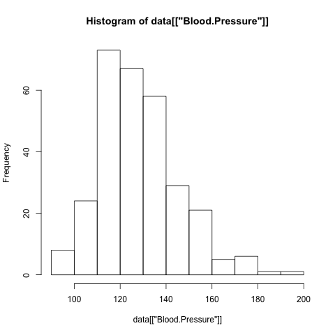
> hist(data[["Sex"]])
Error in hist.default(data[["Sex"]]) : 'x' must be numeric
Female Male
81 213
> table(data[c("Sex","EKG")]) EKG
Sex left ventricular hypertrophy normal ST-T wave abnormality
Female 1 58 22
Male 5 177 30
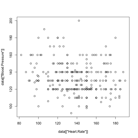
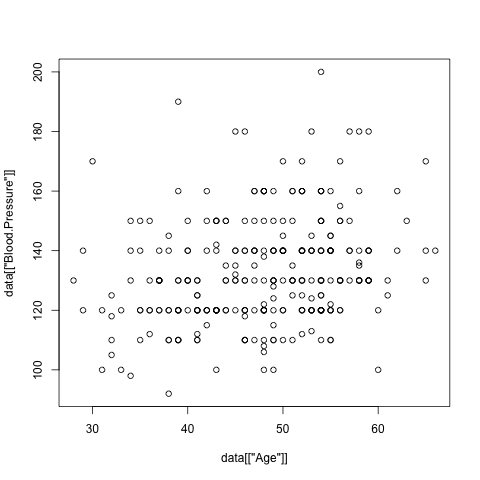
> plot(data[["Age"]], data[["Blood.Pressure"]])
Effective data aggregation. Although the basic analysis commands together with data manipulation routines are sufficient to compute sub-totals for different sub-groups, it is inconvenient, inefficient and clumsy. Far more better alternative is to use built in data aggregation routines. As an example, let us study whether Sex and Prognosis have remarkable effect on Blood.Pressure. For that, let us compute mean and standard deviation of blood pressure based on resulting sub-populations
Sex Prognosis x
1 Female Bad 138.5833
2 Male Bad 135.5000
3 Female Good 128.5147
4 Male Good 132.0000
> aggregate(data$Blood.Pressure, data[c("Sex","Prognosis")], sd, na.rm=TRUE)
Sex Prognosis x
1 Female Bad 21.54259
2 Male Bad 18.43836
3 Female Good 17.20248
4 Male Good 16.41000
Prognosis
Sex Bad Good
Female Numeric,6 Numeric,7
Male Numeric,6 Numeric,6
> tmp["Female", "Bad"]
[[1]]
Min. 1st Qu. Median Mean 3rd Qu. Max.
100.0 127.5 136.5 138.6 152.5 180.0
How to Visualise Data
Good data visualisation is crucial for diagnostics and brainstorming, but it also provides an easy way to convey complex facts about the data. Although plot and hist are good enough for visualising the most important aspects of the data more professional looking plots and charts can be obtained with ggplot2 package. Unfortunately this package is somewhat complex to understand without reading a 200 page tutorial ggplot2: Elegant Graphics for Data Analysis by Hadley Wickham. Hence, we provide only magical lines that are useful for visualising most prominent aspects of sub-populations. More detailed explanation of commands and introduction to other graphical primitives can be found in the website: http://had.co.nz/ggplot2/.
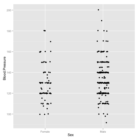
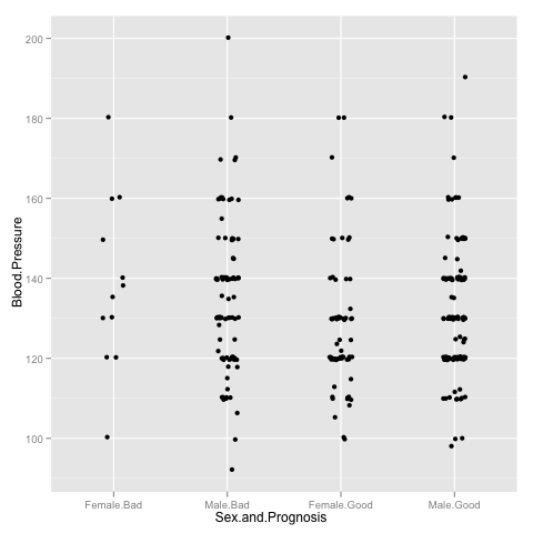
As a first trick, note that it is very convenient to visualise spread of the variable in different groups by drawing a jitter plot
> p <- ggplot(data)
> p <- p + geom_jitter(aes(x = Sex, y = Blood.Pressure), position = position_jitter(width=0.1))
> p
> p <- ggplot(data)
> p <- p + geom_jitter(aes(x = Sex.and.Prognosis, y = Blood.Pressure), position=position_jitter(width=0.2))
> p
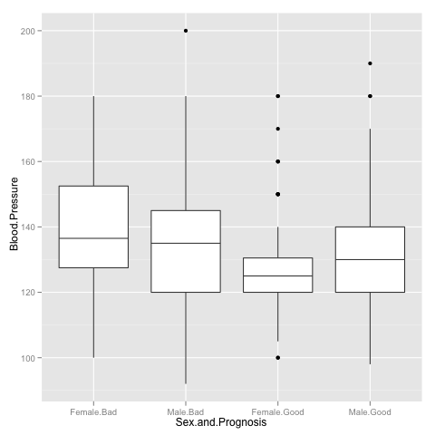
> p <- p + geom_boxplot(aes(x = Sex.and.Prognosis, y = Blood.Pressure))
> p
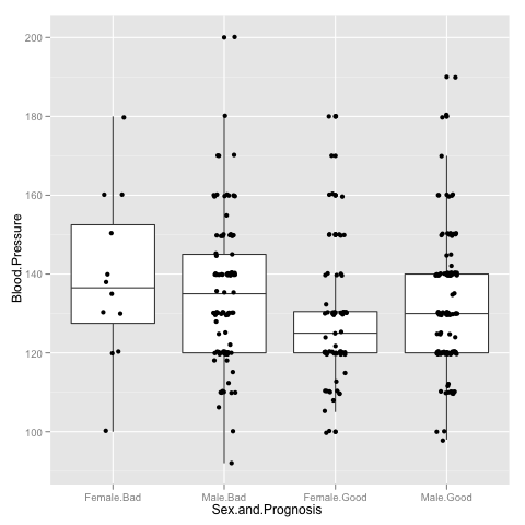
> p <- p + geom_jitter(aes(x = Sex.and.Prognosis, y = Blood.Pressure), position=position_jitter(width=0.2))
Hypothesis testing
In our last example, the differences in blood pressure for women with good and bad prognosis seemed sufficiently far apart. However, this is subjective opinion. It would look much more scientific, if we could somehow quantify it. Often, we have to choose between two hypothesis H0 and H1 where H0 represents well-formulated but uninteresting case and H1 is somewhat vaguely stated alternative. For example, we could state that the means are same up to measuring error for two sub-populations as null hypothesis H0 and the alternative hypothesis H1 states that means are different, but does not specify how.
In most cases, the data is generated by some sort of random process and thus it is impossible to separate cases of H0 and H1 without errors, as the number of observable samples is finite. Moreover, the question how well the test (a particular algorithm) works for particular dataset is meaningless. Either the dataset could be generated under both hypotheses or we know exactly which hypothesis holds and testing makes no sense.
To by-pass this conundrum, statistical tests are rated in terms of average rate of failures. Note that there are two types of errors: we can reject hypothesis H0 if it holds or accept H0 if the alternative hypothesis H1 holds. The first type of error is known as a false positive and the second type of error is known as a false negative. For historical reasons, statisticians use more cryptic terms: Type I error and Type II error. Normally, a statistical test is calibrated so that the fraction of false positives is less than 5%. In most cases it is impossible to control the fraction of false positives as the alternative hypothesis is not well specified and thus we cannot quantify the probability. We return to this issue in the following examples.
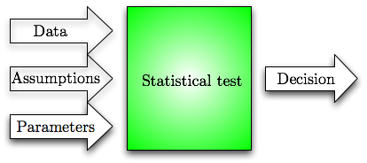
If we omit all the details, then we can view a statistical tests as a black-box, which takes in data and some parameters that determine desired balance between hypotheses and outputs a yes (H0) or no (H1) decision. Any statistical test makes some assumptions about the data. To be precise, the test usually specifies only H0 but the usefulness (e.g. optimality or asymptotic optimality) of the test is often proved by assuming something about H1. Hence, one has to verify these assumptions before applying the test, i.e., there are three conceptual inputs to the statistical test.
What are p-values?
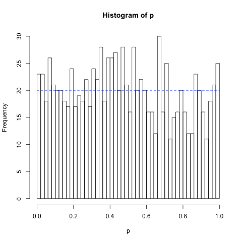
The simplest way to construct statistical tests with guaranteed ratio of false positives is based on p-values. Consider an algorithm p that takes an input x (normally a list of real values or objects) and produces a single output value (aggregate value) from the range [0,1]. Now let H0 be a specification of a data generation process, e.g. a procedure that generates data from the normal distribution N(0,1). The aggregate value is a p-value if its output distribution is uniform over the range [0,1] under the assumption that the data is generated by H0. Consequently, if we reject hypothesis H0 when p(x)≤ 0.05, then the probability of false rejections (the approximate fraction of false rejections in a large series of independent trials) is 5%.
There are many types of statistical tests. Let us start with the distribution tests. In practice, one often needs to decide whether a certain measurement data follows a certain distribution. There are many such tests like Shapiro-Wilk, Kolmogorov-Smirnov and Pearson Chi-square test. As an example consider Shapiro-Wilk test, which is used to determine whether set of observed values come from normal distribution or not. The corresponding command shapiro.test in GNU R returns a complex object consisting of many parameters, as demonstrated below
> shapiro.test(x)
Shapiro-Wilk normality test
data: x
W = 0.9702, p-value = 0.8924
> shapiro.test(x)$p.value
[1] 0.8923684
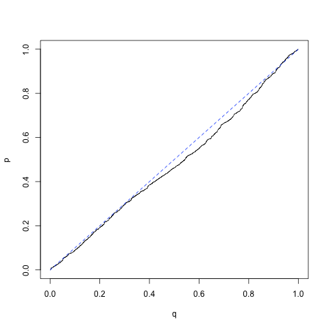
As a first illustrating example, we demonstrate that Shapiro-Wilk test indeed computes a p-value. For that, we must show that p(x) follows uniform distribution when all samples are drawn from the normal distribution. The following code snippet generates 1000 independent samples of N element vectors x drawn form normal distribution N(0, 1) and then computes the corresponding p-values p(x).
for(i in c(1:1000))
{
x <- rnorm(10)
p[i] <- shapiro.test(x)$p.value
}
lines(c(0,1), c(20,20), lty = "dashed", col = "blue")
 q <- c(1:1000)/1000
 qqplot(q,p, type="l")
lines(c(0,1),c(0,1), lty = "dashed", col = "blue")
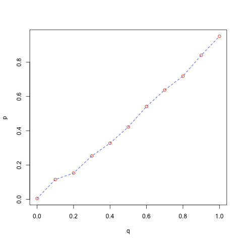
probs <- c(0.0, 0.1, 0.2, 0.3, 0.4, 0.5, 0.6, 0.7, 0.8, 0.9, 1)
q <- qunif(probs)
p <- quantile(x, probs)
plot(q,p, type = "l", lty = "dashed", col = "blue")
points(q, p, col = "red")
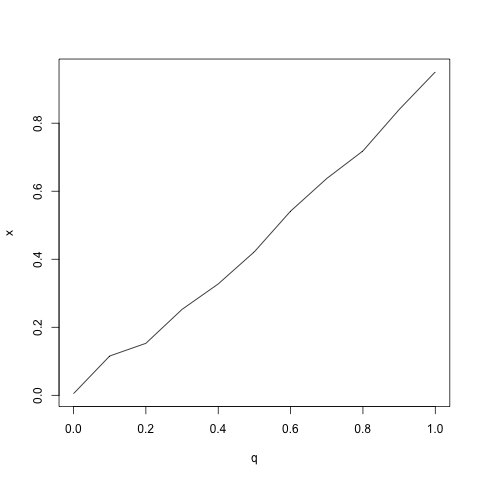
qqplot(q, x, type = "l")
P-values related to standard statistical tests are independent from the size of the data sample. As the test works for all sample sizes and the computed aggregate value is indeed a p-value, it must have uniform distribution when H0 holds regardless of the sample size. This is really different form the likelihood of the data which usually decreases exponentially with the sample size. As a consequence, the probability of false positives stays the same, whereas the probability of false negatives decreases with the sample size. Hence, the concept of statistical testing based on p-values is not entirely fraudulent: though we do not know the probability of false negatives, it is likely to be small if the sample size is large enough.
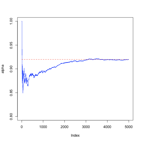
As a concrete example, consider a setting where the alternative hypothesis H1 is known to be uniform distribution. First, lets illustrate the concept of false negatives by conducting 5000 experiments with the sample of size 10 and computing the average number of false negatives.
alpha <- rep(NA, 1000)
for(i in c(1:5000))
{
x <- runif(10)
p[i] <- shapiro.test(x)$p.value
alpha[i] <- sum(p[1:i] > 0.05)/i
}
plot(alpha, type="l", ylim=c(0.8, 1.0), col = "blue")
lines(c(0, 5000), c(alpha[5000], alpha[5000]), col = "red", lty = "dashed")
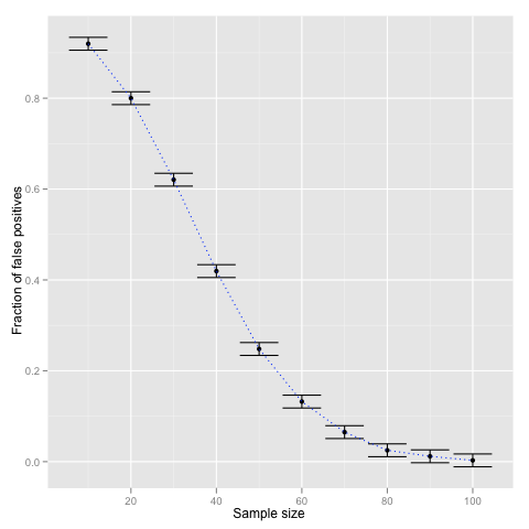
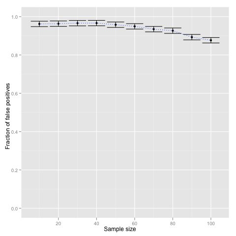
To show that the ratio of false negatives indeed decreases with the size of the sample let us repeat the computation with different sample sizes N = (10, 20, ..., 100). The following code snippet shows how to visualise the results with ggplot2. The error bars are computed according to crude 1/√N estimate.
df <- data.frame(N = c(1:10) * 10, alpha = alpha, alpha_min = alpha_min, alpha_max = alpha_max)
p <- ggplot(df) + geom_point(aes(x = N, y = alpha))
p <- p + geom_errorbar(aes(x = N, ymin = alpha_min, ymax = alpha_max))
p <- p + geom_line(aes(x = N, y = alpha), linetype = "dotted", color = "blue")
p <- p + scale_x_continuous("Sample size") + scale_y_continuous("Fraction of false positives")
p
T-test as a way to quantify whether difference in means is significant or not
The most common question asked by biologist or experimenters in general is whether the results in two groups are sufficiently different, e.g., whether the gender has a significant impact on the height of a person or whether a certain drug provides effective treatment against influenza. Usually, the results are not visually clearly separable and even if they where it is common to quantify their distinctness. More formally, let x and y be samples collected from two different groups of individuals. For instance, let x be the vector of blood pressure measurements of healthy patients and let y be the vector of blood pressure measurements of sick patients. Then we can ask whether these samples come from the same distribution or not, i.e., whether patients health influences the blood pressure or not. In such setting the t-test is one most commonly used statistical test. Under the null hypothesis both samples are drawn from the same normal distribution and the alternative hypothesis is that the samples are drawn from normal distributions with different means and possibly different variances. Under these assumptions it is possible to estimate the probability of false negatives. The corresponding functions are t.test and power.t.test.
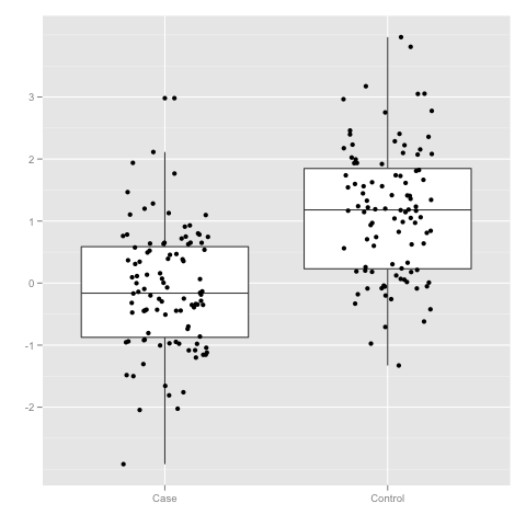
Let us illustrate the usage of t-test by creating two datasets. In one the sub samples x and y are generated by the same distribution N(0,1) and in the other distributions are shifted by Δ. The first code snippet visualises the result when Δ is either zero or one.
data$Group <- c(rep("Case",100), rep("Control", 100))
p <- ggplot(data)
p <- p + geom_boxplot(aes(x = Group, y = Value))
p <- p + geom_jitter(aes(x = Group, y = Value), position=position_jitter(width=0.2))
p <- p + scale_x_discrete("") + scale_y_continuous("")
p
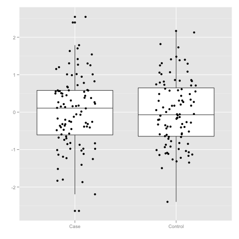
x <- subset(data, Group == "Case")$Value
y <- subset(data, Group == "Control")$Value
t.test(x, y)
Welch Two Sample t-test
data: x and y
t = 0.0573, df = 196.558, p-value = 0.9544
...
data$Group <- c(rep("Case",100), rep("Control", 100))
p <- ggplot(data)
p <- p + geom_boxplot(aes(x = Group, y = Value))
p <- p + geom_jitter(aes(x = Group, y = Value), position=position_jitter(width=0.2))
p <- p + scale_x_discrete("") + scale_y_continuous("")
p
x <- subset(data, Group == "Case")$Value
y <- subset(data, Group == "Control")$Value
t.test(x, y)
Welch Two Sample t-test
data: x and y
t = -8.863, df = 196.832, p-value = 4.656e-16
...
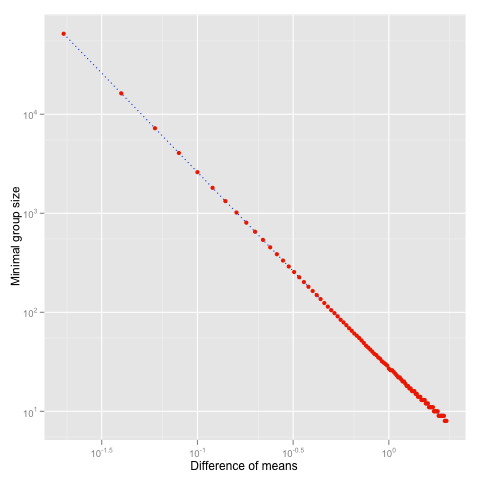
Note that the smaller the difference &Delta is the higher number of samples are needed to reliably detect H1. As illustration, consider the minimal number of samples in a group needed to detect difference, when the upper bound to false positives and negatives is set to 5% and both distributions are assumed to have unit variance.
n <- rep(NA, 100)
for(i in c(1:100))
{
n[i] <- ceiling(power.t.test(delta = delta[i], sd=1, sig.level=0.05,
&emsp power = 0.95, type="two.sample", alternative = "two.sided")$n)
}
df <- data.frame(N = n, Delta = delta)
p <- ggplot(df)
p <- p + geom_line(aes(x = Delta, y = N), linetype = "dotted", color = "blue")
p <- p + geom_point(aes(x = Delta, y = N), color = "red")
p <- p + scale_y_log10("Minimal group size") + scale_x_log10("Difference of means")
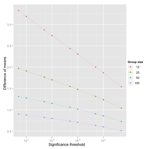
thr <- 0.05/c(1, 5, 10, 50, 100, 500, 1000, 5000, 10000)
for(n in c(12, 25, 50, 100))
{
delta <- rep(NA, length(thr))
for(i in c(1:length(thr)))
{
delta[i] <- power.t.test(n = n, sd = 1, sig.level = thr[i], power = 0.95,
type="two.sample", alternative = "two.sided")$delta
}
df <- rbind(df, data.frame(N = n, Thr = thr, Delta = delta))
}
p <- ggplot(df)
p <- p + geom_line(aes(x = Thr, y = Delta, group = factor(N), color = factor(N)), linetype = "dotted")
p <- p + geom_point(aes(x = Thr, y = Delta, group = factor(N), color = factor(N)))
p <- p + scale_y_continuous("Difference of means", breaks = c(0.5, 1, 1.5, 2, 2.5, 3), formatter = "comma")
p <- p + scale_x_log10("Significance threshold") + scale_colour_discrete("Group size")
p
What is Paired T-test Useful for
In many cases, the values measured in two groups are linked together. For instance, if we study the effect of a drug on blood pressure, measurements of a patient before and after form a pair and we can ask a natural question "Whether the treatment decreases the blood pressure of individual patients?" rather than pondering "Whether the overall level of blood pressure is lower afterwards?" When the in-group variance is large, clearly observable changes in the individual level is not so clear in the group level. Hence a paired t-test which utilises this type of natural links can be much more sensitive (more powerful).
y <- x + rnorm(20, mean = 0.1, sd = 0.05)
df <- data.frame(X = x, Y = y)
p <- ggplot(df)
p <- p + geom_boxplot(aes(x = "Case", y = X)) + geom_boxplot(aes(x = "Control", y = Y))
p <- p + geom_point(aes(x = "Case", y = X)) + geom_point(aes(x = "Control", y = Y))
p <- p + geom_segment(aes(x = "Case", y = X, xend = "Control", yend = Y), color = "blue", linetype = "dotted")
p <- p + scale_x_discrete("") + opts(aspect.ratio = 2)
p
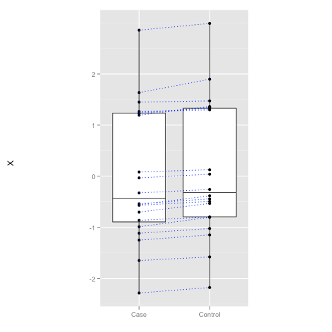
t.test(x, y, paired = FALSE)
Welch Two Sample t-test
data: x and y
t = -0.2556, df = 37.999, p-value = 0.7997
...
t.test(x, y, paired = TRUE)
Paired t-test
data: x and y
t = -8.034, df = 19, p-value = 1.574e-07
Although paired t-test is often more sensitive, standard t-test can beat the paired test in settings where the individual changes are more random than the overall average change between the case and control group. The file data-generators.R defines three data sources: DataSource1, DataSource2 and DataSource3. Experiment with them to see which of them produces samples that are more different in group level than in the individual level. The functions return list of x and y vectors, which can be accessed as in the following example.
df <- DataSource1(100)
t.test(df$X, df$Y)
T-tests Are not Robust
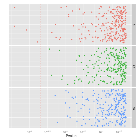
T-test comes with certain limits. In particular, the test is not guaranteed to give sensible results when the assumptions are not satisfied, i.e., the in-group distribution of measurements is not normal nor is it "close" to normal distribution. As an illustration consider a setting where the measurements come from the same distribution, but the distribution is different form the normal distribution. Let us first observe the case when the distribution is normal distribution with outliers.
{
runif(n) + 10000* (runif(n) < 0.001)
}
for(k in c(5, 25, 50))
{
p <- rep(NA, 1000)
&emps;for(i in c(1:5000))
{
p[i] <- t.test(NormalDistWithOutliers(k), NormalDistWithOutliers(k))$p.value
}
df <- rbind(df, data.frame(N = k, Pvalue = p))
}
p <- p + geom_jitter(aes(x = Pvalue, y = 0.1, colour = factor(N)), position = position_jitter(height = 0.1))
p <- p + facet_grid(N~.) + opts(legend.position = "none")
#Ugly hack that works now and should break later when the package is fixed
p <- p + geom_vline(xintercept = log10(2e-04), linetype = "dashed", colour = "red")
p <- p + geom_vline(xintercept = log10(2e-03), linetype = "dashed", colour = "green")
p <- p + geom_vline(xintercept = log10(2e-02), linetype = "dashed", colour = "blue")
# End of hack
p <- p + scale_x_continuous("Pvalue", trans = "log10")
p <- p + scale_y_continuous("") + opts(axis.text.y = theme_blank(), axis.ticks = theme_blank())
p
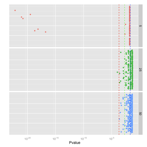
Similar or even bigger aberrations occur for long-tail distributions such as Laplacian distribution
{
rexp(n)*(-1)^(runif(n) < 0.5)
}
...

{
round(runif(n))+ 0.001*runif(n, min = -1, max = 1)
}
...
Wilcoxon Test as a Robust Analogue of T-test
T-tests are fragile as the p-value is computed based on mean and variance. These point estimates are also known to be fragile against outliers. There are two principal ways to fix the problem. First, we can use more robust estimates for the mean and variance. The latter solves the issue of outliers but the test will still fail if the measurements are not distributed according to the normal distribution. Wilcoxon tests are the second type of alternative that uses non-parametric statistics. In layman terms, such tests order the data, throw away the values and then the p-value is computed solely based on the ordering. As a result, outliers have limited impact on the outcome. The corresponding test is known as Mann-Whitney-Wilcoxon or Wilcoxon rank-sum test and it has the same syntax in GNU R as t-test and as before one can choose between unpaired and paired tests by setting the flag paired.
> y <- rnorm(10, mean = 1)
> wilcox.test(x, y)
Wilcoxon rank sum test
data: x and y
W = 55, p-value = 0.7394
alternative hypothesis: true location shift is not equal to 0
> wilcox.test(x, y, paired = TRUE)
Wilcoxon rank sum test
data: x and y
W = 55, p-value = 0.7394
alternative hypothesis: true location shift is not equal to 0
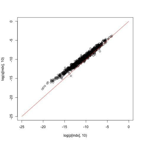
The main difference between t-test and Wilcoxon test lies in the null hypothesis and assumptions. The null hypothesis states that measurements of both group come from the same distribution, whereas the alternative hypothesis states that distributions are different in the following sense. If you draw a sample from these distribution the probability that the first sample is larger than the other is not 0.5. Secondly, Wilcoxon test is a bit less powerful, that is, if the assumptions of t-test are satisfied, then the p-values form the Wilcoxon test are constantly larger than the p-values form t-test, as demonstrated by the following examples.
q <- rep(NA, 1000)
for(i in c(1:1000))
{
x <- rnorm(10)
y <- rnorm(10, mean = 1)
p[i] <- t.test(x,y)$p.value
q[i] <- wilcox.test(x,y)$p.value
}
indx <- order(p) plot(log(p[indx], 10), log(q[indx], 10), xlim=c(-6,0), ylim=c(-6,0)) lines(c(-6,0), c(-6,0), col="red")

q <- rep(NA, 1000)
for(i in c(1:1000))
{
x <- rnorm(100)
y <- rnorm(100, mean = 1)
p[i] <- t.test(x,y)$p.value
q[i] <- wilcox.test(x,y)$p.value
}
indx <- order(p) plot(log(p[indx], 10), log(q[indx], 10), xlim=c(-25,0), ylim=c(-25,0)) lines(c(-25,0), c(-25,0), col="red")
Null hypothesis. Above we simplified the definition of the null hypothesis for the Wilcoxon test. The actual null hypothesis states that instead of sorting observed values and assigning ranks to them, we could assign ranks just randomly without looking at the data. This assumption is clearly satisfied when the data in both groups is generated by the same distribution, as all permutations of the data have exactly the same probability or density value. It is somewhat non-trivial to construct a two distribution that satisfy this assumption but are not identical, but such distributions do exist. The additional assumption made about alternative hypothesis is sufficient to rule out the null hypothesis.
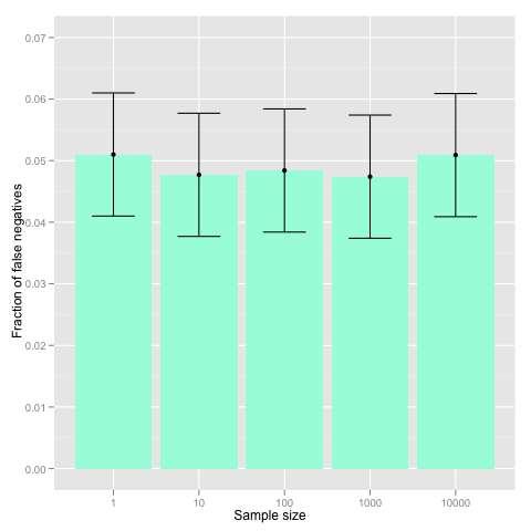
Multiple testing and p-value correction
Although statisticians do not like to talk about it, there are some restrictions you must comply before applying any of the statistical methods. In particular, you should design the methodology before seeing the data. In our case, you should fix the hypothesis to be tested before you get the data. In practice, such situations rarely occur. Unless you are the biologist who conducts the experiments, you are always presented the data first. The fact that you see the data before fixing the methodology allows you to cheat. For instance, it is almost impossible to choose 100 locations from 300 throws of a fair coins so that all of them are heads. However, it is trivial to do it after the experiment.
> which(x==1)[1:100]
P-value correction is one of such techniques used in case of multiple hypothesis testing. Coming back to our experiment, if you choose 100 locations before seeing the data, the probability that all of them are heads is 2-100≈7.9⋅10-31 and thus seeing heads only is highly significant. However, when you choose 100 locations from 300 locations afterwards, the result is not even marginally significant, as there are 4.2⋅1081 possible locations potential location the analyst can choose from. To put it in other way, before seeing the data you have not committed to any particular hypothesis, rather you try all 4.2⋅1081 potential hypothesis in parallel. When the data arrives, you present only the best result and abandon all other hypotheses that are not consistent with the data. More generally, assume that a statistical test Ti holds with probability pi under the null hypothesis, then under the null hypothesis one of the hypotheses holds with probability at most p1+⋅⋅&sdot +pn. Hence, if we want to preserve 5% significance level even if we are allowed to choose among n hypotheses, we must make sure that the sum of individual significance thresholds remains below 5%. Usually, this is achieved by multiplying individual p-values by the number of performed statistical tests. This p-value correction method is known as Bonferroni correction and is invoked as follows.
At the first glance, the Bonferroni correction is rather crude, as it is based on a quite loose union bound. However, simulations show that the bound is rather precise when the hypotheses are independent (e.g. stated in terms of independent variables).
N <- c(1, 10, 100, 1000, 10000)
for(n in N)
{
result <- rep(NA, 10000)
for(i in c(1:10000))
{
result[i] <- any(p.adjust(runif(n), method = "bonferroni") < 0.05)
}
beta <- c(beta, sum(result)/10000)
}
beta_min <- beta - 1/sqrt(10000)
beta_max <- beta + 1/sqrt(10000)
df <- data.frame(N = c(2, 5, 10, 50, 100), beta = beta, beta_min = beta_min, beta_max = beta_max)
p <- ggplot(df) + geom_bar(aes(x = factor(N), y = beta), fill = "aquamarine")
p <- p + geom_point(aes(x = factor(N), y = beta))
p <- p + geom_errorbar(aes(x = factor(N), ymin = beta_min, ymax = beta_max), width = 0.5)
p <- p + geom_line(aes(x = factor(N), y = beta), linetype = "dotted", color = "blue")
p <- p + scale_x_discrete("Sample size")
p <- p +scale_y_continuous("Fraction of false positives", limits=c(0, 0.07))
p
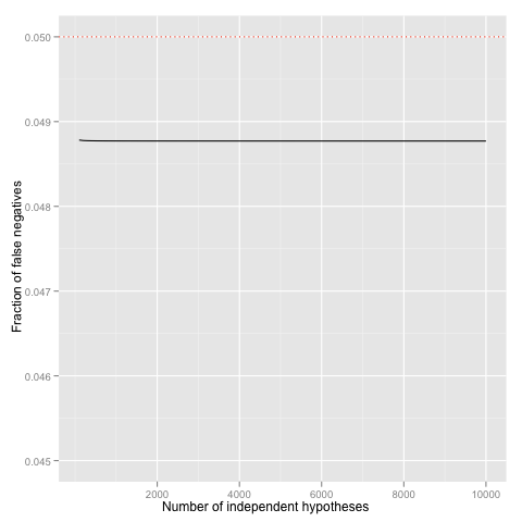
for(N in c(1:1000))
{
p[N] <- pbinom(0, 10 * N, prob = 0.05/(10 * N), lower.tail = FALSE)
}
df <- data.frame(x = x, y = p)
p <- ggplot(df) + geom_line(aes(x=x, y=y))
p <- p + geom_hline(yintercept = 0.05, linetype = "dotted", colour = "red")
p <- p + scale_x_continuous("Number of independent hypotheses")
p <- p + scale_y_continuous("Fraction of false positives", limits=c(0.045, 0.05))
p
Use of background information. Even with liberal p-value correction method, the number of hypotheses to be considered directly reduces power of statistical tests---some effects which would be detectable on individual level remain undetected in multiple hypothesis testing. Hence, it is important to reduce the set of hypotheses before testing. If there are some biological or statistical background information, which allows to eliminate a large portion of plausible hypotheses, one should always do it. Of course, there are some potential drawbacks, as well. Sometimes, background information is fraudulent and thus effectively blocks us from discovering new relevant facts. Sometimes, background information is tainted---it uses the same dataset to filter out some hypotheses and thus gives us a false sense of confidence. In other words, use background information whenever it is possible, but also check whether the background information is relevant and applicable in your context.
The dangling threat of spurious results
Missing:. Write what is the difference between correlation and causation and why ice cream eating in not the main cause of drownings.