Data reclassification
Reclassifying data based on specific criteria is a common task when doing GIS analysis. The purpose of this lesson is to see how we can reclassify values based on some criteria which can be whatever, but typical are related to a logical decision tree.
In this lecture we’ll look at some traditional use cases to learn classifications.
We will use Corine land cover layer from year 2012, and a Population Matrix data from Estonia to classify some features of them based on our own self-made classifier, or using a ready made classifiers that are commonly used e.g. when doing visualizations.
The target in this part of the lesson is to:
classify the bogs into big and small bogs where
a big bog is a bog that is larger than the average size of all bogs in our study region
a small bog ^ vice versa
use ready made classifiers from pysal -module to classify municipal into multiple classes.
Download data
Download (and then extract) the dataset zip-package used during this lesson from this link.
You should have following Shapefiles in your L4 folder:
corine_legend/    corine_tartu.shp            population_admin_units.prj
corine_tartu.cpg  corine_tartu.shp.xml        population_admin_units.sbn
corine_tartu.dbf  corine_tartu.shx            population_admin_units.sbx
corine_tartu.prj  L4.zip                      population_admin_units.shp
corine_tartu.sbn  population_admin_units.cpg  population_admin_units.shp.xml
corine_tartu.sbx  population_admin_units.dbf  population_admin_units.shx
Data preparation
Before doing any classification, we need to prepare our data a little bit.
Let’s read the data in and have a look at the columnsand plot our data so that we can see how it looks like on a map.
In [1]: import pandas as pd

In [2]: import geopandas as gpd

In [3]: import matplotlib.pyplot as plt

In [4]: import os

In [5]: fp = "source/_static/data/L4/corine_tartu.shp"

In [6]: data = gpd.read_file(fp)
# in Jupyter Notebook don't forget to enable the inline plotting magic
import matplotlib.pyplot as plt
%matplotlib inline
Let’s see what we have.
In [7]: data.head(5)
Out[7]:
  code_12          ID Remark    Area_Ha   Shape_Leng     Shape_Area  \
0     111  EU-2024275   None  51.462132  4531.639281  514621.315450
1     112  EU-2024328   None  25.389164   143.790405     153.109311
2     112  EU-2024336   None  28.963212  2974.801106  289632.119850
3     112  EU-2024348   None  54.482860  5546.791914  544828.603299
4     112  EU-2024352   None  33.392926  4102.166244  333929.262851

                                            geometry
0  POLYGON Z ((5290566.200 4034511.450 0.000, 529...
1  MULTIPOLYGON Z (((5259932.400 3993825.370 0.00...
2  POLYGON Z ((5268691.710 3996582.900 0.000, 526...
3  POLYGON Z ((5270008.730 4001777.440 0.000, 526...
4  POLYGON Z ((5278194.410 4003869.230 0.000, 527...
We see that the Land Use in column “code_12” is numerical and we don’t know right now what that means. So we should at first join the “clc_legend” in order to know what the codes mean:
In [8]: fp_clc = "source/_static/data/L4/corine_legend/clc_legend.csv"

In [9]: data_legend = pd.read_csv(fp_clc, sep=';', encoding='latin1')

In [10]: data_legend.head(5)
Out[10]:
   GRID_CODE  CLC_CODE                                      LABEL3  \
0          1       111                     Continuous urban fabric
1          2       112                  Discontinuous urban fabric
2          3       121              Industrial or commercial units
3          4       122  Road and rail networks and associated land
4          5       123                                  Port areas

           RGB
0  230-000-077
1  255-000-000
2  204-077-242
3  204-000-000
4  230-204-204
We could now try to merge / join the two dataframes, ideally by the ‘code_12’ column of “data” and the “CLC_CODE” of “data_legend”.
In [11]: display(data.dtypes)
code_12         object
ID              object
Remark          object
Area_Ha        float64
Shape_Leng     float64
Shape_Area     float64
geometry      geometry
dtype: object

In [12]: display(data_legend.dtypes)
GRID_CODE     int64
CLC_CODE      int64
LABEL3       object
RGB          object
dtype: object

# please don't actually do it right now, it might cause extra troubles later
# data = data.merge(data_legend, how='inner', left_on='code_12', right_on='CLC_CODE')
But if we try, we will receive an error telling us that the columns are of different data type and therefore can’t be used as join-index. So we have to add a column where have the codes in the same type. I am choosing to add a column on “data”, where we transform the String/Text based “code_12” into an integer number.
In [13]: def change_type(row):
   ....:     code_as_int = int(row['code_12'])
   ....:     return code_as_int
   ....:
In [14]: data['clc_code_int'] = data.apply(change_type, axis=1)

In [15]: data.head(2)
Out[15]:
  code_12          ID Remark    Area_Ha   Shape_Leng     Shape_Area  \
0     111  EU-2024275   None  51.462132  4531.639281  514621.315450
1     112  EU-2024328   None  25.389164   143.790405     153.109311

                                            geometry  clc_code_int
0  POLYGON Z ((5290566.200 4034511.450 0.000, 529...           111
1  MULTIPOLYGON Z (((5259932.400 3993825.370 0.00...           112
Here we are “casting” the String-based value, which happens to be a number, to be interpreted as an actula numeric data type.
Using the int() function. Pandas (and therefore also Geopandas) also provides an in-built function that provides similar functionality astype() ,
e.g. like so data['code_astype_int'] = data['code_12'].astype('int64', copy=True)
Both versions can go wrong if the String cannot be interpreted as a number, and we should be more defensive (more details later, don’t worry right now).
Now we can merge/join the legend dateframe into our corine landuse dataframe:
In [16]: data = data.merge(data_legend, how='inner', left_on='clc_code_int', right_on='CLC_CODE', suffixes=('', '_legend'))
We have now also added more columns. Let’s drop a few, so we can focus on the data we need.
In [17]: selected_cols = ['ID','Remark','Shape_Area','CLC_CODE','LABEL3','RGB','geometry']

# Select data
In [18]: data = data[selected_cols]

# What are the columns now?
In [19]: data.columns
Out[19]: Index(['ID', 'Remark', 'Shape_Area', 'CLC_CODE', 'LABEL3', 'RGB', 'geometry'], dtype='object')
Before we plot, let’s check the coordinate system.
# Check coordinate system information
In [20]: data.crs
Out[20]:
<Projected CRS: EPSG:3035>
Name: ETRS89-extended / LAEA Europe
Axis Info [cartesian]:
- Y[north]: Northing (metre)
- X[east]: Easting (metre)
Area of Use:
- name: Europe - LCC & LAEA
- bounds: (-35.58, 24.6, 44.83, 84.17)
Coordinate Operation:
- name: Europe Equal Area 2001
- method: Lambert Azimuthal Equal Area
Datum: European Terrestrial Reference System 1989
- Ellipsoid: GRS 1980
- Prime Meridian: Greenwich
Okey we can see that the units are in meters, but …
… geographers will realise that the Corine dataset is in the ETRS89 / LAEA Europe coordinate system, aka EPSG:3035. Because it is a European dataset it is in the recommended CRS for Europe-wide data. It is a single CRS for all of Europe and predominantly used for statistical mapping at all scales and other purposes where true area representation is required.
However, being in Estonia and only using an Estonian part of the data, we should consider reprojecting it into the Estonian national grid (aka Estonian Coordinate System of 1997 -> EPSG:3301) before we plot or calculate the area of our bogs.
In [21]: data_proj = data.to_crs(epsg=3301)

# Calculate the area of bogs
In [22]: data_proj['area'] = data_proj.area

# What do we have?
In [23]: data_proj['area'].head(2)
Out[23]:
0    514565.037797
1       153.104211
Name: area, dtype: float64
Let’s plot the data and use column ‘CLC_CODE’ as our color.
In [24]: data_proj.plot(column='CLC_CODE', linewidth=0.05)
Out[24]: <AxesSubplot:>

# Use tight layout and remove empty whitespace around our map
In [25]: plt.tight_layout()
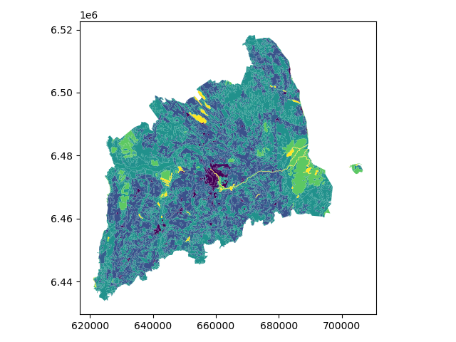
Let’s see what kind of values we have in ‘code_12’ column.
In [26]: print(list(data_proj['CLC_CODE'].unique()))
[111, 112, 121, 122, 124, 131, 133, 141, 142, 211, 222, 231, 242, 243, 311, 312, 313, 321, 324, 411, 412, 511, 512]

In [27]: print(list(data_proj['LABEL3'].unique()))
['Continuous urban fabric', 'Discontinuous urban fabric', 'Industrial or commercial units', 'Road and rail networks and associated land', 'Airports', 'Mineral extraction sites', 'Construction sites', 'Green urban areas', 'Sport and leisure facilities', 'Non-irrigated arable land', 'Fruit trees and berry plantations', 'Pastures', 'Complex cultivation patterns', 'Land principally occupied by agriculture, with significant areas of natural vegetation', 'Broad-leaved forest', 'Coniferous forest', 'Mixed forest', 'Natural grasslands', 'Transitional woodland-shrub', 'Inland marshes', 'Peat bogs', 'Water courses', 'Water bodies']
Okey we have different kind of land covers in our data. Let’s select only bogs from our data. Selecting specific rows from a DataFrame
based on some value(s) is easy to do in Pandas / Geopandas using the indexer called .loc[], read more from here.
# Select bogs (i.e. 'Peat bogs' in the data) and make a proper copy out of our data
In [28]: bogs = data_proj.loc[data['LABEL3'] == 'Peat bogs'].copy()

In [29]: bogs.head(2)
Out[29]:
              ID Remark    Shape_Area  CLC_CODE     LABEL3          RGB  \
2214  EU-2056784   None  4.772165e+05       412  Peat bogs  077-077-255
2215  EU-2056806   None  8.917057e+06       412  Peat bogs  077-077-255

                                               geometry          area
2214  POLYGON Z ((625609.433 6453543.495 0.000, 6255...  4.771837e+05
2215  POLYGON Z ((631620.621 6465132.490 0.000, 6316...  8.916207e+06
Calculations in DataFrames
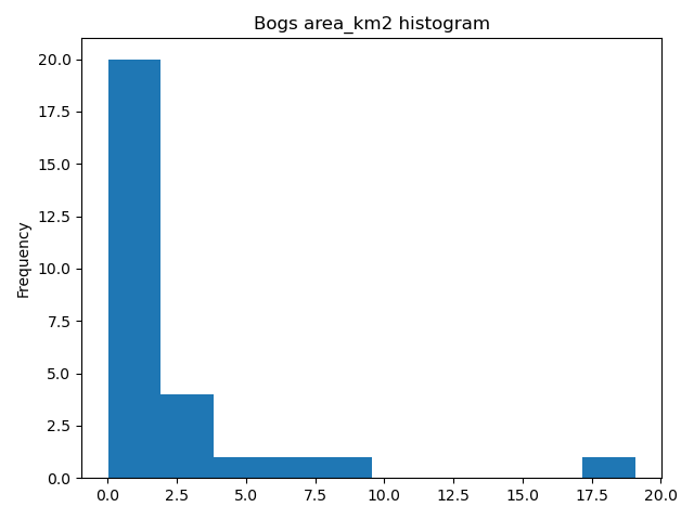
Okey now we have our bogs dataset ready. The aim was to classify those bogs into small and big bogs based on the average size of all bogs in our study area. Thus, we need to calculate the average size of our bogs.
We remember also that the CRS was projected with units in metre, and the calculated values are therefore be in square meters. Let’s change those into square kilometers so they are easier to read. Doing calculations in Pandas / Geopandas are easy to do:
In [30]: bogs['area_km2'] = bogs['area'] / 1000000

# What is the mean size of our bogs?
In [31]: l_mean_size = bogs['area_km2'].mean()

In [32]: l_mean_size
Out[32]: 2.155588679443975
Okey so the size of our bogs seem to be approximately 2.15 square kilometers.
But to understand the overall distribution of the different sizes of the bogs, we can use the histogram. A histogram shows how the numerical values of a datasets are distributed within the overall data. It shows the frequency of values (how many single “features”) are within each “bin”.
# Plot
In [33]: fig, ax = plt.subplots()

In [34]: bogs['area_km2'].plot.hist(bins=10);

# Add title
In [35]: plt.title("Bogs area_km2 histogram")
Out[35]: Text(0.5, 1.0, 'Bogs area_km2 histogram')

In [36]: plt.tight_layout()
Note
It is also easy to calculate e.g. sum or difference between two or more layers (plus all other mathematical operations), e.g.:
# Sum two columns
data['sum_of_columns'] = data['col_1'] + data['col_2']

# Calculate the difference of three columns
data['difference'] = data['some_column'] - data['col_1'] + data['col_2']
Classifying data
Creating a custom classifier
Let’s create a function where we classify the geometries into two classes based on a given threshold -parameter.
If the area of a polygon is lower than the threshold value (average size of the bog), the output column will get a value 0,
if it is larger, it will get a value 1. This kind of classification is often called a binary classification.
First we need to create a function for our classification task. This function takes a single row of the GeoDataFrame as input, plus few other parameters that we can use.
def binaryClassifier(row, source_col, output_col, threshold):
    # If area of input geometry is lower that the threshold value
    if row[source_col] < threshold:
        # Update the output column with value 0
        row[output_col] = 0
    # If area of input geometry is higher than the threshold value update with value 1
    else:
        row[output_col] = 1
    # Return the updated row
    return row
In [37]: def binaryClassifier(row, source_col, output_col, threshold):
   ....:     if row[source_col] < threshold:
   ....:         row[output_col] = 0
   ....:     else:
   ....:         row[output_col] = 1
   ....:     return row
   ....:
Let’s create an empty column for our classification
In [38]: bogs['small_big'] = None
We can use our custom function by using a Pandas / Geopandas function called .apply().
Thus, let’s apply our function and do the classification.
In [39]: bogs = bogs.apply(binaryClassifier, source_col='area_km2', output_col='small_big', threshold=l_mean_size, axis=1)
Let’s plot these bogs and see how they look like.
In [40]: bogs.plot(column='small_big', linewidth=0.05, cmap="seismic")
Out[40]: <AxesSubplot:>

In [41]: plt.tight_layout()
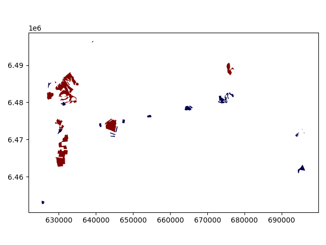
Okey so it looks like they are correctly classified, good. As a final step let’s save the bogs as a file to disk.
In [42]: outfp_bogs = "source/_static/data/L4/bogs.shp"

In [43]: bogs.to_file(outfp_bogs)
Note
There is also a way of doing this without a function but with the previous example might be easier to understand how the function works. Doing more complicated set of criteria should definitely be done in a function as it is much more human readable.
Let’s give a value 0 for small bogs and value 1 for big bogs by using an alternative technique:
bogs['small_big_alt'] = None
bogs.loc[bogs['area_km2'] < l_mean_size, 'small_big_alt'] = 0
bogs.loc[bogs['area_km2'] >= l_mean_size, 'small_big_alt'] = 1
Classification based on common classification schemes
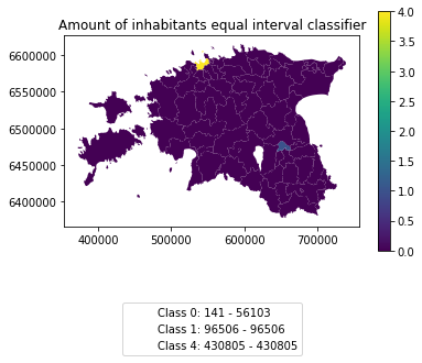
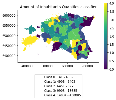
Pysal -module is an extensive Python library including various functions and tools to do spatial data analysis. It also includes all of the most common data classification schemes that are used commonly e.g. when visualizing data. Available map classification schemes in pysal -module are (see here for more details):
Box_Plot: Box_Plot Map Classification
Equal_Interval: Equal Interval Classification
Fisher_Jenks: Fisher Jenks optimal classifier - mean based
Fisher_Jenks_Sampled: Fisher Jenks optimal classifier - mean based using random sample
HeadTail_Breaks: Head/tail Breaks Map Classification for Heavy-tailed Distributions
Jenks_Caspall: Jenks Caspall Map Classification
Jenks_Caspall_Forced: Jenks Caspall Map Classification with forced movements
Jenks_Caspall_Sampled: Jenks Caspall Map Classification using a random sample
Max_P_Classifier: Max_P Map Classification
Maximum_Breaks(: Maximum Breaks Map Classification
Natural_Breaks: Natural Breaks Map Classification
Quantiles: Quantile Map Classification
Percentiles: Percentiles Map Classification
Std_Mean: Standard Deviation and Mean Map Classification
User_Defined: User Specified Binning
For this we will use the Adminstrative Units dataset for population. It is in the Estonian “vald” level, which compares to the level at municipality. It has the following fields:
VID, an Id for the “vald”
KOOD, a unique code for the Statistics Board
NIMI, the name of the municipality
population, the population, number of people living
geometry, the polygon for the municpality district border
Let’s apply one of those schemes into our data and classify the population into 5 classes.
Choosing Number of Classes – if you choose too many classes then it requires the map reader to remember too much when viewing the map and it may also make the differentiation of class colors difficult for the map reader. On the other hand, if you choose too few classes, it oversimplifies the data possibly hiding important patterns. Additionally, each class may group dissimilar items together which is in direct opposition of one of the main goals of classification. Typically in cartography three to seven classes are preferred and five is the most common and optimal for most thematic maps.
In [44]: import geopandas as gpd

In [45]: import matplotlib.pyplot as plt

In [46]: fp = "source/_static/data/L4/population_admin_units.shp"

In [47]: acc = gpd.read_file(fp)

In [48]: print(acc.head(5))
          VID  KOOD          NIMI population  \
0  41158132.0  0698    Rõuge vald       5435
1  41158133.0  0855    Valga vald      15989
2  41158134.0  0732  Setomaa vald       3369
3  41158135.0  0917     Võru vald      10793
4  41158136.0  0142   Antsla vald       4514

                                            geometry
0  POLYGON ((646935.772 6394632.940, 647093.829 6...
1  POLYGON ((620434.776 6406412.852, 620687.169 6...
2  MULTIPOLYGON (((698977.677 6412793.362, 699094...
3  POLYGON ((656207.141 6413138.438, 656408.394 6...
4  POLYGON ((640706.698 6417414.068, 641029.597 6...
However, at a close look, we run into the “numbers as text problem” again.
# data types in the population dataset
In [49]: acc.dtypes
Out[49]:
VID            float64
KOOD            object
NIMI            object
population      object
geometry      geometry
dtype: object
Therefore, we have to change the column type for population into a numerical data type first:
In [50]: import numpy as np

In [51]: def change_type_defensively(row):
   ....:     try:
   ....:         return int(row['population'])
   ....:     except Exception:
   ....:         return np.nan
   ....: acc['population_int'] = acc.apply(change_type_defensively, axis=1)
   ....: acc.head(5)
   ....:
Out[51]:
          VID  KOOD          NIMI population  \
0  41158132.0  0698    Rõuge vald       5435
1  41158133.0  0855    Valga vald      15989
2  41158134.0  0732  Setomaa vald       3369
3  41158135.0  0917     Võru vald      10793
4  41158136.0  0142   Antsla vald       4514

                                            geometry  population_int
0  POLYGON ((646935.772 6394632.940, 647093.829 6...            5435
1  POLYGON ((620434.776 6406412.852, 620687.169 6...           15989
2  MULTIPOLYGON (((698977.677 6412793.362, 699094...            3369
3  POLYGON ((656207.141 6413138.438, 656408.394 6...           10793
4  POLYGON ((640706.698 6417414.068, 641029.597 6...            4514
Here we demonstrate a more defensive strategy to convert datatypes. Many operations can cause Exceptions and then you can’t ignore the problem anymore because your code breaks.
But with try - except we can catch expected exception (aka crashes) and react appropriately.
Pandas (and therefore also Geopandas) also provides an in-built function that provides similar functionality to_numeric() ,
e.g. like so data['code_tonumeric_int'] = pd.to_numeric(data['code_12'], errors='coerce'). Beware, to_numeric() is called as pandas/pd function, not on the dataframe.
Both versions will at least return a useful NaN value (not_a_number, sort of a nodata value) without crashing. Pandas, Geopandas, numpy and many other Python libraries have some functionality to work with or ignore Nan values without breaking calculations.
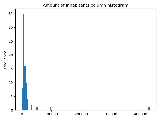
It would be great to know the actual class ranges for the values. So let’s plot a histogram.
# Plot
In [52]: fig, ax = plt.subplots()

In [53]: acc["population_int"].plot.hist(bins=100);

# Add title
In [54]: plt.title("Amount of inhabitants column histogram")
Out[54]: Text(0.5, 1.0, 'Amount of inhabitants column histogram')

In [55]: plt.tight_layout()
Now we can apply a classifier to our data quite similarly as in our previous examples.
In [56]: import pysal.viz.mapclassify as mc

# Define the number of classes
In [57]: n_classes = 5
The classifier needs to be initialized first with make() function that takes the number of desired classes as input parameter.
# Create a Natural Breaks classifier
In [58]: classifier = mc.NaturalBreaks.make(k=n_classes)
Then we apply the classifier by explicitly providing it a column and then assigning the derived class values to a new column.
# Classify the data
In [59]: acc['population_classes'] = acc[['population_int']].apply(classifier)

# Let's see what we have
In [60]: acc.head()
Out[60]:
          VID  KOOD          NIMI population  \
0  41158132.0  0698    Rõuge vald       5435
1  41158133.0  0855    Valga vald      15989
2  41158134.0  0732  Setomaa vald       3369
3  41158135.0  0917     Võru vald      10793
4  41158136.0  0142   Antsla vald       4514

                                            geometry  population_int  \
0  POLYGON ((646935.772 6394632.940, 647093.829 6...            5435
1  POLYGON ((620434.776 6406412.852, 620687.169 6...           15989
2  MULTIPOLYGON (((698977.677 6412793.362, 699094...            3369
3  POLYGON ((656207.141 6413138.438, 656408.394 6...           10793
4  POLYGON ((640706.698 6417414.068, 641029.597 6...            4514

   population_classes
0                   0
1                   1
2                   0
3                   1
4                   0
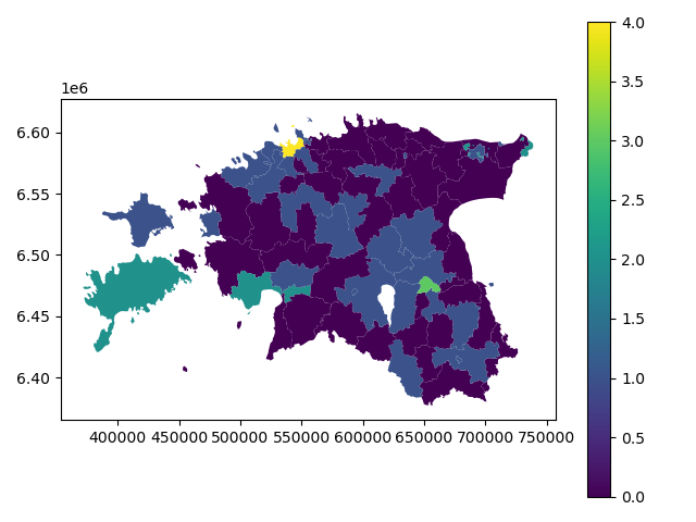
Okey, so we have added a column to our DataFrame where our input column was classified into 5 different classes (numbers 0-4) based on Natural Breaks classification.
Great, now we have those values in our population GeoDataFrame. Let’s visualize the results and see how they look.
# Plot
In [61]: acc.plot(column="population_classes", linewidth=0, legend=True);

# Use tight layour
In [62]: plt.tight_layout()
In order to get the min() and max() per class group, we use groupby again.
In [63]: grouped = acc.groupby('population_classes')
# legend_dict = { 'class from to' : 'white'}
In [64]: legend_dict = {}
In [65]: for cl, valds in grouped:
....: minv = valds['population_int'].min()
....: maxv = valds['population_int'].max()
....: print("Class {}: {} - {}".format(cl, minv, maxv))
....:
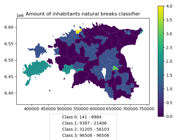
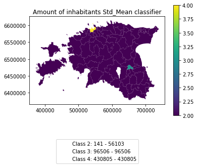
Class 0: 141 - 8984
Class 1: 9387 - 21406
Class 2: 31205 - 56103
Class 3: 96506 - 96506
Class 4: 430805 - 430805
And in order to add our custom legend info to the plot, we need to employ a bit more of Python’s matplotlib magic:
In [66]: import matplotlib.patches as mpatches

In [67]: import matplotlib.pyplot as plt

In [68]: import collections

# legend_dict, a special ordered dictionary (which reliably remembers order of adding things) that holds our class description and gives it a colour on the legend (we leave it "background" white for now)
In [69]: legend_dict = collections.OrderedDict([])

#
In [70]: for cl, valds in grouped:
   ....:     minv = valds['population_int'].min()
   ....:     maxv = valds['population_int'].max()
   ....:     legend_dict.update({"Class {}: {} - {}".format(cl, minv, maxv): "white"})
   ....:

# Plot preps for several plot into one figure
In [71]: fig, ax = plt.subplots()

# plot the dataframe, with the natural breaks colour scheme
In [72]: acc.plot(ax=ax, column="population_classes", linewidth=0, legend=True);

# the custom "patches" per legend entry of our additional labels
In [73]: patchList = []

In [74]: for key in legend_dict:
   ....:     data_key = mpatches.Patch(color=legend_dict[key], label=key)
   ....:     patchList.append(data_key)
   ....:

# plot the custom legend
In [75]: plt.legend(handles=patchList, loc='lower center', bbox_to_anchor=(0.5, -0.5), ncol=1)
Out[75]: <matplotlib.legend.Legend at 0x2a4dd1af348>

# Add title
In [76]: plt.title("Amount of inhabitants natural breaks classifier")
Out[76]: Text(0.5, 1.0, 'Amount of inhabitants natural breaks classifier')

In [77]: plt.tight_layout()
Launch in the web/MyBinder: