More raster data analytics
Calculating NDVI
In this exercise we explain how to calculate and classify the normalized difference vegetation index (NDVI) using Landsat 8 data.
A quick background on phenology: Phenology is the study of phenomena or happenings. It is applied to the recording and study of the dates of recurrent natural events (such as the flowering of a plant or the first or last appearance of a migrant bird) in relation to seasonal climatic changes. Phenology thus combines ecology with meteorology.
The weather factor that has the greatest influence on recurrent events in temperate climates is almost always temperature; in tropical areas it may be rainfall, humidity, or some other factor. The length of day, which fluctuates throughout the year but is always the same in a single locality on the same date in every year, often determines the average date of natural events but not their variation from year to year. With resident species, these local events are influenced by previous weather conditions in the area; with migrant animals, dates of arrival are affected more by conditions at the start of and during their migrations.
In addition to comparisons of the same event in different years in one locality, phenology is also concerned with studies of the times of the same event in different localities in the same year (when differences of geographic position, soil, slope, shelter, etc., are involved) and of the sequence of different events in one locality during the annual cycle of climatic and biological changes. Phenological observations are of importance to farmers and gardeners and to beekeepers who want to know when nectar-secreting flowers are at their peak production. The best date for spraying for insect pests, particularly of fruit trees in the spring, is determined by the state of development of the leaf and flower buds, which varies from year to year
NDVI can be considered one of the foundation for Remote Sensing phenology. In the sciences we often use remote sensing data gathered by satellite sensors that measure wavelengths of light absorbed and reflected by green plants to study phenology. Certain pigments in plant leaves strongly absorb wavelengths of visible (red) light. The leaves themselves strongly reflect wavelengths of near-infrared light, which is invisible to human eyes. As a plant canopy changes from early spring growth to late-season maturity and senescence, these reflectance properties also change.
Many sensors carried aboard satellites measure red and near-infrared light waves reflected by land surfaces. Using mathematical formulas (algorithms), scientists transform raw satellite data about these light waves into vegetation indices. A vegetation index is an indicator that describes the greenness — the relative density and health of vegetation — for each picture element, or pixel, in a satellite image.
Although there are several vegetation indices, one of the most widely used is the Normalized Difference Vegetation Index (NDVI). NDVI values range from +1.0 to -1.0. Areas of barren rock, sand, or snow usually show very low NDVI values (for example, 0.1 or less). Sparse vegetation such as shrubs and grasslands or senescing crops may result in moderate NDVI values (approximately 0.2 to 0.5). High NDVI values (approximately 0.6 to 0.9) correspond to dense vegetation such as that found in temperate and tropical forests or crops at their peak growth stage.
By transforming raw satellite data into NDVI values, researchers can create images and other products that give a rough measure of vegetation type, amount, and condition on land surfaces around the world. NDVI is especially useful for continental- to global-scale vegetation monitoring because it can compensate for changing illumination conditions, surface slope, and viewing angle. That said, NDVI does tend to saturate over dense vegetation and is sensitive to underlying soil color.
NDVI values can be averaged over time to establish “normal” growing conditions in a region for a given time of year. Further analysis can then characterize the health of vegetation in that place relative to the norm. When analyzed through time, NDVI can reveal where vegetation is thriving and where it is under stress, as well as changes in vegetation due to human activities such as deforestation, natural disturbances such as wild fires, or changes in plants’ phenological stage.
Landsat 8
Landsat 8 (formally the Landsat Data Continuity Mission, LDCM) was launched on an Atlas-V rocket from Vandenberg Air Force Base, California on February 11, 2013. Landsat 8 is the most recently launched Landsat satellite and carries the Operational Land Imager (OLI) and the Thermal Infrared Sensor (TIRS) instruments.
Operational Land Imager (OLI) - Built by Ball Aerospace & Technologies Corporation
Nine spectral bands, including a pan band:
Band 1 Visible (0.43 - 0.45 µm) 30 m
Band 2 Visible (0.450 - 0.51 µm) 30 m
Band 3 Visible (0.53 - 0.59 µm) 30 m
Band 4 Red (0.64 - 0.67 µm) 30 m
Band 5 Near-Infrared (0.85 - 0.88 µm) 30 m
Band 6 SWIR 1(1.57 - 1.65 µm) 30 m
Band 7 SWIR 2 (2.11 - 2.29 µm) 30 m
Band 8 Panchromatic (PAN) (0.50 - 0.68 µm) 15 m
Band 9 Cirrus (1.36 - 1.38 µm) 30 m
OLI captures data with improved radiometic precision over a 12-bit dynamic range, which improves overall signal to noise ratio. This translates into 4096 potential grey levels, compared with only 256 grey levels in Landsat 1-7 8-bit instruments. Improved signal to noise performance enables improved characterization of land cover state and condition.
The 12-bit data are scaled to 16-bit integers and delivered in the Level-1 data products. Products are scaled to 55,000 grey levels, and can be rescaled to the Top of Atmosphere (TOA) reflectance and/or radiance using radiometric rescaling coefficients provided in the product metadata file (MTL file).
Thermal Infrared Sensor (TIRS) - Built by NASA Goddard Space Flight Center
Two spectral bands:
Band 10 TIRS 1 (10.6 - 11.19 µm) 100 m
Band 11 TIRS 2 (11.5 - 12.51 µm) 100 m
In order to calculate NDVI with spectral data from Landsat 8 you can acquire scenes (the images) for days with low cloud cover from the USGS EarthExplorer data portal. For this lesson I have prepared a small subset: download a Porijõgi Landsat8 scene for August 2020 here!
The zip package contains several separate bands as .tif files (compare with Landsat 8 description above):
Calculate and Classify Normalized Difference Results with EarthPy
This example shows you how to use the normalized_diff() function to calculate the normalized difference vegetation index (NDVI), a commonly used remotely sensed index for quantifying vegetation health. NDVI can be calculated from Landsat 8 data using band 4 (red) and band 5 (near-infrared). For other satellite data such as from Sentinel 2 you always need to check the satellite mission documentation on the sensors and instruments in order to know which bands are for what use cases.
At first we load the .tif files. For that we create a numpy array with each “layer” representing a single band:
In [1]: import os

In [2]: from glob import glob

In [3]: import numpy as np

In [4]: import matplotlib.pyplot as plt

In [5]: from matplotlib.colors import ListedColormap

In [6]: import earthpy as et

In [7]: import earthpy.spatial as es

In [8]: import earthpy.plot as ep

# Stack the Landsat 8 bands
In [9]: landsat_path = glob("source/_static/data/L5/Landsat8_pori__sr*.tif")

In [10]: landsat_path.sort()

In [11]: for idx, f in enumerate(landsat_path):
   ....:     print(f"{idx}: {f}")
   ....:
0: source/_static/data/L5\Landsat8_pori__sr_band1.tif
1: source/_static/data/L5\Landsat8_pori__sr_band2.tif
2: source/_static/data/L5\Landsat8_pori__sr_band3.tif
3: source/_static/data/L5\Landsat8_pori__sr_band4.tif
4: source/_static/data/L5\Landsat8_pori__sr_band5.tif
5: source/_static/data/L5\Landsat8_pori__sr_band6.tif
6: source/_static/data/L5\Landsat8_pori__sr_band7.tif

In [12]: arr_st_l8, meta_l8 = es.stack(landsat_path, nodata=-9999)
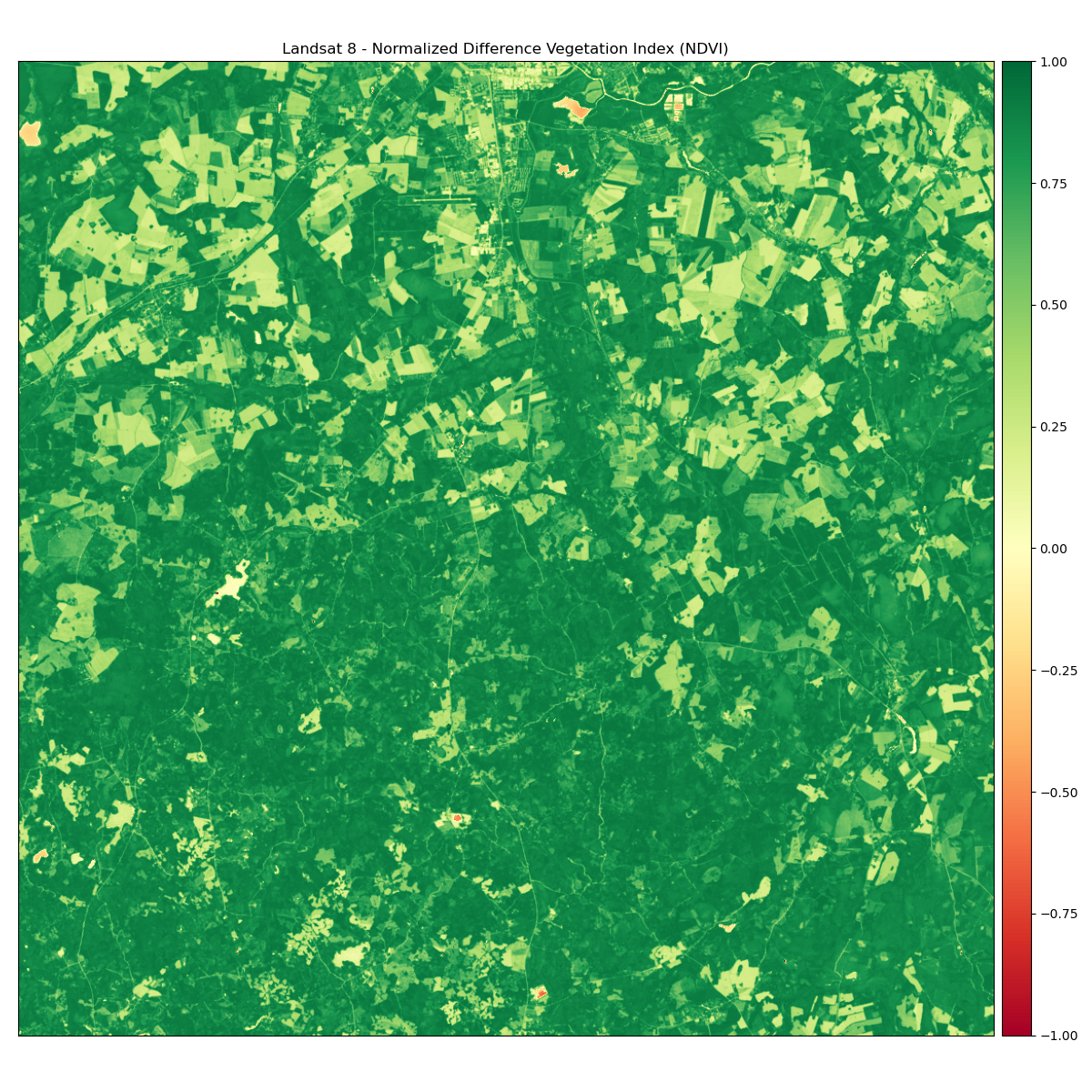
Now we calculate a new array representing our NDVI image using the normalized_diff function from the earthpy.spatial module. Math will be calculated (b1-b2) / (b1 + b2).
Landsat 8 near-infrared band is band 5 at [4] (as b1 input), and Landsat 8 red band is band 4 at [3] (as b2 input) - remember lists and arrays in Python usually start with index 0.
We use the EarthPy function ep.plot_bands() for showing the “bands” (our arrays representing the raster images).
In [13]: b1 = arr_st_l8[4]

In [14]: b2 = arr_st_l8[3]

In [15]: ndvi_l8 = es.normalized_diff(b1, b2)

In [16]: title = "Landsat 8 - Normalized Difference Vegetation Index (NDVI)"

# Turn off bytescale scaling due to float values for NDVI
In [17]: ep.plot_bands(ndvi_l8, cmap="RdYlGn", cols=1, title=title, vmin=-1, vmax=1)
Out[17]: <AxesSubplot:title={'center':'Landsat 8 - Normalized Difference Vegetation Index (NDVI)'}>

In [18]: plt.tight_layout()
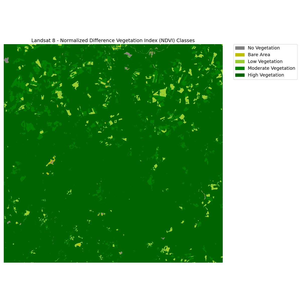
The next thing we usually can do, is to categorize (or classify) the NDVI results into useful classes. In this case we will do a manual classification: Values under 0 will be classified together as no vegetation. Additional classes will be created for bare area and low, moderate, and high vegetation areas.
Attention!
We can categorize the NDVI values in certain classes using intervals of values. These intervals chosen here are only for didactic / teaching purposes (especially for the classes of bare area and low, moderate, and high vegetation). This is not methodology you should use unchecked when working with remote sensing data. Typically, you need to know something about the study area in order to make better informed choices. There is no exact definition of these values intervals once it can vary greatly between geographic regions. Moreover, the NDVI is a very sensitive index and can saturate easily in areas where perhaps the vegetation is not high, but very dense (e.g. crop areas).
We use some helper functions from Numpy to deal with this:
# Create classes and apply to NDVI results
In [19]: ndvi_class_bins = [-np.inf, 0, 0.1, 0.25, 0.4, np.inf]

In [20]: ndvi_landsat_class = np.digitize(ndvi_l8, ndvi_class_bins)

# Apply the nodata mask to the newly classified NDVI data
In [21]: ndvi_landsat_class = np.ma.masked_where(np.ma.getmask(ndvi_l8), ndvi_landsat_class)

# and check the number of unique values in our now classified dataset
In [22]: np.unique(ndvi_landsat_class)
Out[22]:
masked_array(data=[1, 2, 3, 4, 5],
             mask=False,
       fill_value=999999,
            dtype=int64)
We check the number of unique values in our now classified dataset, because they hopefully match with our class bins defined before. This will also be important to know, when create the legend.
We can plot the classified NDVI with a categorical legend using the draw_legend() function from the earthpy.plot module
# Define color map
In [23]: nbr_colors = ["gray", "y", "yellowgreen", "g", "darkgreen"]

In [24]: nbr_cmap = ListedColormap(nbr_colors)

# Define class names
In [25]: ndvi_cat_names = [
   ....:     "No Vegetation",
   ....:     "Bare Area",
   ....:     "Low Vegetation",
   ....:     "Moderate Vegetation",
   ....:     "High Vegetation",
   ....: ]
   ....:

# Get list of classes
In [26]: classes_l8 = np.unique(ndvi_landsat_class)

In [27]: classes_l8 = classes_l8.tolist()

# The mask returns a value of none in the classes. remove that
In [28]: classes_l8 = classes_l8[0:5]

# Plot your data
In [29]: fig, ax = plt.subplots(figsize=(12, 12))

In [30]: im = ax.imshow(ndvi_landsat_class, cmap=nbr_cmap)

In [31]: ep.draw_legend(im_ax=im, classes=classes_l8, titles=ndvi_cat_names)
Out[31]: <matplotlib.legend.Legend at 0x2a4dda231c8>

In [32]: ax.set_title("Landsat 8 - Normalized Difference Vegetation Index (NDVI) Classes", fontsize=14)
Out[32]: Text(0.5, 1.0, 'Landsat 8 - Normalized Difference Vegetation Index (NDVI) Classes')

In [33]: ax.set_axis_off()

# Auto adjust subplot to fit figure size
In [34]: plt.tight_layout()
Hillshading of a DEM
A hillshade is a 3D representation of a surface. Hillshades are generally rendered in greyscale. The darker and lighter colors represent the shadows and highlights that you would visually expect to see in a terrain model. Hillshades are often used as an underlay in a map, to make the data appear more 3-Dimensional and thus visually interesting.
To download SRTM DEM data (one of the most widely used and freely available global DEM datasets) you need an account on https://earthexplorer.usgs.gov/. You can then either download from that USGS EarthExplorer portal or with this neat web app: 30-Meter SRTM Tile Downloader. However, it will still load the data from USGS and thus you need the EarthExplorer account.
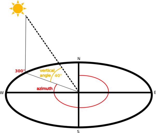
The shading of the layer is calculated according to the sun position: you have the options to change both the horizontal angle (azimuth) and the vertical angle (sun elevation) of the sun.
In this example we will create a hillshade from a DEM using EarthPy. It will also give some advice how to adjust the sun’s azimuth, altitude and other settings that will impact how the hillshade shadows are modeled in the data. The hillshade function is a part of the spatial module in EarthPy.
In [35]: import os
In [36]: import numpy as np
In [37]: import matplotlib.pyplot as plt
In [38]: import earthpy as et
In [39]: import earthpy.spatial as es
In [40]: import earthpy.plot as ep
In [41]: import rasterio as rio
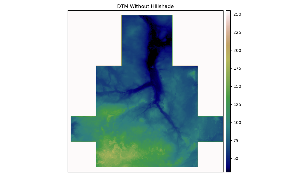
In [42]: dtm = 'source/_static/data/L5/dem.tif'
# Open the DEM with Rasterio
In [43]: src = rio.open(dtm)
In [44]: elevation = src.read(1)
# Plot the data
In [45]: ep.plot_bands(elevation, cmap="gist_earth", title="DTM Without Hillshade", figsize=(10, 6) )
Out[45]: <AxesSubplot:title={'center':'DTM Without Hillshade'}>
In [46]: plt.tight_layout()
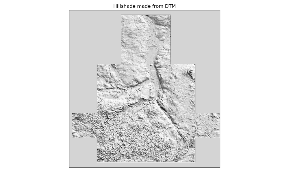
Create the Hillshade
Once the DEM is read in, call es.hillshade() to create the hillshade. Let’s Create and plot the hillshade with earthpy.
In [47]: hillshade = es.hillshade(elevation)

In [48]: ep.plot_bands(hillshade, cbar=False, title="Hillshade made from DTM", figsize=(10, 6) )
Out[48]: <AxesSubplot:title={'center':'Hillshade made from DTM'}>

In [49]: plt.tight_layout()
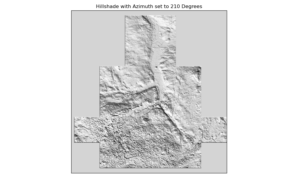
Change the Azimuth of the Sun
The angle that sun light hits the landscape, impacts the shadows and highlights
created on the landscape. You can adjust the azimuth values to adjust angle of the
highlights and shadows that are created in your output hillshade. Azimuth numbers can
range from 0 to 360 degrees, where 0 is due North. The default value for azimuth
in es.hillshade() is 30 degrees.
# Change the azimuth of the hillshade layer
In [50]: hillshade_azimuth_210 = es.hillshade(elevation, azimuth=210)

# Plot the hillshade layer with the modified azimuth
In [51]: ep.plot_bands(hillshade_azimuth_210, cbar=False, title="Hillshade with Azimuth set to 210 Degrees", figsize=(10, 6) )
Out[51]: <AxesSubplot:title={'center':'Hillshade with Azimuth set to 210 Degrees'}>

In [52]: plt.tight_layout()
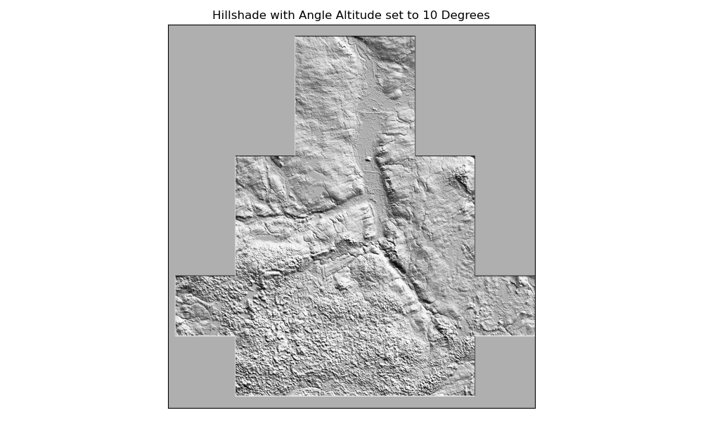
Change the Angle Altitude of the Sun
Another variable you can adjust for hillshade is what angle of the sun.
The angle_altitude parameter values range from 0 to 90. 90 represents the sun
shining from directly above the scene. The default value for angle_altitude in
es.hillshade() is 30 degrees.
# Adjust the azimuth value
In [53]: hillshade_angle_10 = es.hillshade(elevation, altitude=10)

# Plot the hillshade layer with the modified angle altitude
In [54]: ep.plot_bands(hillshade_angle_10, cbar=False, title="Hillshade with Angle Altitude set to 10 Degrees", figsize=(10, 6) )
Out[54]: <AxesSubplot:title={'center':'Hillshade with Angle Altitude set to 10 Degrees'}>

In [55]: plt.tight_layout()
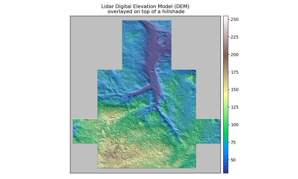
Overlay a DEM on top of the Hillshade
A hillshade can be used to visually enhance a DEM.
To overlay the data, use the ep.plot_bands() function in EarthPy combined with
ax.imshow(). The alpha setting sets the tranparency value for the hillshade layer.
# Plot the DEM and hillshade at the same time
In [56]: fig, ax = plt.subplots(figsize=(10, 6))

In [57]: ep.plot_bands(elevation, ax=ax, cmap="terrain", title="Lidar Digital Elevation Model (DEM)\n overlayed on top of a hillshade" )
Out[57]: <AxesSubplot:title={'center':'Lidar Digital Elevation Model (DEM)\n overlayed on top of a hillshade'}>

In [58]: ax.imshow(hillshade_angle_10, cmap="Greys", alpha=0.5)
Out[58]: <matplotlib.image.AxesImage at 0x2a4dd9bd448>

In [59]: plt.tight_layout()
Launch in the web/MyBinder: