library(tmap)
library(sf)
library(tidyverse)
library(spData) # to access spatial datasetsLesson 4: Making maps with R
This lesson focuses on making professional maps in R, incorporating essential map components through the use of the tmap package. It covers a range of map types, including choropleth maps, graduated symbols, inset maps, and faceted maps. We will continue in using the datasets introduced in preceding lessons, such as the Estonian population, Tartu districts, and bike stations datasets, together with some additional datasets.
Learning outcomes
At the end of this lesson, the students should be able to:
- Understand tmap package and its key features
- Visualize a wide range of spatial data types and attributes using tmap
Let’s load all the packages needed for this lesson:
4.1. Basics of tmap
Like ggplot2, tmap is based on the idea of a grammar of graphics. This involves a separation between the input data and the aesthetics (how data are visualised): each input dataset can be mapped by the visual variables. tmap utilizes tm_shape() as the basic block, which defines input data (raster and vector objects). This is then followed by the addition of one or more layer elements like tm_fill() and tm_dots() to render data as either polygons or points. If you would like to learn more about tmap, here is a link to the documentation.
The following illustration presents a comparison between the commands utilized in the tmap and ggplot2 packages:
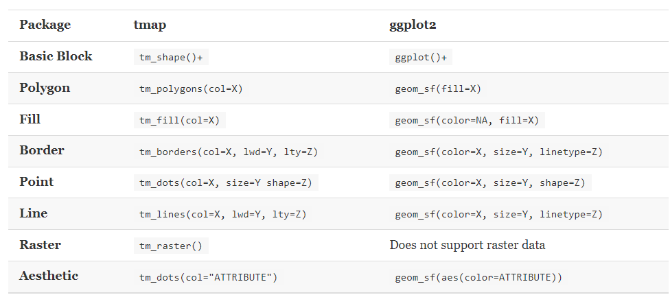
We will continue in using Tartu districts data for the tasks, which you can load into your current R session from R_02 folder by running the following code.
# Import Tartu districts data from lesson 2 folder
tartu_districts <- st_read("../R_02/tartu_districts.gpkg")

glimpse(tartu_districts)
In the code chunk below, we first pass the data object tartu_districts to the basic building block tm_shape(). Then, we add layers to it using the following thematic mapping functions:
tm_fill(): fills the individual polygons (tmap1)tm_borders(): draws the borders of the individual polygons (tmap2), andtm_polygons(): combines the two functions and adds both layers to the shape at the same time (tmap3).
Finally, tmap_arrange is used to arrange these three map layers (tmap1, tmap2, and tmap3) into a single row with three columns (ncol = 3, nrow = 1).
#Set tmap mode to static plotting
tmap_mode("plot")
tmap mode set to plotting# Add fill layer to the shape
tmap1 <- tm_shape(tartu_districts) +
tm_fill()
# Add border layer to the shape
tmap2 <- tm_shape(tartu_districts) +
tm_borders()
# Add both fill and border layers to the shape
tmap3 <- tm_shape(tartu_districts) +
tm_fill() +
tm_borders()
# Arrange tmap1, tmap2, and tmap3 in a 3x1 grid
tmap_arrange(tmap1, tmap2, tmap3, ncol = 3, nrow = 1)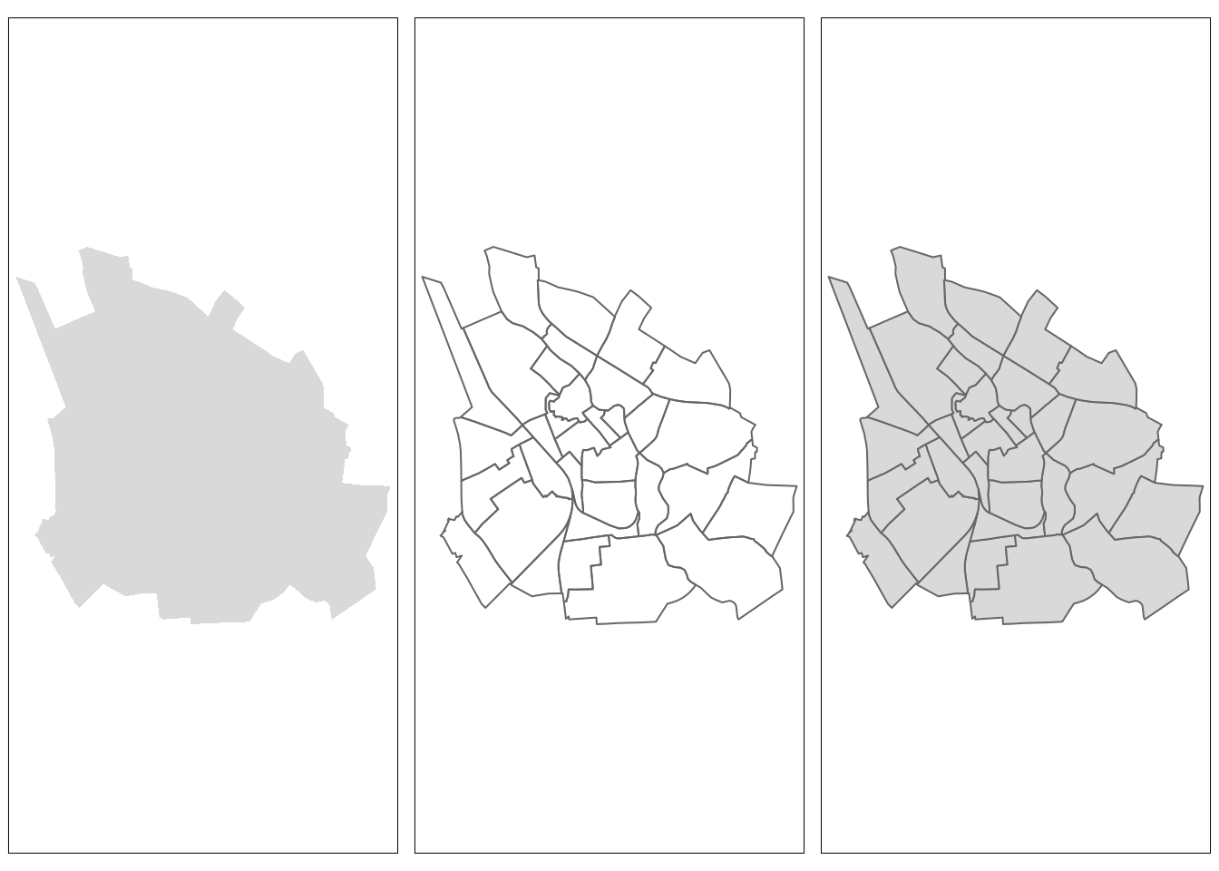
In the above visualizations, we relied on tmap’s default aesthetic settings (such as color, alpha, size, shape, line width, and labels). However, to create visually appealing maps, we need to customize the aesthetics. Among the most useful parameters available for this customization in tmap are fill color (col), transparency (alpha), line width (lwd), and line style/type (lty).
tmap_mode("plot") tmap mode set to plotting# Sets the fill color to "thistle," which is a light purple color and the alpha transparency to 1, making the fill completely opaque
tm1 <- tm_shape(tartu_districts) +
tm_fill(col = "thistle", alpha = 1)
# set color for the border: border.col = "thistle4". It is good to choose outline with the same hue but just darker
tm2 <- tm_shape(tartu_districts) +
tm_polygons(col = "thistle", alpha = 0.5, border.col = "thistle4") # lower alpha, higher transparency
# Change the line width. Defaul: lwd=1
tm3 <- tm_shape(tartu_districts) +
tm_polygons(col = "thistle", alpha = 0.5, border.col = "thistle4", lwd = 2)
# Change the line style. Defaul: lty=1
tm4 <- tm_shape(tartu_districts) +
tm_polygons(col = "thistle", alpha = 0.5, border.col = "thistle4", lty = 2) # 1-solid, 2-dashed, 3-dotted, and "blank"-No line
# For further insights into choosing colors, please refer to this link: https://rstudio-pubs-static.s3.amazonaws.com/3486_79191ad32cf74955b4502b8530aad627.html
# Display the maps next to each other using the map_arrange() function. Enables to create so called "small multiples"
tmap_arrange(tm1, tm2, tm3, tm4, ncol = 2)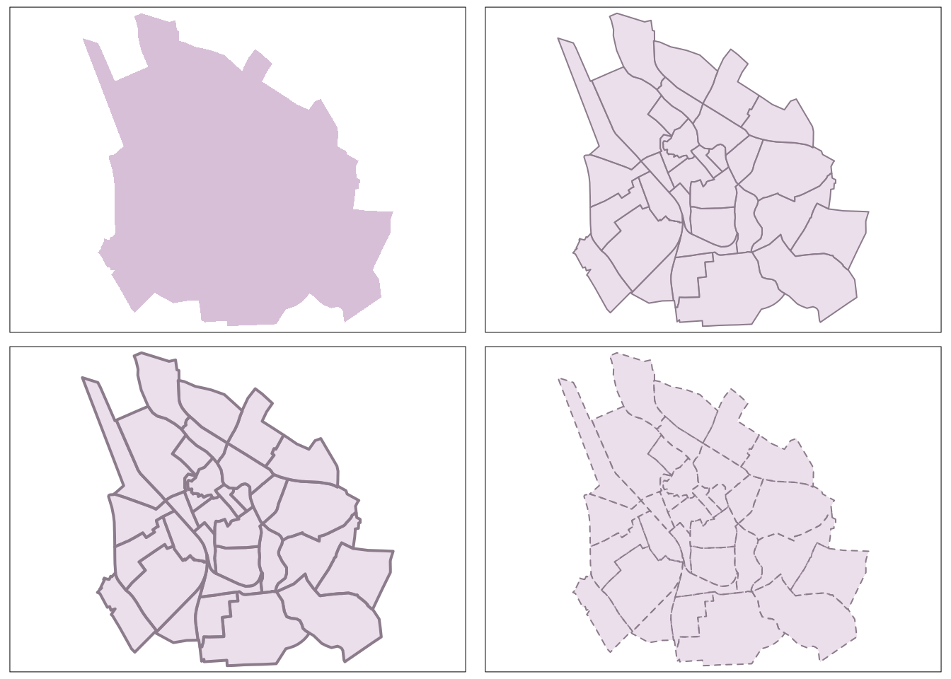
We can also add text labels to the map.
# Add text labels to "tm4" object
tm5 <- tm4 +
       tm_text("NIMI", #name of the variable in the shape object that contains the text labels
        size = 0.5,    # relative size of the text labels
        col = "black", # color of the text labels. Either a color value or a data variable name.
        fontface = 2,  #font face of the text labels (1 - plain, 2 - bold, 3 - italic)
        remove.overlap = TRUE) #logical that determines whether the overlapping labels are removed

# size can be either one number, a name of a numeric variable in the shape data that is used to scale the sizes proportionally, or the value "AREA", where the text size is proportional to the area size of the polygons.
#for more info see tmap tm_text documentation: https://www.rdocumentation.org/packages/tmap/versions/3.3-4/topics/tm_text

#Display map with labels
tm5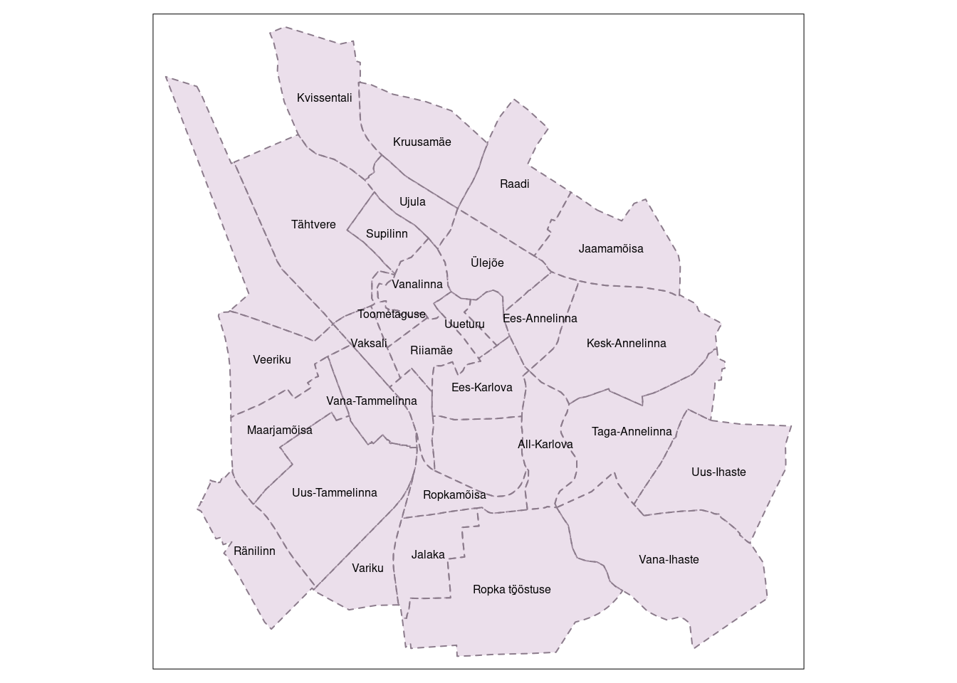
To incorporate additional layers in tmap, the process involves using the addition (+) operator, followed by the tm_*() functions. The wildcard (*) accommodates various layer types, each with self-explanatory names, including tm_borders(), tm_polygons(), tm_lines(), tm_symbols(), tm_raster() (also, tm_rgb() is available for rasters with three layers), and tm_text().
4.2. Choropleth maps
A choropleth map is a thematic map that uses color mapping to represent statistical data in distinct geographical areas. Enumeration units, such as regions or countries, are shaded or colored based on the values of a specific variable, providing a quick visual insight into the spatial distribution of data.
In this tutorial, we will work with population data introduced in lesson 1. Let’s import the data into the current R session from R_01 folder by running the following code.
# Import population data from lesson 1 folder
est_pop <- st_read("../R_01/population.gpkg")
Reading layer `population' from data source
`/home/geoadmin/dev/simply-general/teaching/geospatial_python_and_r/R_01/population.gpkg'
using driver `GPKG'
Simple feature collection with 9426 features and 3 fields
Geometry type: MULTIPOLYGON
Dimension: XY
Bounding box: xmin: 369032.1 ymin: 6377141 xmax: 739152.8 ymax: 6634019
Projected CRS: Estonian Coordinate System of 1997glimpse(est_pop)Rows: 9,426
Columns: 4
$ Code <chr> "9599", "1885", "3050", "2654", "9010", "1846", "1081", "4…
$ Settlements <chr> "Võuküla", "Holvandi küla", "Kiisa küla", "Kanassaare küla…
$ Population <dbl> 60, 46, 74, 54, 65, 501, 100, 146, 239, 51, 65, 55, 55, 51…
$ geom <MULTIPOLYGON [m]> MULTIPOLYGON (((693596.1 64..., MULTIPOLYGON …Utilizing the imported population data, we will compute the population density, which we intend to use for creating a choropleth map. The code below calculates the area in square meters for est_pop, converts it to square kilometers, and computes population density.
# Calculate area in square meters and add a column for area in square meters to est_pop object
est_pop$area <- st_area(est_pop)

# Convert square meters to square kilometers (km^2):
est_pd <- est_pop %>%
  mutate(area = as.numeric(area) / 1000000) %>%  # Convert to square kilometers
  mutate(density = Population / area)  # Calculate population density

# Display a summary of est_pd:
summary(est_pd)
Code Settlements Population geom
Length:9426 Length:9426 Min. : 2.0 MULTIPOLYGON :9426
Class :character Class :character 1st Qu.: 16.0 epsg:3301 : 0
Mode :character Mode :character Median : 36.0 +proj=lcc ...: 0
Mean : 281.4
3rd Qu.: 80.0
Max. :116153.0
area density
Min. : 0.05603 Min. : 0.026
1st Qu.: 3.36383 1st Qu.: 2.577
Median : 6.33473 Median : 5.496
Mean : 9.22244 Mean : 38.873
3rd Qu.: 11.30853 3rd Qu.: 12.044
Max. :173.12031 Max. :8145.520 By employing the population density variable, we can create a choropleth map using the tmap package. It’s important to note that, in tmap, variable names should be provided as character values, and the use of the $ operator, commonly seen in ggplot2, is not applicable.
Try this code:
tm_shape(est_pd) +
  tm_polygons(col = est_pd$density)
Error: Fill argument neither colors nor valid variable name(s)The above code should return an error. To generate the desired map, consider using the following code instead:
# set the plotting mode to "plot"
tmap_mode("plot")
tmap mode set to plottingtm_shape(est_pd) +
tm_polygons(col = "density",
title = "People per sq.km",
palette = "YlOrRd",
legend.hist = TRUE, #adds histogram to the map
border.alpha = 0.2) + #makes the polygon outlines partially transparent, so we can see the polygon fill better
tm_layout(legend.outside = TRUE,
legend.hist.width = 2,
legend.hist.height = 0.5,
legend.hist.size = 0.5) 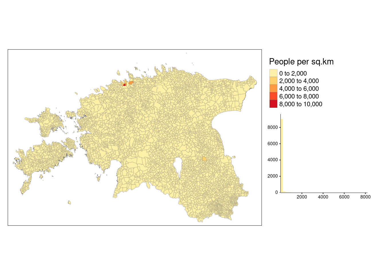
The default classification scheme used by tm_polygons() is pretty, which identifies almost equal intervals based on the data range and rounds the class values. In the above example, data classes change every 2000. However, this approach is not practical if the data is not normally distributed as it results in a lot of polygons in the first class and only few polygons in the other classes.
The histogram above reveals that the majority of areas exhibit a population density below 2000 people per sq.km. Nevertheless, the map does not effectively display variation within the other classes due to the concentration of data in the first class. In such cases, selecting appropriate style argument in tm_polygons() allows the user to use better classification.
The tmap package uses different classification scheme to categorize data values into different groups or classes. The classification scheme determines how the range of values in the data is divided into different classes. The commonly used classification scheme include:
style = pretty: the default setting, rounds breaks into whole numbers where possible and spaces them evenly.style = equal: divides input values into bins of equal range and is appropriate for variables with a uniform distribution (not recommended for variables with a skewed distribution as the resulting map may end-up having little color diversity).style = quantile: ensures the same number of observations fall into each category (with the potential downside that bin ranges can vary widely).style = jenks: identifies groups of similar values in the data and maximizes the differences between categories.style = log10_pretty: a common logarithmic (the logarithm to base 10) version of the regular pretty style used for variables with a right-skewed distribution.
Let’s switch the default pretty classification scheme we used above to quantile:
# set the plotting mode to "plot"
tmap_mode("plot")
tmap mode set to plotting# use quantile
pd_map1 <- tm_shape(est_pd) +
tm_polygons(col = "density",
style = "quantile",
palette = "OrRd",
title = "People per sq.km\nQuantiles(5)", # \n will take the second part of the legend title to the new row - kind of acts like Enter
border.alpha = 0.2,
textNA= "No data")
# We can also change the number of classes into 4 and change the color palette
pd_map2 <- tm_shape(est_pd) +
tm_polygons(col = "density",
style = "quantile",
n = 4,
palette = "Blues",
title = "People per sq.km\nQuantiles (4)",
border.alpha = 0.2)
# Display the maps
tmap_arrange(pd_map1, pd_map2, ncol = 2)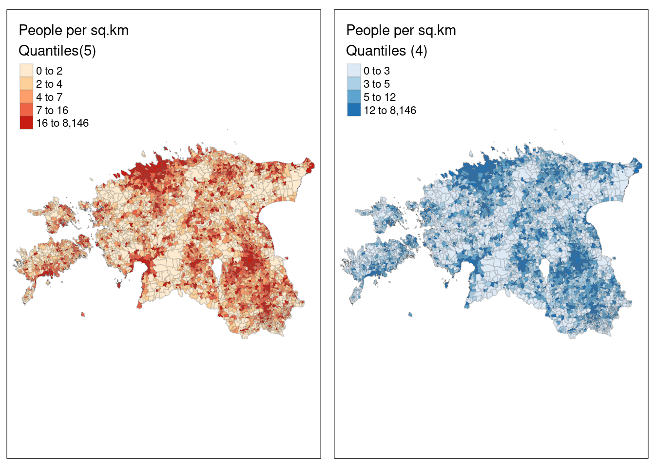
To use other intervals, we can also pass manual bins to the breaks argument or use n together with quantile classification to specify the number of bins.
# Specify the breaks
tm_shape(est_pd) +
  tm_polygons(col = "density",
              breaks = c(0, 10, 20, 30, 8146),
              palette = "YlOrBr",
              title = "People per sq.km\nUser defined (4)",
              border.alpha = 0.2)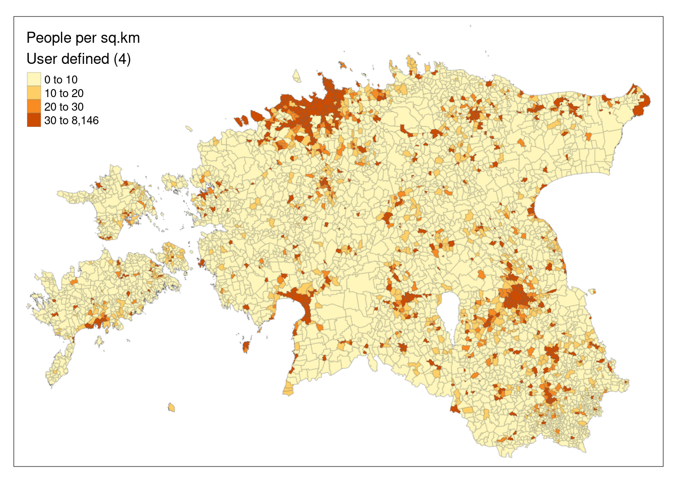
4.3. Add map elements
A map is more than a collection of symbols and labels. To make a map effective and informative, we need to add basic map elements that give users context to interpret what’s on the map. These may include among others the legend or Key, scale bar, grid or graticule, north arrow, map title, margins, credits and source.
The tmap offers two ways to to render graticules, or a latitude/longitude grid – tm_grid() and tm_graticules() (refer this for more)
The code below modifies the previously created map (pd_map1) by adding basic map elements:
# set the plotting mode to "plot"
tmap_mode("plot")
tmap mode set to plotting# Create a thematic map
fmap <- pd_map1 +
# add coordinates
tm_graticules(col = "grey20", #backgound color - should be very mild
projection = 4326, #change the CRS to WGS84 to show geographic coordinates
lines = F) +
tm_compass(type = "arrow", position = c("right", "top")) + # add compass
tm_scale_bar(breaks= c(0,25,50), position = c("center", "bottom")) + #add scalebar and determine its breaks
# add a background color, adjust margins, etc
tm_layout(title = "Population density in Estonia",
bg.color = "gray100",
frame.lwd = 1,
legend.outside = FALSE, # by default it is FALSE (legend is inside the map frame) - you may change it to TRUE and see what happens
inner.margins = 0.1) +
# add credits or source
tm_credits("Map design: D. Moges\nData sourse: Estonian Statistics",
size = 0.8,
position = c(0.01, 0.02))
# display the map
fmap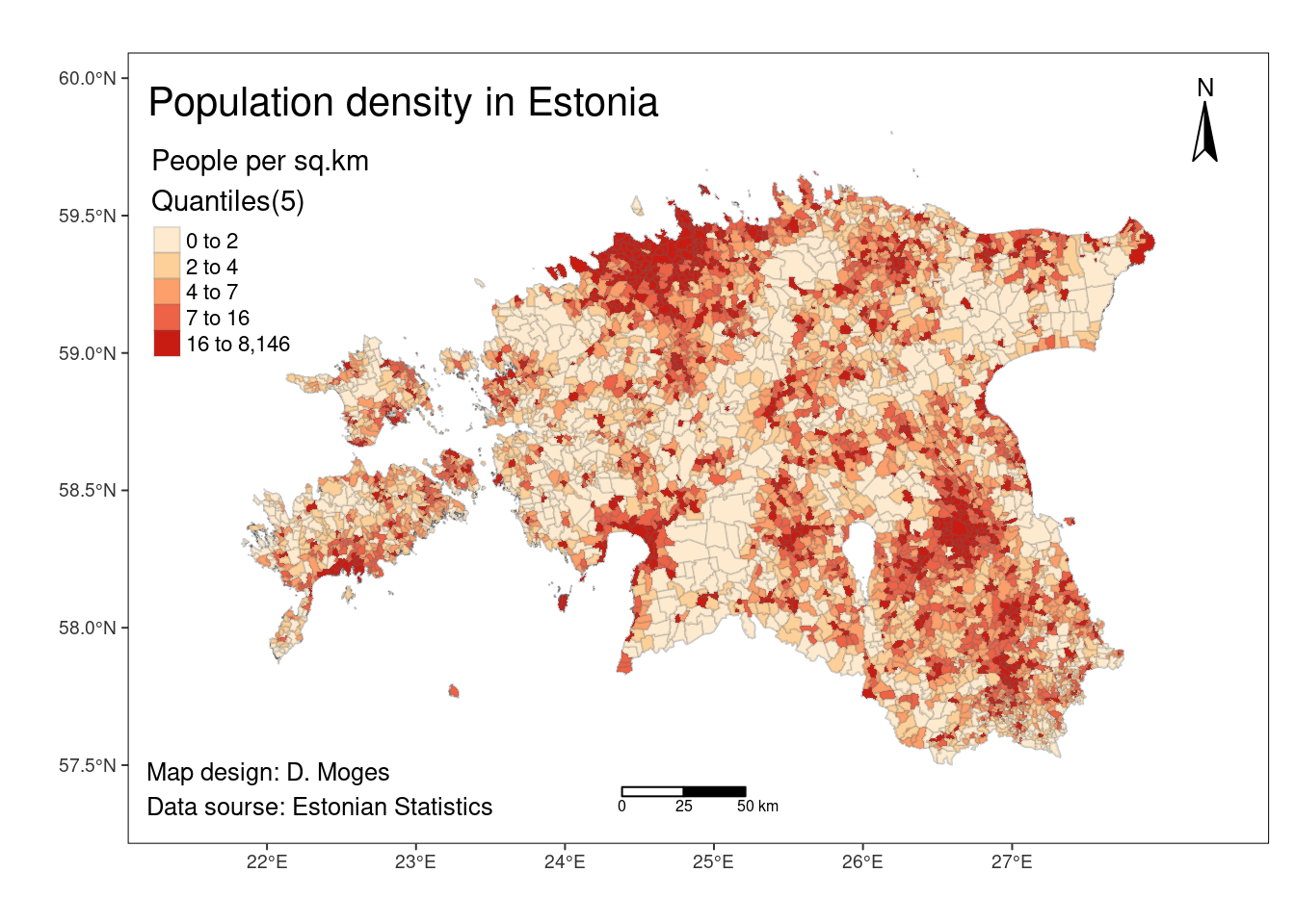
Although, tmap allows quite a lot of precise control over layouts and color schemes, it is still quite hard to make nicely balanced map. The scale bar, north arrow should be very modest and rather small but that is not always easy to achieve in R.
tmap also provides pre-set styling options through the tm_style() function. The styles exemplified by tm_style("cobalt") can completely transform the map’s appearance, while others bring about subtler adjustments, as illustrated below:
# set the plotting mode to "plot"
tmap_mode("plot")
tmap mode set to plotting# Define common map settings
map_pop <- tm_shape(est_pd) +
tm_polygons(col = "density",
n = 5,
style = "quantile",
title = "People per sq.km",
border.alpha = 0.2,
textNA = "No data")
# Create maps with different styles
map1 <- map_pop +
tm_style("bw") +
tm_layout(title = "bw",
legend.outside = TRUE) # black and white
map2 <- map_pop +
tm_style("classic") +
tm_layout(title = "classic",
legend.outside = TRUE) # classic or historical style
map3 <- map_pop +
tm_style("col_blind") +
tm_layout(title = "col_blind",
legend.outside = TRUE) # suitable for color blind
map4 <- map_pop +
tm_style("cobalt") +
tm_layout(title = "cobalt",
legend.outside = TRUE,
legend.bg.color = "#002240") # dark mode, you need to define legend background color (legend.bg.color), otherwise you would not see the legend text as it is white
# Display maps
tmap_arrange(map1, map2, map3, map4)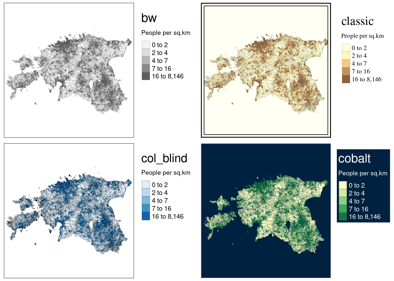
4.4. Graduated symbol maps
Graduated symbol (aka proportional symbol or dot density maps) maps are used to visualize count data. Graduated symbol maps use shapes referenced to geographic units that are sized relative to a data attribute. Graduated symbol maps in R can be created using tm_bubbles() function from tmap package. The size of the symbol is proportional to the data value it represents, making it easy to visualize variations and patterns in the data across the map.
Let’s create a map showing the distribution of bike stations across Tartu districts based on the number of bikes (represented by the Rataste_arv column) using point size to show bike counts for each location.
Let’s import the bike stations data into the current R session from R_02 folder:
stations <- st_read("../R_02/bike_stations.gpkg")Reading layer `tartu_bike_share_stations' from data source
`/home/geoadmin/dev/simply-general/teaching/geospatial_python_and_r/R_02/bike_stations.gpkg'
using driver `GPKG'
Simple feature collection with 101 features and 8 fields
Geometry type: POINT
Dimension: XY
Bounding box: xmin: 649813.2 ymin: 6467043 xmax: 668519.4 ymax: 6478854
Projected CRS: Estonian Coordinate System of 1997glimpse(stations)Rows: 101
Columns: 9
$ OBJECTID <dbl> 6468, 6470, 6473, 6810, 6811, 6812, 6813, 6815, 6816, 6817…
$ Rataste_arv <int> 20, 20, 20, 16, 18, 15, 12, 8, 16, 12, 9, 15, 8, 12, 9, 20…
$ Asukoht <chr> "79 E-kaubamaja", "76 Tartu Maja", "72 Paju", "10 Turusild…
$ Markus <chr> NA, NA, NA, NA, NA, NA, NA, NA, NA, NA, NA, NA, NA, NA, NA…
$ Omanik <int> 3, 3, 3, 3, 3, 3, 3, 3, 3, 3, 3, 3, 3, 3, 3, 3, 3, 3, 3, 3…
$ Staatus <int> 1, 1, 1, 1, 1, 1, 1, 1, 1, 1, 1, 1, 1, 1, 1, 1, 1, 1, 1, 1…
$ P_aasta <int> 2020, 2020, 2020, 2019, 2019, 2019, 2019, 2019, 2019, 2019…
$ Linnaosa <int> 4, 16, 17, 1, 1, 1, 1, 1, 1, 1, 3, 17, 7, 7, 7, 5, 5, 13, …
$ geom <POINT [m]> POINT (659812.7 6472137), POINT (657050.9 6474397), …Let’s plot it
# set the plotting mode to "plot"
tmap_mode("plot")
tmap mode set to plottingbike_stations <- tm_shape(tartu_districts)+
tm_borders() +
tm_layout(inner.margin = 0.1)+
tm_shape(stations) +
tm_bubbles(size = "Rataste_arv", # alternatively, you can use 'tm_symbols()'
alpha = 0.5,
col = "red",
border.col="red4",
border.lwd=1,
shape = 21, #determines the shape of the symbol. Number 21 is circle but for example number 22 is triangle. You can try different numbers. Different numbers also denote empty of filled shapes.
title.size = "Bike count") +
tm_layout(main.title = "Bike stations in Tartu",
main.title.size = 1,
main.title.position = "center",
legend.position = c("right", "top")) +
tm_scale_bar(breaks= c(0,1,2), position = c(0.02, 0.02)) +
tm_compass(position = c("right", "top")) +
tm_credits("Data source: Tartu City Government",
position = c("right", "bottom"))+
tm_graticules(lines = FALSE)
bike_stations
4.5. Inset maps
Sometimes not all information can be displayed effectively with a single map. That’s when inset maps can be handy. An inset map is a smaller map rendered within or next to the main map, offering additional context, detail, or a focused view of a specific area. In cartography and data visualization, inset maps are commonly used to provide supplementary information or zoom in on specific regions, enhancing the overall understanding of the geographic data presented in the main map.
In this tutorial, we’ll present the earlier generated Tartu districts map (tm5) as the main map, incorporating a full-scale map of Estonia with a red polygon indicating the extent of Tartu district as an inset map.
To combine the two maps (main and inset), we use the print() and viewport() functions. The first two arguments of the viewport() function specify the center location (x and y) of the inset map. And width and height specify the size of the inset map.
Download the Estonian border data from this link and save it within R_04 folder. Then read the data using the following code:
# Add Estonian countour
est_border <- st_read("estonian_border.gpkg")
Reading layer `eestimaa' from data source
`/home/geoadmin/dev/simply-general/teaching/geospatial_python_and_r/R_04/estonian_border.gpkg'
using driver `GPKG'
Simple feature collection with 1 feature and 2 fields
Geometry type: MULTIPOLYGON
Dimension: XY
Bounding box: xmin: 21.77134 ymin: 57.50842 xmax: 28.21073 ymax: 59.68583
Geodetic CRS: WGS 84# Created a bounding box of Tartu
bbox <- st_bbox(tartu_districts)%>%
st_as_sfc() # convert to an sfc object
# Inset map
inset <- tm_shape(est_border) +
tm_polygons() +
# add the bounding box
tm_shape(bbox) +
tm_polygons(alpha = 0, border.col = "red", lwd = 2)
# Combine both maps
tm5
print(inset, vp = grid::viewport(0.8, 0.8, width = 0.25, height = 0.35)) 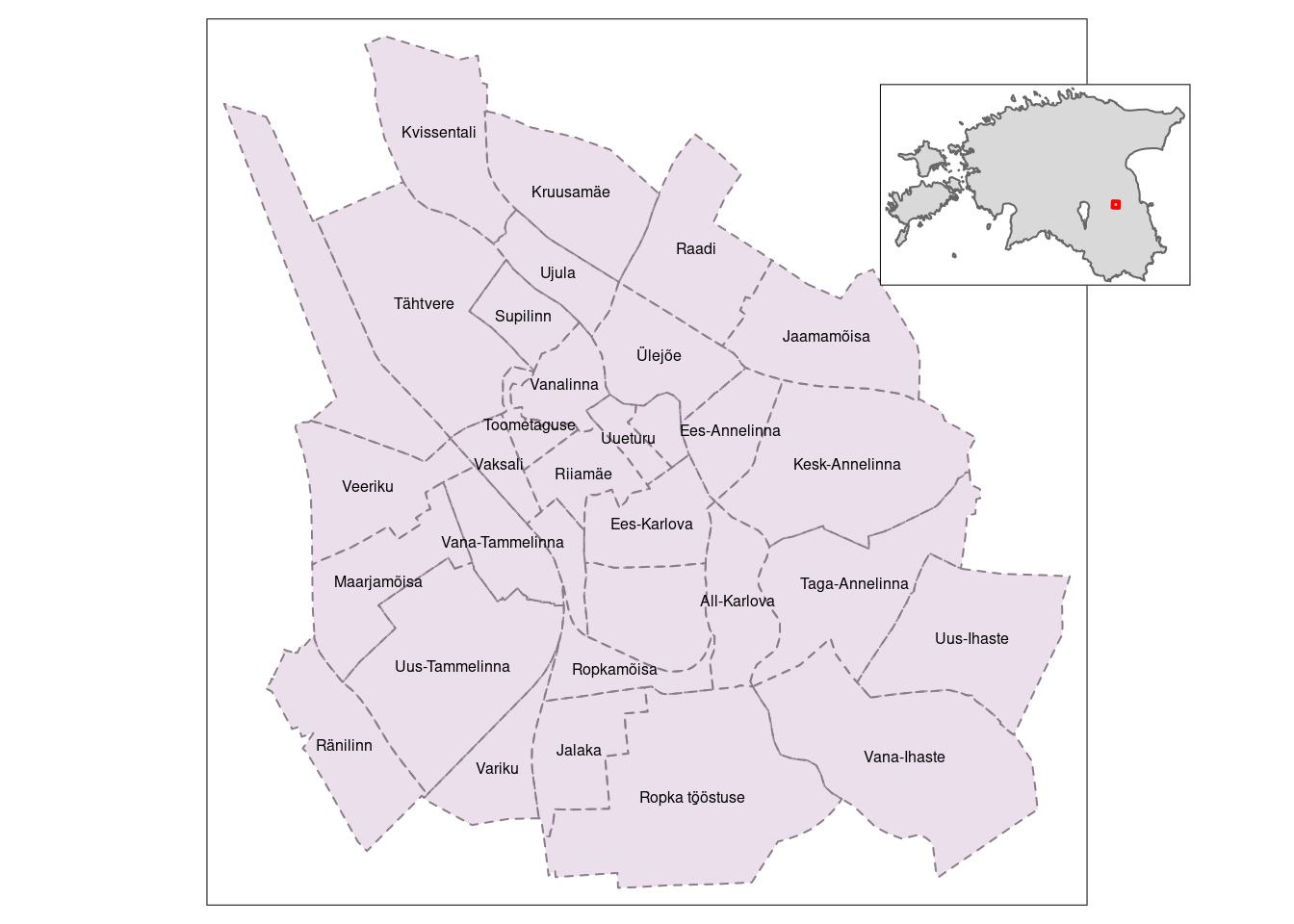
4.6. Faceted maps
Faceted (aka multiple) maps enable to visualize how spatial relationships change with respect to another variable using tm_facets(). It creates multiple maps, each showing a subset of your data, and arranging them in a grid or matrix-like layout. This is often used to visualize geographic data for different categories, time periods, or other factors, making it easier to compare and analyze the spatial distribution of data across multiple dimensions. If you would like to learn more about faceted maps using tmap, here is a link to the documentation.
The important arguments in map facets include:
by: determine the variable according to which facets should be defined.nrow / ncol: determine the number of rows or columns for the facets.free.cords: determine whether each map should have its own coordinate ranges. The default is TRUE.
For example, the population change in the countries can be presented in a faceted map with each panel representing the population at a particular moment in time. All individual facets in a faceted map contain the same geometry data repeated multiple times, once for each column in the attribute data (this is the default plotting method for sf objects). However, facets can also represent shifting geometries such as the evolution of a point pattern over time.
Let’s visualize the global population changes over time by employing facet maps, utilizing the urban_agglomerations data available in the spData package.
# load data from spData package
data("urban_agglomerations") # Major urban areas worldwide
data("world")  # World country polygons

# Check all datasets in spData package
   #data(package = "spData")

# crs of `world`
crs_world <- st_crs(world)

# transform the world map to a World Robinson projection system
world_robin <- st_transform(world,"+proj=robin +lon_0=0 +x_0=0 +y_0=0 +ellps=WGS84 +datum=WGS84 +units=m +no_defs")

# Filter some years
urb_1970_2030 <- urban_agglomerations %>%
  filter(year %in% c(1970, 1990, 2010, 2030))

# create multiple maps
final_map <- tm_shape(world_robin) +
  tm_polygons() +
  tm_shape(urb_1970_2030) +
  tm_symbols(size = "population_millions",
             col = "red",
             title.size = "Population (millions)",
             border.col = "white") +
  tm_facets(by = "year",
            nrow = 2,
            free.coords = F) # see what happens if you change "free.coords" to TRUE

# display the map
final_map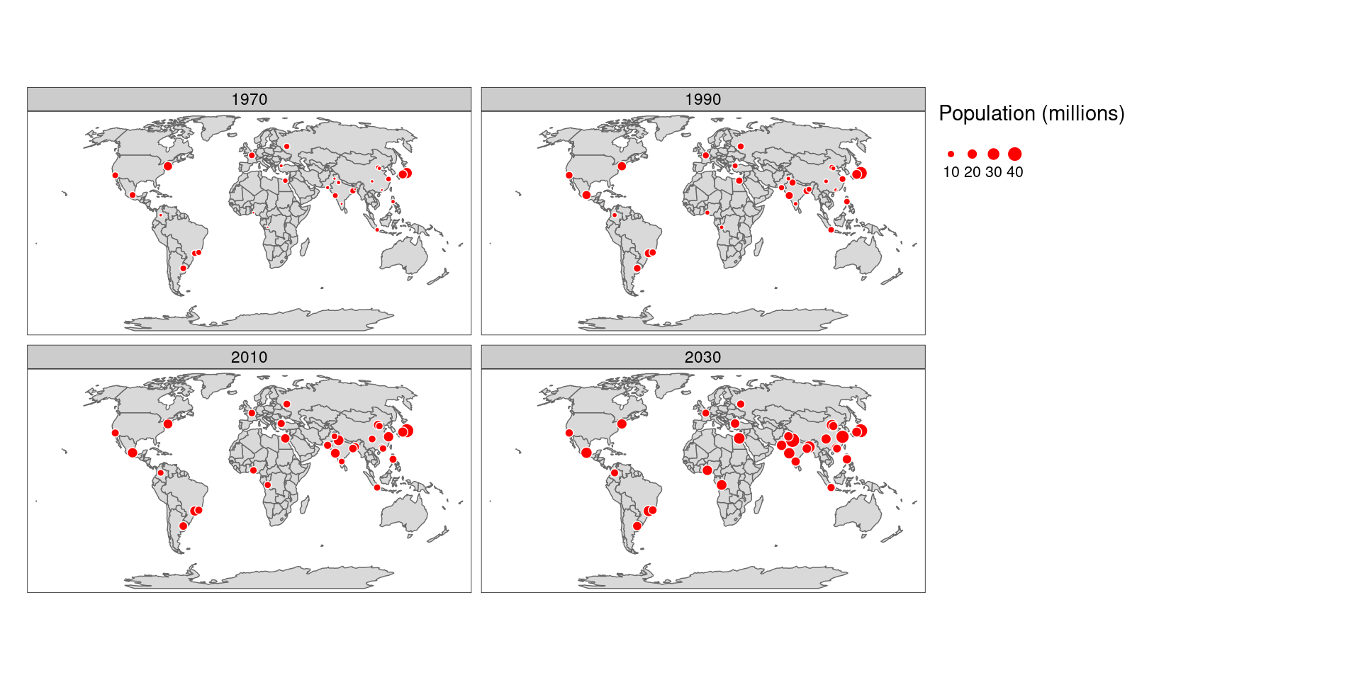
4.7. Save maps
After finalizing the visualization of our data and ensuring satisfaction with it, the subsequent step involves exporting the visualization. The tmap_save() function allows to save our map in three groups of file formats - raster graphics, vector graphics, and interactive. Additionally, we can use tmap_animation() function to save map animations (lesson 10).
The tmap_save() function usually accepts two arguments - map object and filename, the path to the created file. One of the major parameters of the function is DPI (Dots Per Inch) - a number of pixels per inch of the output image.
By default, tmap uses graphic devices incorporated in R. However, it is also possible to use other, external devices with the device argument. For example, the code below uses the ragg::agg_png device which is usually faster and has better support for non-standard fonts than the regular grDevices::png.
tmap_save(final_map, "my_map.png", device = ragg::agg_png)By default, the image width and height is automatically adjusted based on the map aspect ratio. The units of width or height depend on the value you set. They are pixels (“px”) when the value is greater than 50, and inches (“in”) otherwise. Units can also be changed with the units argument.
Let’s go ahead and save fmap we previously created:
tmap_save(fmap, "pop_density.png", dpi=300)