library(XML)      # For handling XML data
library(tidyverse)# For data manipulation and visualization
library(sf)       # For working with spatial data using Simple Features
library(gstat)    # For geostatistical analysis
library(tmap)     # For thematic mapping and cartography
library(sp)       # For classes and methods for spatial data
library(terra) # For working with raster dataLesson 6: Spatial interpolation
In this tutorial, we will explore several techniques spatial interpolation, including nearest neighbor, inverse distance weighting (IDW), and kriging. We will utilize weather data obtained from the Estonian weather service website and border data from Estonia introduced in the fourth lesson. The codes and materials utilized in this lesson have been adapted from the original materials created by Anto Aasa.
Learning outcomes
At the end of this lesson, the students should be able to:
- Understand the fundamental principles of different interpolation techniques.
- Utilize different interpolation methods to interpolate spatial data points.
- Interpret and explain the interpolation results.
Let’s load all the packages needed for this lesson:
A lot of environmental datasets such as air temperature, precipitation, and air pressure are captured in point samples. While it’s often useful to just use those point observations and evaluate spatial patterns of those measurements, we also may want to predict a surface of those variables over the map, and that’s where interpolation comes in.
Spatial interpolation is the activity of estimating values of spatially continuous variables (fields) for spatial locations where they have not been observed, based on observations. The statistical methodology for spatial interpolation, called geostatistics, is concerned with the modelling, prediction, and simulation of spatially continuous phenomena. It aims to create a continuous representation of a variable across space.
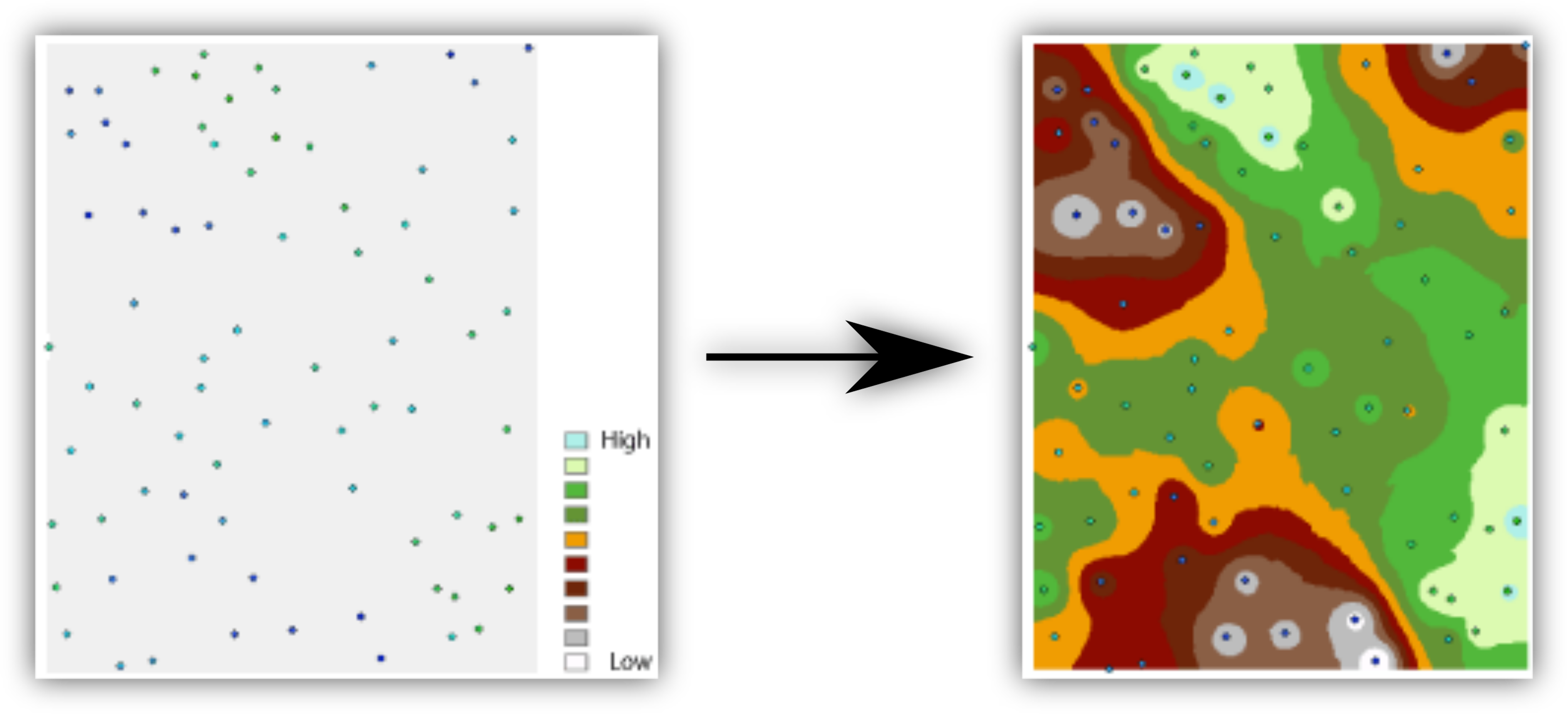
In this lesson, we’ll be using air temperature data of Estonia introduced in the previous lesson to learn how to use Thiessen Polygons, IDW, and kriging interpolations. The latest weather observation data can be directly downloaded from Estonina Weather Service in XML format. XML is one of the commonly used data formats in data science (please visit this site to learn more about why should we use XML.
Let’s import the data needed for the tutorial. Importing XML data in R is straightforward using XML package.
#Import Estonian border data
estonia <- st_read("../R_04/estonian_border.gpkg")
Reading layer `eestimaa' from data source
`/home/geoadmin/dev/simply-general/teaching/geospatial_python_and_r/R_04/estonian_border.gpkg'
using driver `GPKG'
Simple feature collection with 1 feature and 2 fields
Geometry type: MULTIPOLYGON
Dimension: XY
Bounding box: xmin: 21.77134 ymin: 57.50842 xmax: 28.21073 ymax: 59.68583
Geodetic CRS: WGS 84# Create a new object with only the geometry and transform to L-EST97
est_border <- st_transform(st_geometry(estonia), 3301)
# Import weather data
weather_file <- "weather.xml" #define the name of the destination file
weather_url <- "http://www.ilmateenistus.ee/ilma_andmed/xml/observations.php" #pull the data from the website
download.file(url = weather_url, destfile = weather_file)
# Current time for reference
weatherDownTime <- Sys.time()
# Convert XML weather data to a data frame
xmlfile <- xmlParse(weather_file)
weather_df <- xmlToDataFrame(xmlfile)
# Check the structure
glimpse(weather_df)Rows: 155
Columns: 19
$ name <chr> "Kuressaare linn", "Tallinn-Harku", "Pakri", "Kunda"…
$ wmocode <chr> "", "26038", "26029", "26045", "26046", "26058", "26…
$ longitude <chr> "22.48944444411111", "24.602891666624284", "24.04008…
$ latitude <chr> "58.26416666666667", "59.398122222355134", "59.38950…
$ phenomenon <chr> "", "", "", "", "Light shower", "Light shower", "", …
$ visibility <chr> "", "35.0", "25.0", "50.0", "13.0", "6.0", "20.0", "…
$ precipitations <chr> "", "0", "0", "0.1", "0.1", "0.1", "0.4", "0.2", "0.…
$ airpressure <chr> "", "991.3", "991.5", "988.5", "988.6", "987.8", "99…
$ relativehumidity <chr> "78", "86", "84", "90", "95", "94", "92", "96", "95"…
$ airtemperature <chr> "6.5", "5", "5.3", "5", "4.5", "4.8", "4", "5.2", "5…
$ winddirection <chr> "", "265", "253", "268", "273", "252", "280", "", "2…
$ windspeed <chr> "", "7", "12.5", "12.3", "5.2", "7.7", "7.7", "", "5…
$ windspeedmax <chr> "", "12.1", "18.5", "16.1", "13.2", "11", "13", "", …
$ waterlevel <chr> "", "", "", "", "", "", "", "", "65", "", "", "", ""…
$ waterlevel_eh2000 <chr> "", "", "", "65", "", "", "", "", "", "", "", "", ""…
$ watertemperature <chr> "", "", "", "3", "", "", "", "", "", "", "", "", "",…
$ uvindex <chr> "", "0.4", "", "", "", "", "", "", "", "", "", "", "…
$ sunshineduration <chr> "", "12", "", "", "0", "", "", "0", "0", "0", "0", "…
$ globalradiation <chr> "", "32", "", "", "", "24", "", "33", "", "13", "", …Let’s tidy up our data by selecting only the essential variables and removing stations with missing values:
air_temp <- weather_df %>%
  transmute(
    longitude = as.numeric(longitude),
    latitude = as.numeric(latitude),
    airtemperature = as.numeric(airtemperature)) %>%
  filter(!is.na(airtemperature))

# Check the structure
glimpse(air_temp)
Rows: 99
Columns: 3
$ longitude <dbl> 22.48944, 24.60289, 24.04008, 26.54140, 27.39827, 28.10…
$ latitude <dbl> 58.26417, 59.39812, 59.38950, 59.52141, 59.32902, 59.38…
$ airtemperature <dbl> 6.5, 5.0, 5.3, 5.0, 4.5, 4.8, 4.0, 5.2, 5.3, 5.4, 5.7, …Plot the data:
ggplot() +
  geom_point(data = air_temp,
             aes(x = longitude, y = latitude, fill = airtemperature),
             shape = 21, size = 3) +
  scale_fill_gradientn(colours = c("blue", "cyan", "green", "yellow", "orange", "red")) +
  labs(title = "Air temperature in Estonia",
       subtitle = weatherDownTime)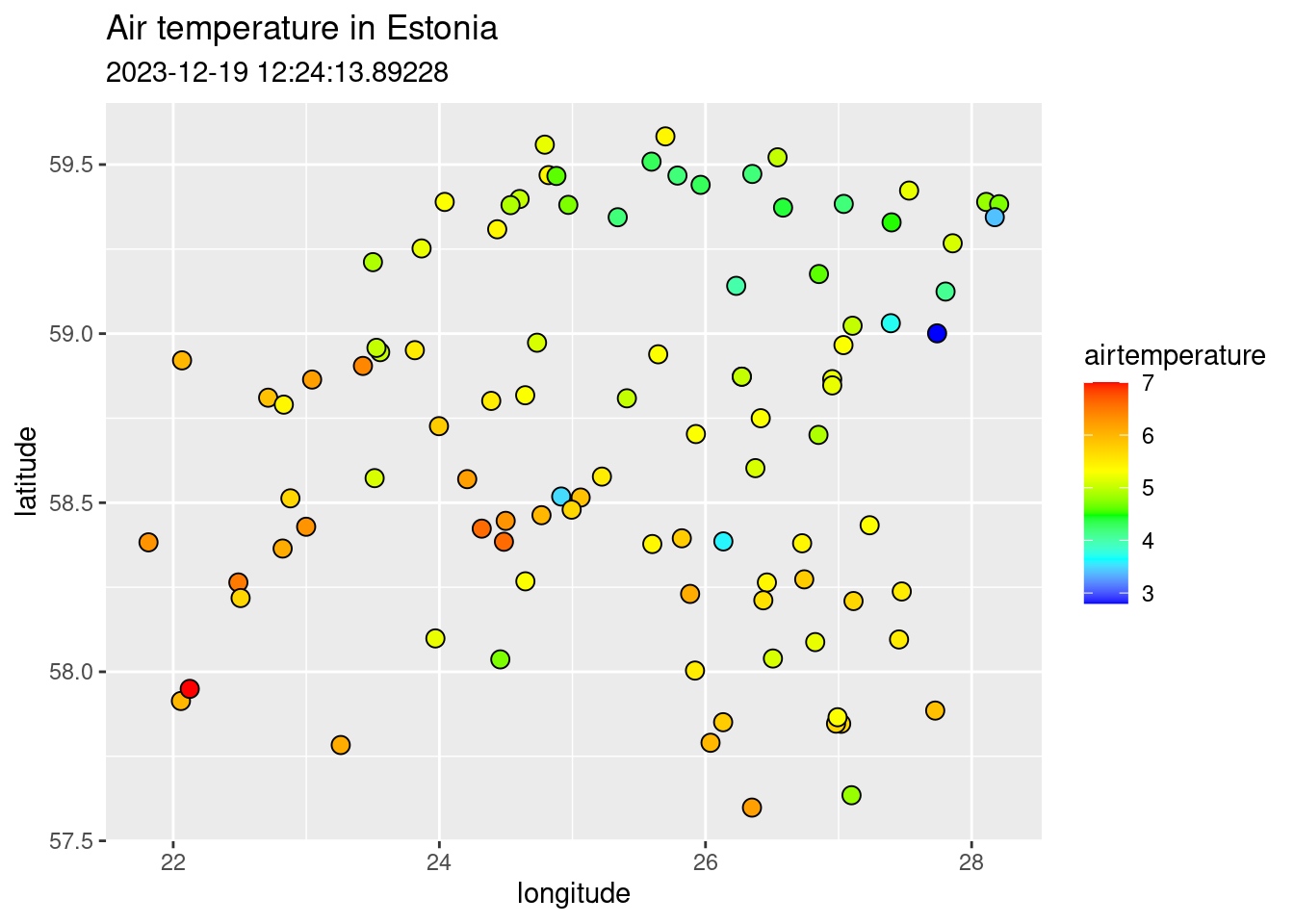
Let’s add the spatial information using Estonian borders:
ggplot()+
  geom_sf(data = est_border, fill="grey", col="grey30", size = 0.25) +
  geom_point(data = air_temp,
             aes(x = longitude, y = latitude, fill = airtemperature),
             shape = 21, size = 5) +
  scale_fill_gradientn(colours = c("navyblue", "blue", "cyan", "green", "yellow", "orange", "red")) +
  labs(title = "Air temperature in Estonia",
       subtitle = weatherDownTime,
       fill = "Temperature (°C)")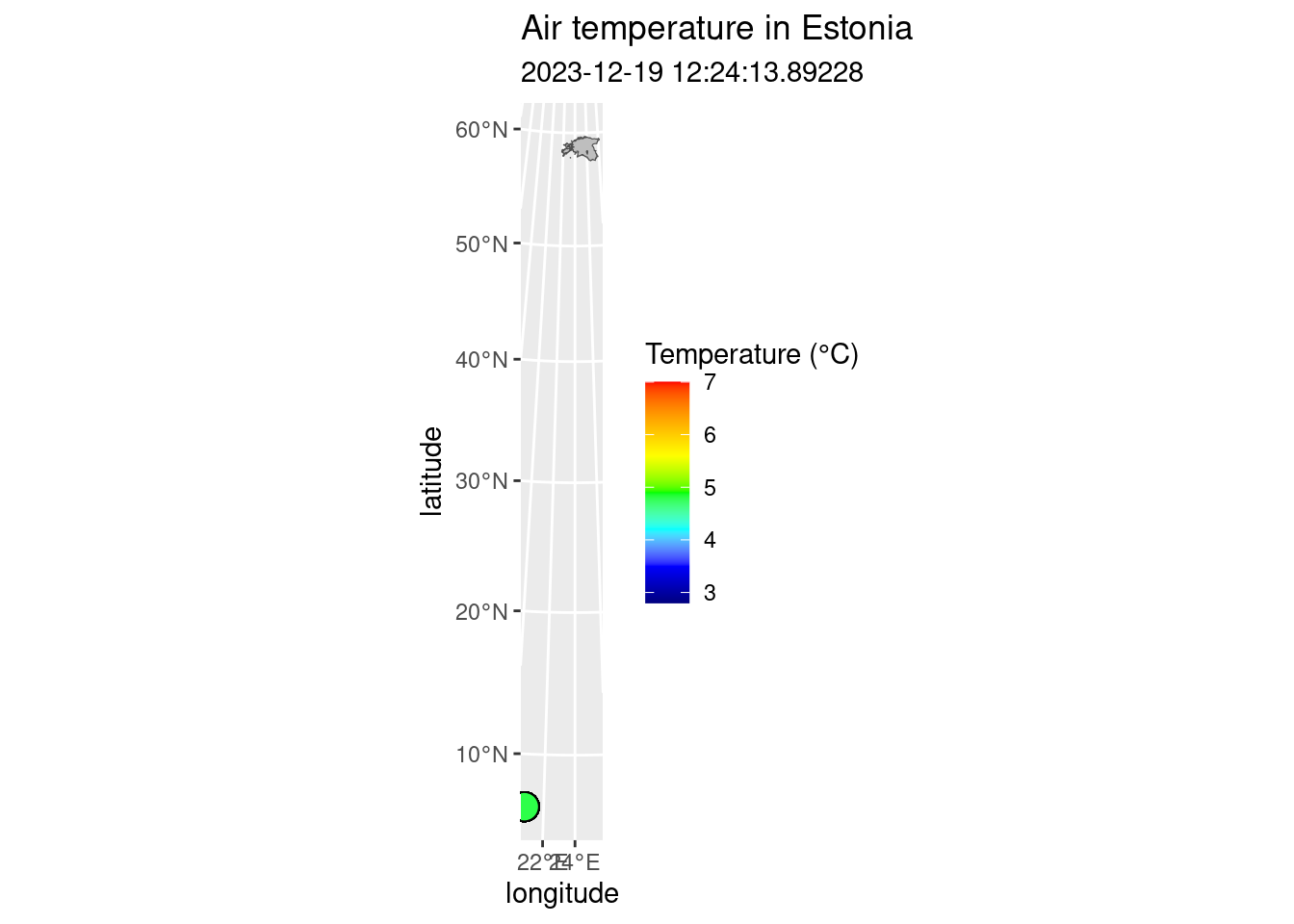
Your data is not plotted in the same place because of two reasons: 1) technically the air temperature data is not spatial as it does not actually have coordinates; 2) the Estonian borders are in Estonian National coordinate system (L-EST97) (EPSG: 3301) but the air temperature has WGS84 (EPSG: 4326). Therefore, to map them together, we need to convert air temperature to spatial data and project from WGS84 to L-EST97.
# Create simple features out of air temperature points:
air_temp_sf <- st_as_sf(air_temp, coords = c("longitude", "latitude"), crs = 4326)

# Project from lat-lon (WGS84) to Estonian National CRS (L-EST97 [epsg:3301])
air_temp_sf_3301 <- st_transform(air_temp_sf, 3301)

# Plot air temperature
map_airtemp <- tm_shape(air_temp_sf_3301) +
        tm_bubbles("airtemperature",
                   size = 0.2,
                   palette = "-RdBu",
                   title.col = "Temperature (°C)",
                   midpoint = NA)

# Make a map of Estonian border. Hint: you can also try to plot only map_est_border
map_est_border <- tm_shape(est_border) +
  tm_borders(lwd = 0.5)

# Combine air temperature and Estonian border into one map
map_est_airtemp <- map_airtemp +
  map_est_border +
  tm_layout(title = "Air temperature in Estonia",
             inner.margins = 0.1)

# Plot the map
map_est_airtemp
6.1 Interpolation using Thiessen Polygons
Thiessen polygon is a geometric method used in spatial interpolation, which is perhaps the most basic type of interpolation. Other terms for this is nearest neighbour or Proximity polygons or Voronoi diagrams interpolation. Thiessen polygons are constructed around each sampled point, delineating regions where all points within a specific polygon are closest in distance to that sampled point compared to other sampled points. The process involves assigning the value of the sampled point to all the space within its respective polygon. The mathematical definition involves the perpendicular bisectors of the lines connecting all points, making this one of the simplest and possibly oldest interpolation techniques.
The outcome is a Voronoi diagram partitioning an area into regions based on distance from points. The individual components of a Voronoi diagram are Voronoi polygons. Fun fact: the first published Voronoi diagram dates back to 1644, in the book Principia Philosophiae by the famous mathematician and philosopher Rene Descartes.
The Thiessen polygons (or Voronoi diagram) can be created using st_voronoi() function of from sf package in R.
Let’s use air_temp_sf_3301 object and create the Voronoi diagram:
# Combine geometries into one
air_temp_geom <- st_union(air_temp_sf_3301)

# Generate the Voronoi diagram
air_voronoi <- st_voronoi(air_temp_geom)

# Convert the Voronoi diagram to an sf object
air_voronoi_sf <- st_sf(air_voronoi)

# Examine the structure of the Voronoi diagram
glimpse(air_voronoi_sf)
Rows: 1
Columns: 1
$ air_voronoi <GEOMETRYCOLLECTION [m]> GEOMETRYCOLLECTION (POLYGON...Plot the Voronoi diagram:
# Plot the Voronoi diagram
ggplot()+
  geom_sf(data = air_voronoi_sf, fill="salmon", colour  = "black", size=0.5)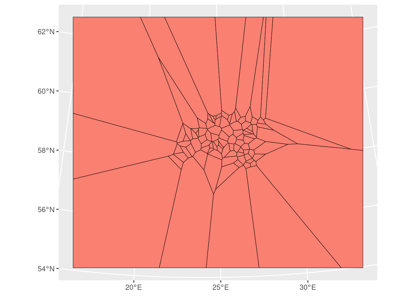
We have now successfully created the tessellated surface (Voronoi diagram) representing Estonian meteorological observation sites. However, it’s an empty geometrical object lacking attributes (air temperature information). We’ll use the st_join() function to join the point attributes to the tesselated surface. However, before that we need to solve the issue that our Voronoi diagram is a geometry collection but for spatial join we need polygons.
# Extract polygons from geometry collection
air_voronoi2 <- sf::st_collection_extract(air_voronoi_sf, type = "POLYGON")

# Examine the structure
glimpse(air_voronoi2)
Rows: 98
Columns: 1
$ air_voronoi <POLYGON [m]> POLYGON ((5384.793 6973090,..., POLYGON ((5384.793…Now we can see that air_voronoi2 has only polygons and we can join Voronoi polygons with the air temperature point data:
# Spatial join
air_voronoi_join <- st_join(air_voronoi2, air_temp_sf_3301)

# Create a tmap
map_voronoi <- tm_shape(air_voronoi_join) +
  tm_polygons(col = "airtemperature",
              n = 10,
              palette = "-RdBu",
              title = "Temperature (°C)") +
  tm_layout(legend.position = c("right", "top"),
            legend.outside = T)

map_voronoi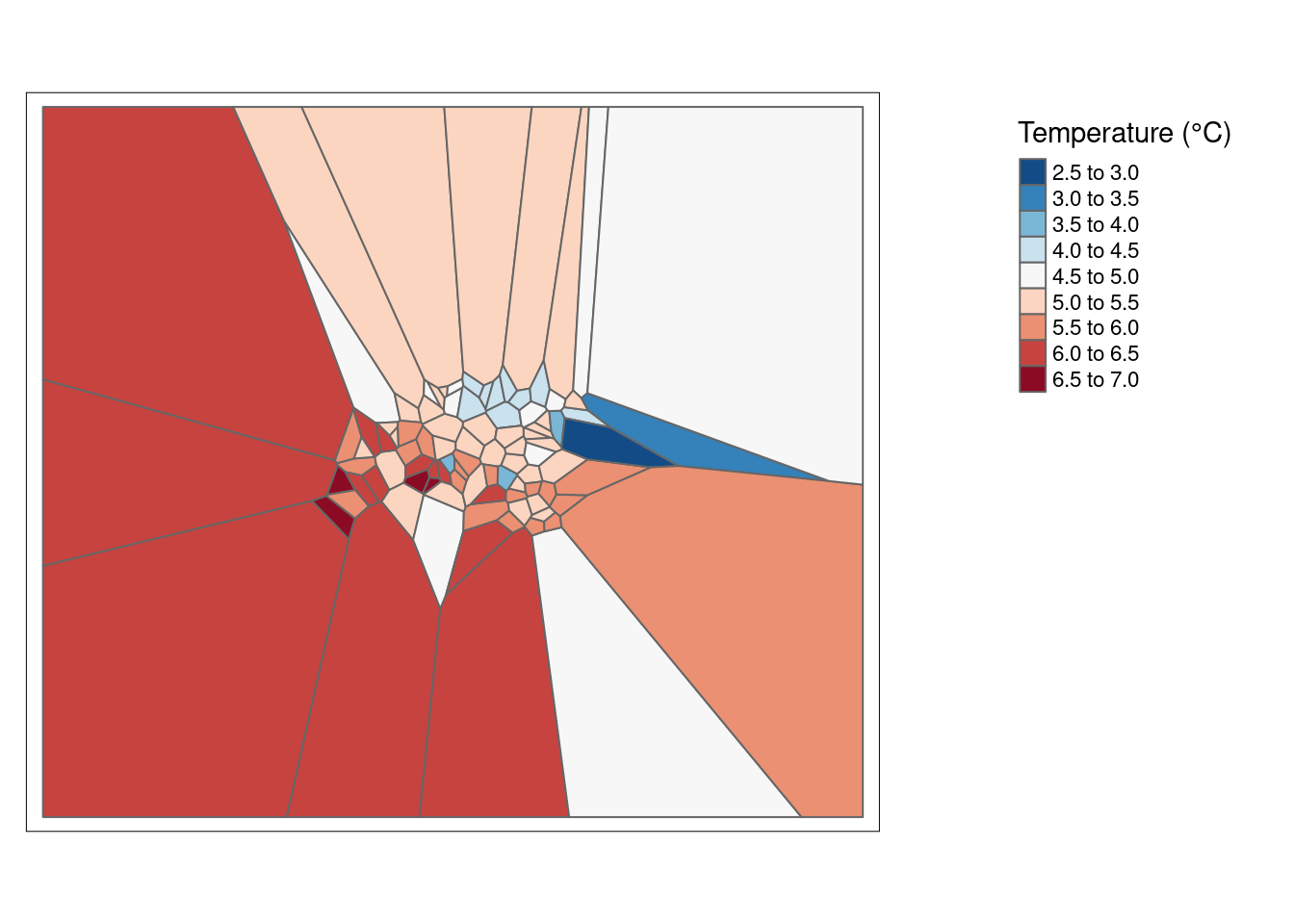
However, we still have a problem that Voronoi polygons extend a lot outside of Estonia. So, let’s crop Voronoi diagram to the extent of Estonian border:
# Convert single polygon to multipolygon in air_voronoi_join
air_voronoi_join <- st_cast(air_voronoi_join, "MULTIPOLYGON")

# Use st_intersection to mask the Voronoi diagram with Estonian border
clip_voronoi <- st_intersection(air_voronoi_join, est_border)

#Plot
map_voronoi2 <- tm_shape(clip_voronoi) +
  tm_polygons(col = "airtemperature",
              n = 10,
              palette = "-RdBu",
              title = "Temperature (°C)",) +
  tm_layout(title = "Air temperature in Estonia",
             inner.margins = 0.15)

map_voronoi2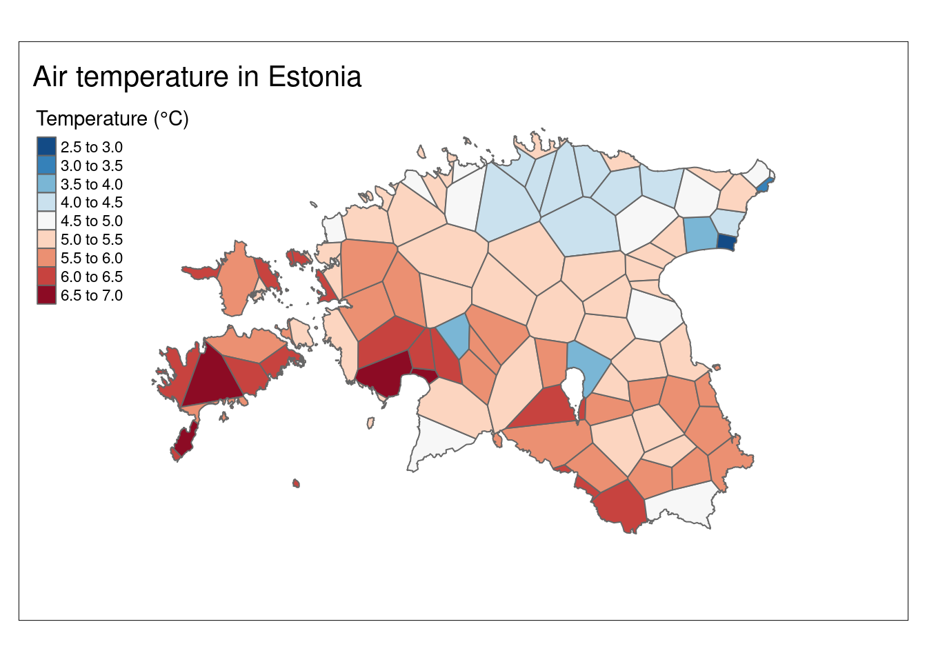
6.2. Inverse distance weighted
Weight are usually inveresely related to distance, i.e., as distance increases the weight (importance) of the point decreases. Inverse distance weighted (IDW) technique computes an average value for unsampled locations using values from nearby weighted locations. The weights are proportional to the proximity of the sampled points to the unsampled location. The technique assigns more weight to nearby data points and less weight to more distant ones, with the weights being inversely proportional to the distance from the target location. In essence, IDW assumes that values at unsampled locations are influenced more by their closer neighbors and less by those farther away, making it a simple but effective method for spatial interpolation in various fields.
The gstat package is used for geostatistical modeling and spatial prediction in R. It provides functions for various spatial interpolation methods, including idw. Given that the idw function is present in multiple packages, we will utilize the gstat::idw function to specifically use the interpolation offered by the gstat package. For details on the gstat package check the user’s manual.
Let’s check the structure of the data we are going to use for our interpolation:
glimpse(air_temp_sf_3301)Rows: 99
Columns: 2
$ airtemperature <dbl> 6.5, 5.0, 5.3, 5.0, 4.5, 4.8, 4.0, 5.2, 5.3, 5.4, 5.7, …
$ geometry <POINT [m]> POINT (411346.6 6459155), POINT (534250.5 6584619…The gstat package works better when applied to spatial data frames. Consequently, it is essential to convert both the air_temp_sf_3301 object into a SpatialPointsDataFrame (spdf) and the est_border object into SpatialPolygons using as_Spatial() function from sf package.
Let’s proceed with the conversion of our air_temp_sf_3301 object from sf to SpatialPointsDataFrame:
#Convert sf to spdf (Spatial Points Data Frame)
air_temp_spdf <- sf::as_Spatial(air_temp_sf_3301)

# Check for duplicated locations based on coordinates
duplicate_indices <- duplicated(coordinates(air_temp_spdf))

# Remove duplicates
air_temp_spdf <- air_temp_spdf[!duplicate_indices, ]
For the Estonian border data (est_border), some additional steps can be taken before converting it to SpatialPolygons. The Estonian border is very highly detailed which is often impractical for quick visualization and extracting borders from rasters which is what we need to do. To address this issue, we can apply a generalization process to simplify the border:
# Simplify the spatial object
est_border_smpl <- st_simplify(est_border, preserveTopology = F, dTolerance = 600)

# Then, convert "est_border_smpl" object to spdf:
est_border_sp <- sf::as_Spatial(est_border_smpl)
Now we need to create an empty grid which we will populate with the interpolation data. For creating the grid, we need the extent (Estonia) and resolution (how many grid cells).
# Create an empty grid where n is the total number of cells and the grid extent is Estonia
grd              <- as.data.frame(spsample(est_border_sp, "regular", n = 4000))
names(grd)       <- c("X", "Y")
coordinates(grd) <- c("X", "Y")
gridded(grd)     <- TRUE  # Create SpatialPixel object
Warning in points2grid(points, tolerance, round): grid has empty column/rows in
dimension 1# Add projection information to the empty grid
proj4string(grd) <- proj4string(air_temp_spdf)
# Plot the grid
plot(grd)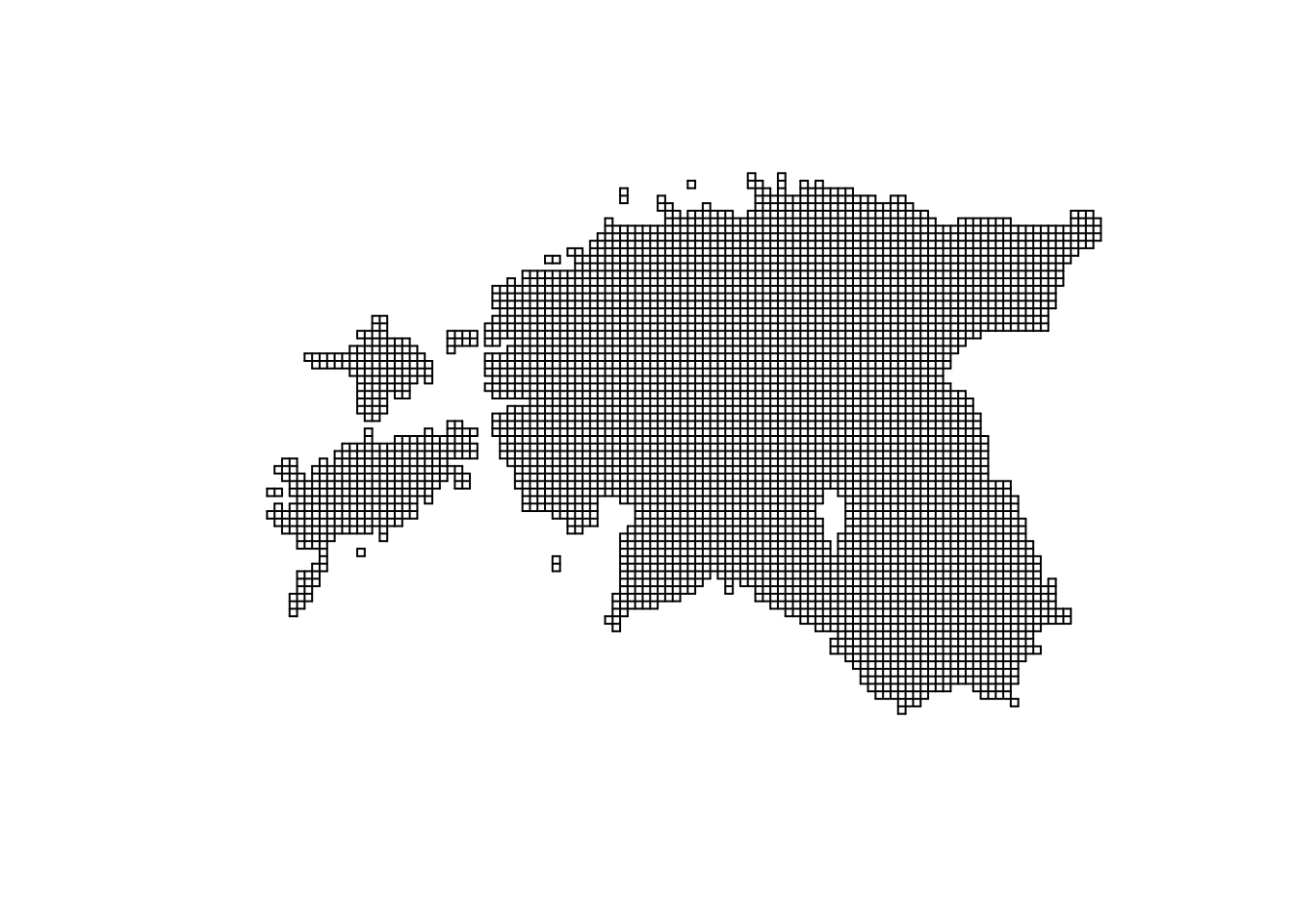
We have empty grid ready for interpolation. Let’s make the interpolation from air temperature points to the grid. In R, formula objects are used to specify relation between objects, the role of different data columns in statistical models. A formula object is created using the ~ operator, which separates names of dependent variables (to the left of the ~ symbol) and independent variables (to the right of the ~ symbol). Writing 1 to the right of the ~ symbol, as in ~ 1, means that there are no independent variables.
# Interpolate the grid cells using inverse distance power value of 2 (idp = 2)
idw <- gstat::idw(formula = airtemperature ~ 1, air_temp_spdf, newdata = grd, idp = 2)
[inverse distance weighted interpolation]##Independent Task: Check what does the power value (idp) do. Try changing it between 1 and 15. What happens and what value is the most optimal?
# Convert to raster object
idw_rast <- rast(idw)The resulting idw_rast object contains two attributes: var1.pred, representing the predicted values, and var1.var, indicating the associated variance. Let’s select only the var1.pred layer from the SpatRaster object for subsequent visualizations:
# Selecting 'var1.pred' layer
idw_rast <- idw_rast$var1.pred
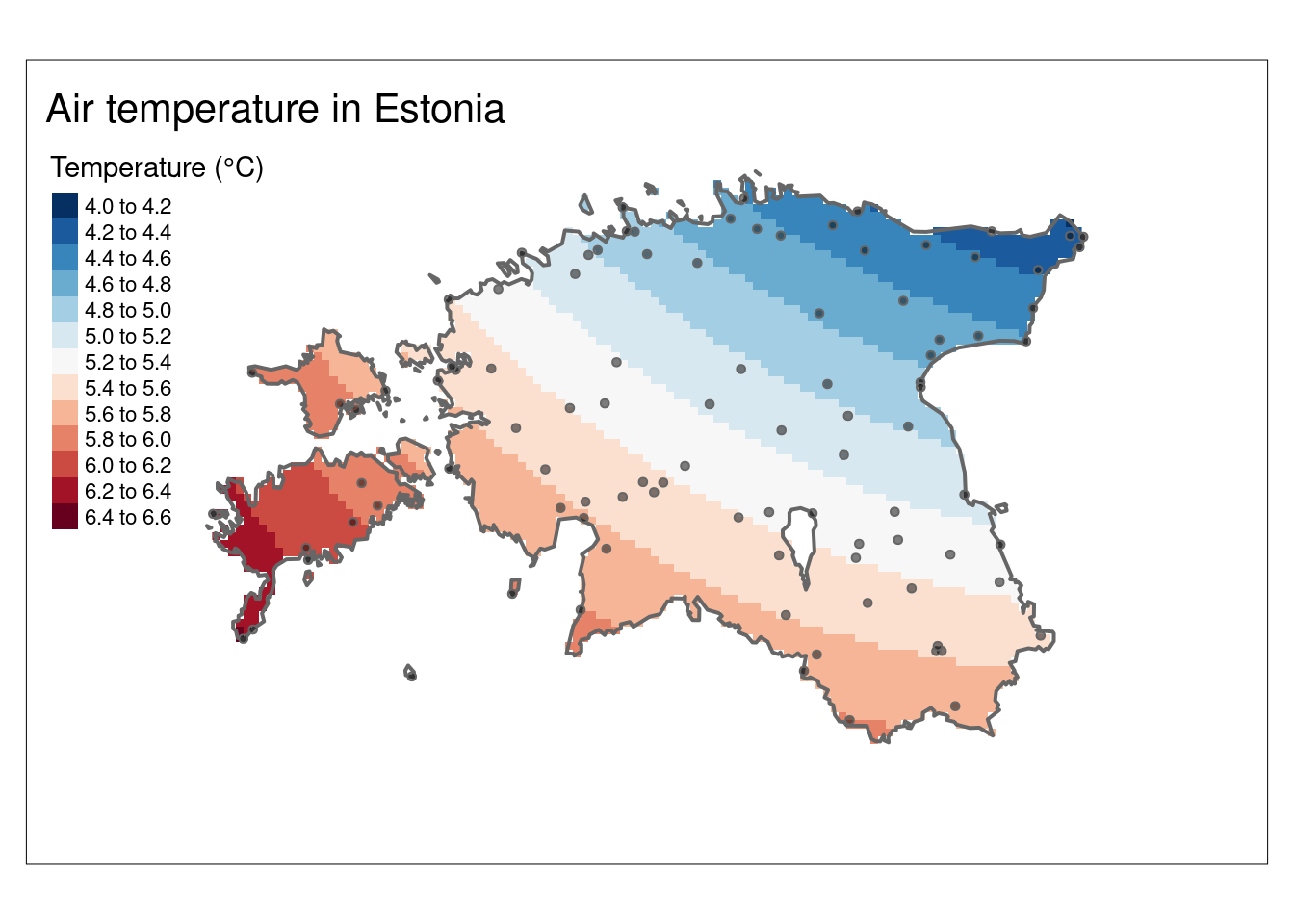
Let’s plot the interpolation result (idw_rast):
# We can also create more informative plot
map_idw <- tm_shape(idw_rast) +
    tm_raster(n = 10, palette = "-RdBu", title = "Temperature (°C)") +
          tm_shape(est_border_sp) +
          tm_borders(lwd = 2) +
          tm_bubbles(size = 0.05, alpha = 0.5, col = "black") +
  tm_layout(title = "Air temperature in Estonia",
             inner.margins = 0.15) +
  tm_graticules(line = F)

map_idw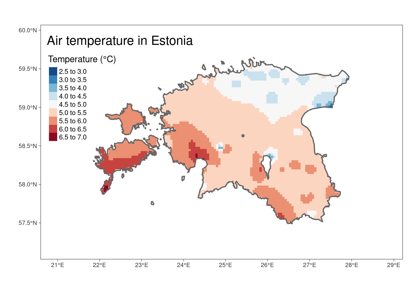
Sometimes we want to use isotherms instead of raster:
# Create isolines from IDW raster
idw_isolines <- terra::as.contour(idw_rast)

# Convert isolines to sf
idw_isolines <- st_as_sf(idw_isolines)

# Convert contour labels from character to numeric
idw_isolines <- idw_isolines %>%
  mutate(level = as.numeric(as.character(level)))

# Print summary of the resulting sf object
glimpse(idw_isolines)
Rows: 8
Columns: 2
$ level <dbl> 3.0, 3.5, 4.0, 4.5, 5.0, 5.5, 6.0, 6.5
$ geometry <GEOMETRY [m]> LINESTRING (712490.5 654646..., MULTILINESTRING ((708883.7 ..…Plot the raster, isotherms and labels together:
#Plot
tm_shape(idw_rast) +
  tm_raster(n = 10, palette = "-RdBu", title = "Temperature (°C)") +
  tm_shape(idw_isolines) +
  tm_lines(lwd = 1, lty = 2) +
  tm_text("level", just ="left", xmod = 0.5, size = 0.75, col = "black", bg.color = "white")+
  tm_shape(est_border_sp) +
  tm_borders(lwd = 2) +
  tm_shape(air_temp_spdf) + #add weather stations to the map
          tm_bubbles(size = 0.05, alpha = 0.5, col = "black") +
  tm_layout(title = "Air temperature in Estonia",
             inner.margins = 0.15) +
tm_graticules(lines = F) 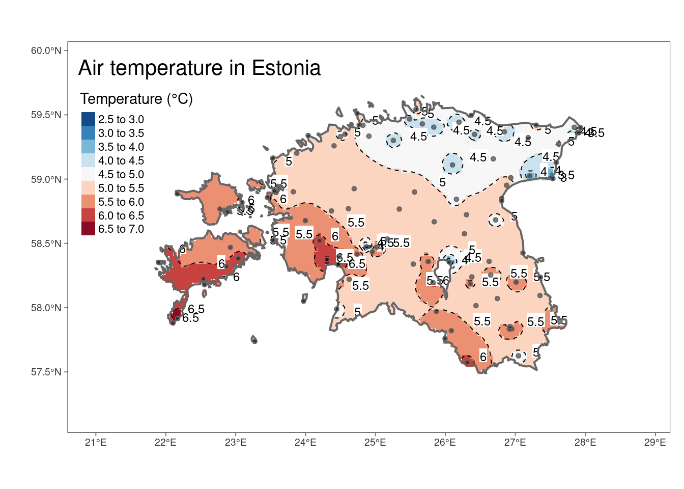
6.3. Kriging
Kriging is a spatial interpolation method used to obtain predictions at unsampled locations based on observed geostatistical data. Unlike other deterministic interpolation methods such as IDW, kriging is based on auto-correlation - that is the statistical relationships among the measured points to interpolate the values at an unsampled locations. The Kriging weights are obtained by first fitting a variogram model to the observed data, which helps us understand how the correlation between observation values changes with the distance between locations. Once the Kriging weights are obtained, they are applied to the known data values at the sampled locations to calculate the predicted values at unsampled locations.
The Kriging weights reflect the spatial correlation of the data, which accounts for the geographical proximity and similarity of data points. Thus, observed locations that are correlated and near to the prediction locations are given more weight than those uncorrelated and farther apart. Weights also take into account the spatial arrangement of all observations, so clusterings of observations in oversampled areas are weighted less heavily since they contain less information than single locations.
Various types of kriging interpolators are available, including ordinary, universal, co-Kriging, regression, and simple kriging, among others. This tutorial will specifically concentrate on the technique of ordinary kriging interpolation. It will demonstrate the interpolation of air temperature using data gathered from weather station points. The tutorial will then illustrate the process of fitting a model variogram to the empirical variogram, utilizing this fit to make predictions through the method of kriging.
6.3.1. Variogram cloud
A variogram cloud is a graphical representation of the empirical variogram values calculated from pairs of observations at different distances or lags in spatial data analysis. The variogram itself measures the spatial variability or dependence of a variable across a landscape. The variogram cloud displays these pairwise differences in values for increasing distances. The variogram() function of gstat can be used to calculate the variogram cloud.
Let compute variogram cloud for airtemperature in our dataset and plot it. The variogram cloud plot is a scatter plot of the calculated variogram values for pairs of points at different distances. Each point in the cloud represents the semivariance (half the variance) between pairs of observations separated by a specific distance.
# Compute variogram cloud
vc <- variogram(airtemperature ~1, air_temp_spdf, cloud = TRUE)

# Display the first 3 rows of the variogram cloud
head(vc, n = 3)
dist gamma dir.hor dir.ver id left right
1 31992.33 0.045 0 0 var1 3 2
2 110781.14 0.000 0 0 var1 4 2
3 53153.79 0.125 0 0 var1 5 4# Plot the variogram cloud
plot(vc, xlab = "distance [m]")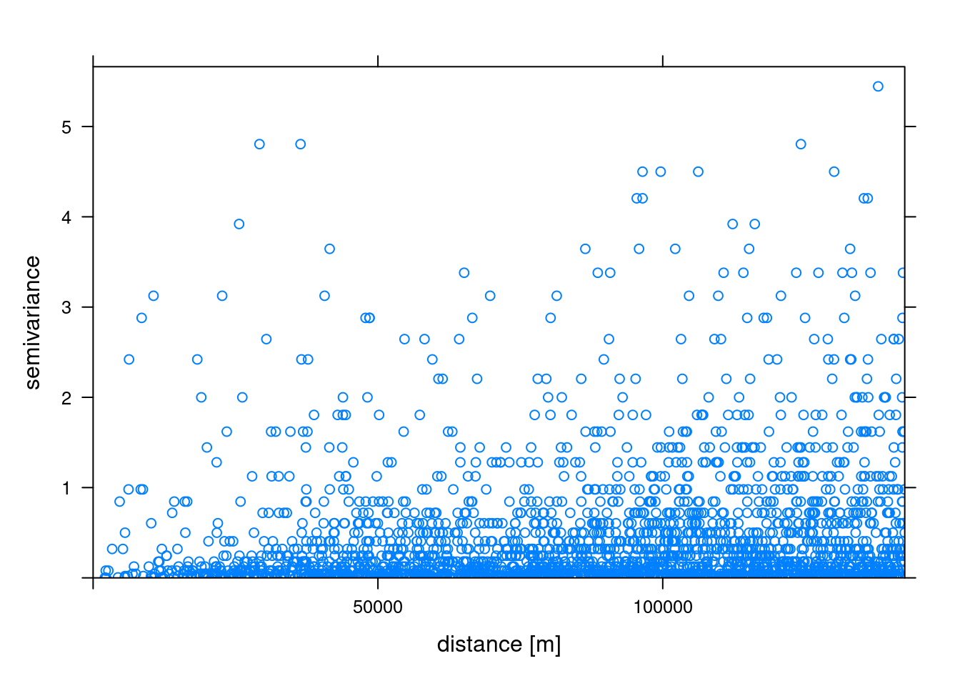
The variogram cloud’s vertical axis depicts semivariance, measuring the extent of variation among variable values at varying distances. On the horizontal axis, the variogram cloud represents distance, denoting the separation between pairs of data points. Semivariance magnitudes within the variogram offer insights into the dataset’s spatial variability or correlation. Our variogram analysis reveals an increasing trend in semivariance values as distances increase in the model, indicating more variability among air temperature data points. In essence, an increase of semivariance with distance among different stations generally implies spatial dependence or variability within the temperature dataset.
6.3.2. Sample variogram
In order to make spatial predictions using geostatistical methods, we first need to identify a model for the mean and for the spatial correlation. The variogram() function of gstat calculates the sample variogram from data or for residuals if a linear model has been specified. We can also specify the argument width indicating the width of distance intervals into which data point pairs are grouped to compute the estimates.
# Compute the sample variogram
sv <- variogram(airtemperature ~ 1, data = air_temp_spdf)

# Plot the sample variogram
plot(sv, plot.numbers = T, xlab = "distance [m]")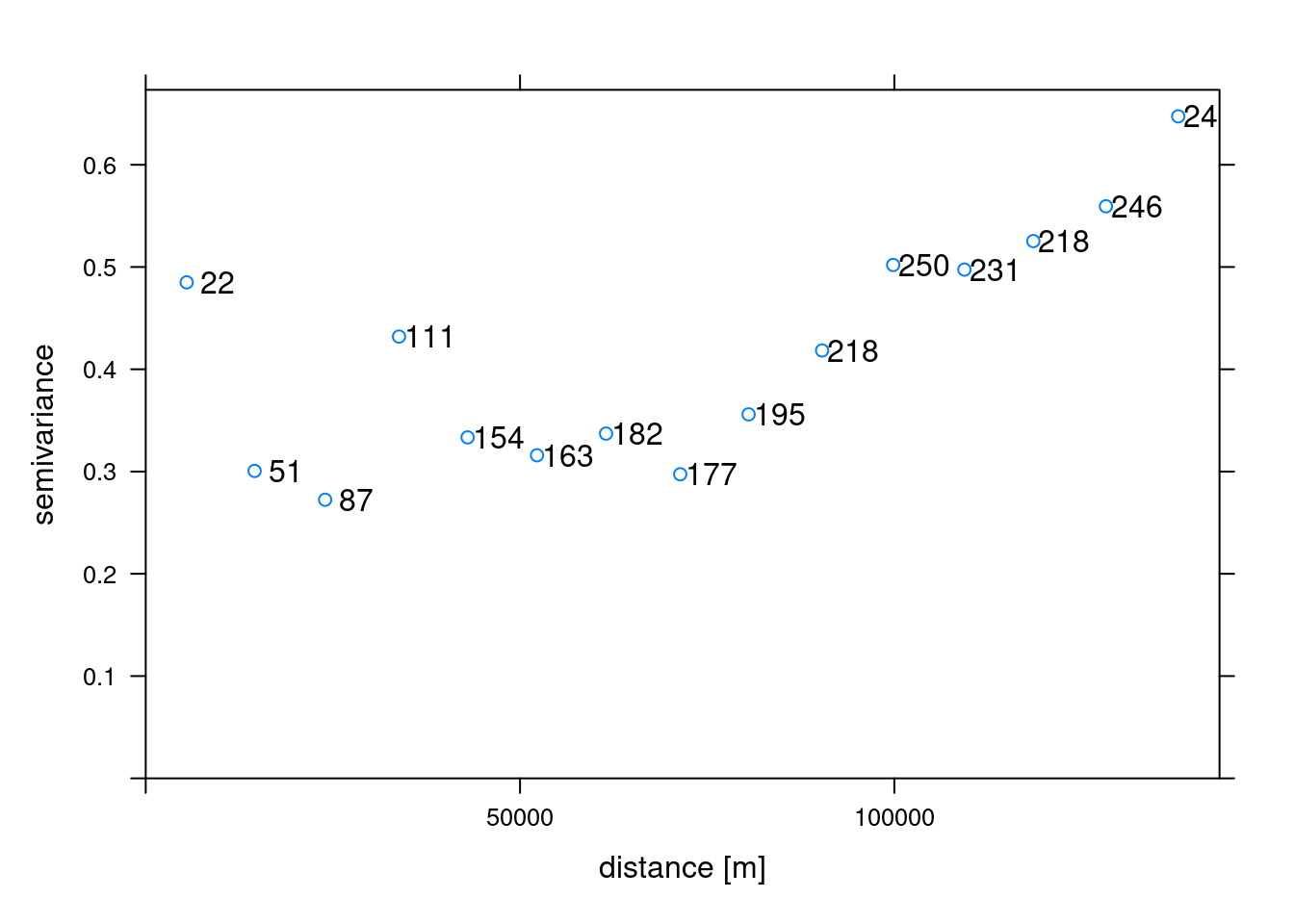
6.3.3. Variogram Model
The next step is to generate a variogram model. The vgm() function of gstat generates a variogram model. This function has arguments model with the model type, nugget, psill (partial sill, which is the sill minus the nugget) and range. A list of available models can be printed with vgm() and visualized with show.vgms()
# Display available variogram models
vgm()
short long
1 Nug Nug (nugget)
2 Exp Exp (exponential)
3 Sph Sph (spherical)
4 Gau Gau (gaussian)
5 Exc Exclass (Exponential class/stable)
6 Mat Mat (Matern)
7 Ste Mat (Matern, M. Stein's parameterization)
8 Cir Cir (circular)
9 Lin Lin (linear)
10 Bes Bes (bessel)
11 Pen Pen (pentaspherical)
12 Per Per (periodic)
13 Wav Wav (wave)
14 Hol Hol (hole)
15 Log Log (logarithmic)
16 Pow Pow (power)
17 Spl Spl (spline)
18 Leg Leg (Legendre)
19 Err Err (Measurement error)
20 Int Int (Intercept)# Show variogram model parameters with adjusted text size
show.vgms(par.strip.text = list(cex = 0.75))
In our working example, we will try to fit the gaussian function to our sample experimental variogram. This is one of three popular models (the other two being linear and Spherical models). In addition to picking the proper model, computing variogram model required tweaking the partial sill, range, and nugget parameters.
Partial sill: is the maximum semi-variance. It represents variability in the absence of spatial dependence Range: is the critical distance beyond which there is no further correlation in the variogram, Nugget: is the semi-variance as the separation approaches zero. It represents variability at a point that cant be explained by spatial structure.
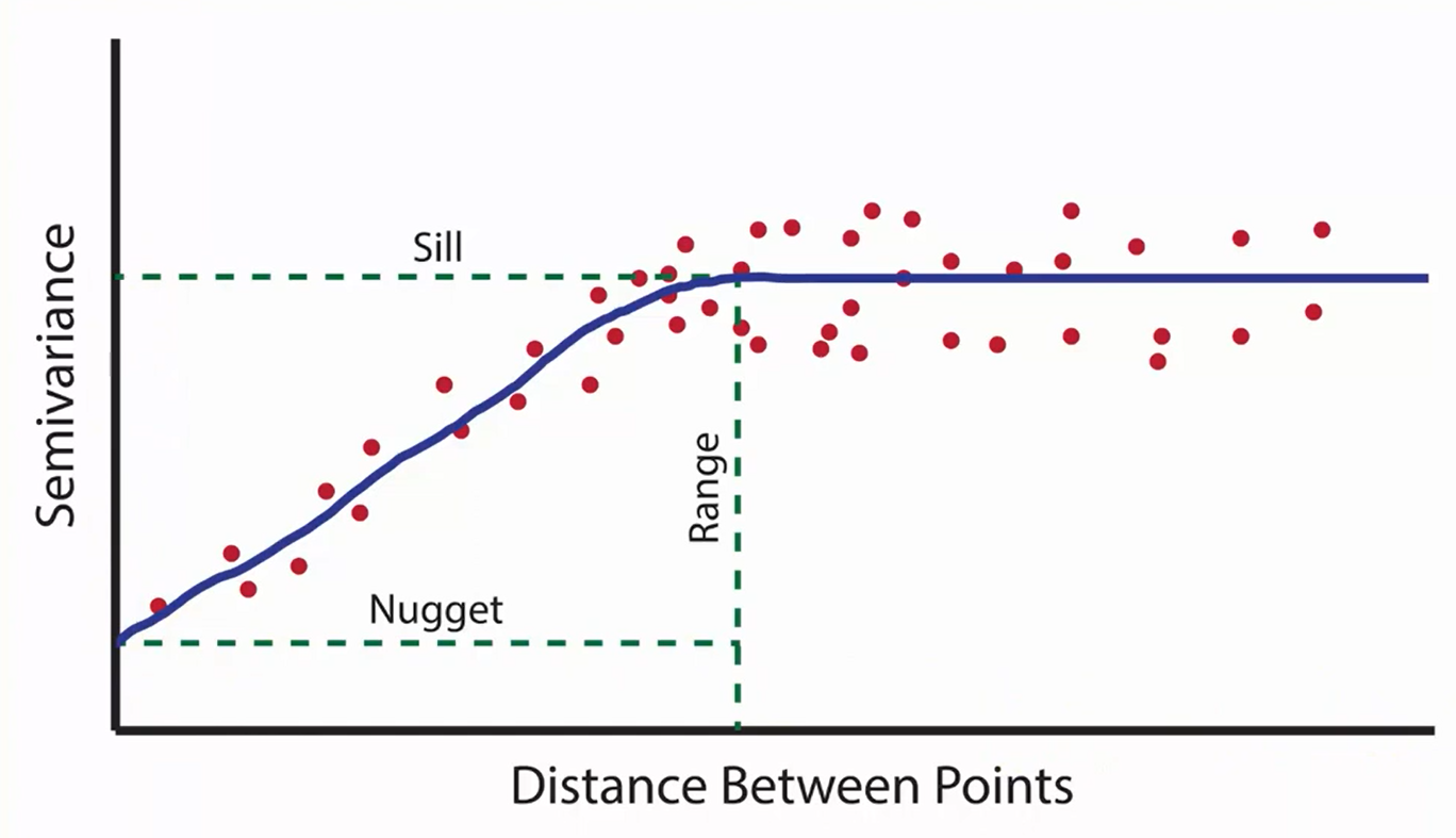
Let us define these parameters using our sample variogram (sv) and then generate variogram model (mv):
# Define the nugget, sill and range values using sv object
psill <- sv$gamma[nrow(sv)]
nugget <- sv$gamma[1]
range <- ceiling(sv$dist[nrow(sv)])

# Generate variogram model:
mv <- vgm(range = range, model = "Gau", psill = psill, nugget = nugget)
mv
model psill range
1 Nug 0.4850000 0
2 Gau 0.6473577 1379246.3.4. Fit variogram
The fit.variogram() function fits a variogram model to a sample variogram. Arguments of this function include object with the sample variogram, and model with the variogram model which is an output of vgm() with arguments nugget, psill, and range denoting initial values of the iterative fitting algorithm.
# Fit the model
fv <- fit.variogram(sv, mv)
Warning in fit.variogram(sv, mv): No convergence after 200 iterations: try
different initial values?fv model psill range
1 Nug 4.891476e-01 0
2 Gau 3.105875e+04 22507208#Plot
plot(sv, fv, cex = 1.5) 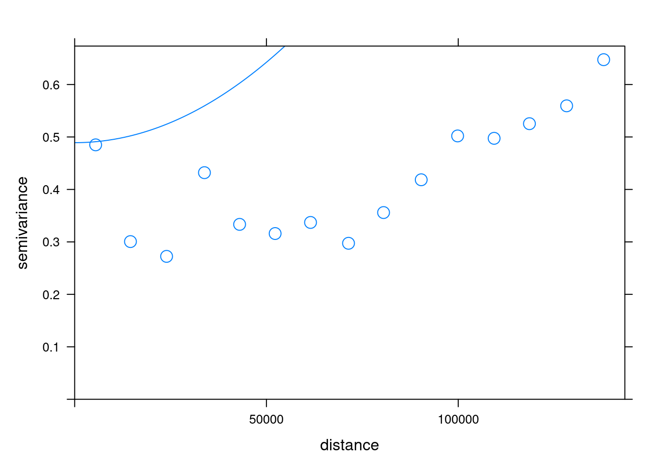
6.3.5. Kriging predictions
Kriging uses the fitted variogram values fv to obtain predictions at unsampled locations. Here, we use the gstat() function of gstat to compute the Kriging predictions.
# Perform the krige interpolation
k <- gstat::krige(formula = airtemperature ~ 1, air_temp_spdf, newdata = grd, model = fv)
[using ordinary kriging]# Convert to raster object
k_rast <- rast(k)The kriging result contains the prediction (var1.pred) and its variance (var1.var). The var1.pred is the kriging estimate or prediction for the variable of interest (air temperature) at each location in the spatial domain. Whereas, var1.var represents the variance or uncertainty associated with the kriging predictions.
Let’s plot the interpolation result (k_rast):
# Plot
k_pred_map <- tm_shape(k_rast[[1]]) +
  tm_raster(n = 10, palette = "-RdBu", title = "Temperature (°C)") +
  tm_shape(est_border_sp) +
  tm_borders(lwd = 2) +
  tm_shape(air_temp_spdf) +
  tm_bubbles(size = 0.05, alpha = 0.5, col = "black") +
  tm_layout(title = "Air temperature in Estonia") +
  tm_layout(inner.margins = 0.1)
k_pred_map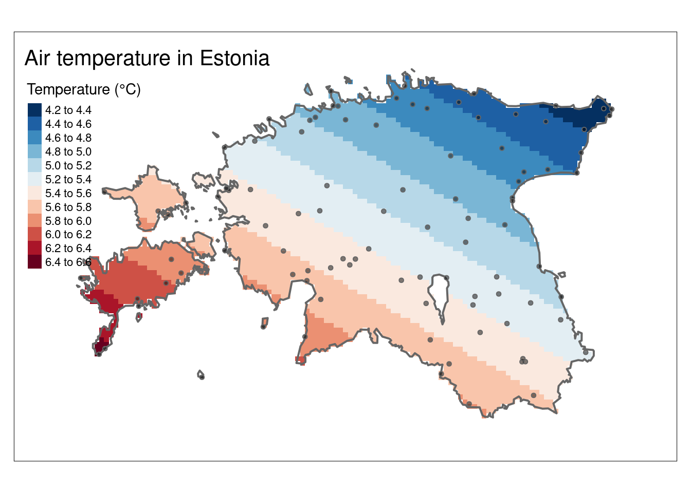
A valuable by-product of the kriging operation is the variance map which gives us a measure of uncertainty in the interpolated values. It reflects the degree of confidence or reliability in the kriging estimates at each location. High values in var1.var indicate greater uncertainty, suggesting that the true value at that location could deviate more from the predicted value. Low values, on the other hand, indicate higher confidence in the kriging predictions. Note that the variance values are in squared units.
#Plot the kriging variance
k_var_map <-   tm_shape(k_rast[[2]]) +
  tm_raster(n = 10, palette = "-RdBu", title = "Variance (°C²)") +
  tm_shape(est_border_sp) +
  tm_borders(lwd = 2) +
tm_layout(inner.margins = 0.15)

k_var_map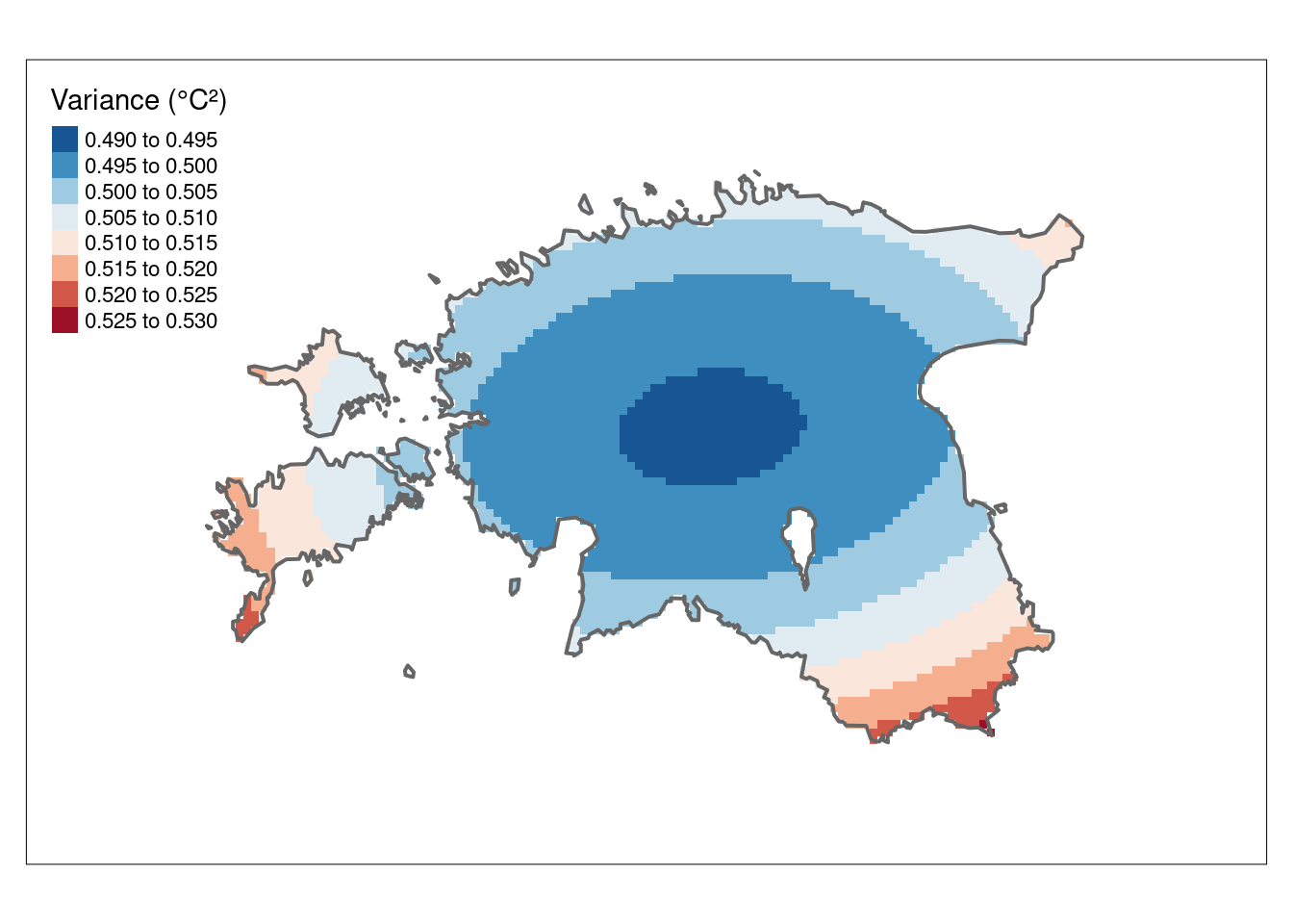
The 95% confidence interval map, derived from the variance values, provides a more easily understandable representation. The CI95 values below indicate the range within which we can be 95% confident that the true value lies.
# Calculate the confidence interval
CI95 <- sqrt(k_rast["var1.var"])* 1.96

#the value 1.96 represents the critical value for a 95% confidence interval in a standard normal distribution. This value is commonly used in statistical calculations to determine the bounds of a confidence interval.

#Plot the CI
tm_shape(CI95) +
  tm_raster(n = 10, palette = "Reds", title = "95% CI (°C)") +
  tm_shape(est_border_sp) +
  tm_borders(lwd = 2) +
tm_layout(inner.margins = 0.15)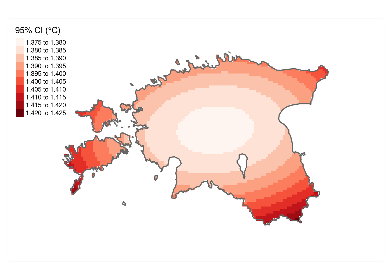
6.4. Polynomial Interpolation
Polynomial interpolation is a method in mathematics and numerical analysis used to approximate a function or data set by fitting a polynomial that passes through a given set of data points. The basic idea is to find a polynomial function that matches the values of the data points as closely as possible.
It’s important to choose an appropriate degree of the polynomial (1st, 2nd or 3rd degree) and to be aware of limitations, as using very high-degree polynomials can lead to issues like overfitting and instability. In this tutorial, we will use 1st and 2rd order polynomial fits. How the spatial interpolation work is explained in here
6.4.1. 1st order polynomial
A 1st-order polynomial interpolation is a simple mathematical technique used to find a linear relationship between two data points. It involves fitting a straight line to the given data points to estimate values between them. This technique is straightforward and often used when a simple linear relationship is assumed between the data points. It’s a basic form of interpolation, but it may not capture more complex or nonlinear relationships in the data.
The 1st order polynomial takes the form: predicted = intercept + aX + bY
- predicted is the predicted value.
- intercept is the y-intercept, the value of the predicted variable when both X and Y are zero.
- a and b are the coefficients for the variables X and Y, respectively.
# Define the 1st order polynomial equation
pf.1st <- as.formula(airtemperature ~ X + Y)

# Add X and Y to air_temp_spdf
air_temp_spdf$X <- coordinates(air_temp_spdf)[,1]
air_temp_spdf$Y <- coordinates(air_temp_spdf)[,2]

# Run the regression model (Note: X and Y are added to air_temp_spdf already)
rm.1st <- lm(pf.1st, data = air_temp_spdf)

# Use the regression model output to interpolate the surface
pf.1st_inter <- SpatialPixelsDataFrame(grd, data.frame(var1.pred = predict(rm.1st, newdata = grd)))

# Convert to raster object
pf.1st_r   <- terra::rast(pf.1st_inter)
Plot the result (1st order polynomial interpolation):
# Plot
tm_shape(pf.1st_r) +
  tm_raster(n = 10, palette = "-RdBu", title="Temperature (°C)") +
  tm_shape(est_border_sp) +
  tm_borders(lwd = 2) +
  tm_shape(air_temp_spdf) +
  tm_bubbles(size = 0.05, alpha = 0.5, col = "black") +
  tm_layout(title = "Air temperature in Estonia") +
  tm_layout(inner.margins = 0.15)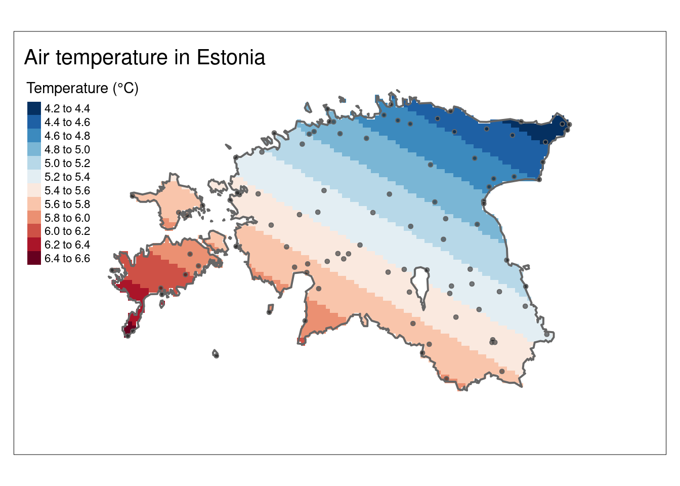
6.4.2. 2nd-order polynomial
A 2nd-order polynomial interpolation, also known as quadratic interpolation, is a mathematical technique used to find a second-degree polynomial (a quadratic equation) that passes through a set of three data points. This type of interpolation is used when there is a need to estimate values between data points or when you believe that a parabolic shape best represents the relationship between the variables.
The 2nd order polynomial takes the form: predicted = intercept + aX + bY + dX^2 + eY^2 + fXY
- predicted is the predicted value.
- intercept is the y-intercept, the value of the predicted variable when both X and Y are zero.
- a, b, d, e, and f are the coefficients for the variables X, Y, X2, Y2, and XY, respectively.
# Define the 2nd order polynomial equation
pf.2nd <- as.formula(airtemperature ~ X + Y + I(X*X)+I(Y*Y) + I(X*Y))

# Run the regression model
rm.2nd <- lm(pf.2nd, data = air_temp_spdf)

# Use the regression model output to interpolate
pf.2nd_inter <- SpatialPixelsDataFrame(grd, data.frame(var1.pred = predict(rm.2nd, newdata = grd)))

# Convert to raster object
pf.2nd_r   <- terra::rast(pf.2nd_inter)
Plot the result (2nd order polynomial interpolation):
# Plot
tm_shape(pf.2nd_r) +
  tm_raster(n = 10, palette = "-RdBu", title="Temperature (°C)") +
  tm_shape(est_border_sp) +
  tm_borders(lwd = 2) +
  tm_shape(air_temp_spdf) +
  tm_bubbles(size = 0.05, alpha = 0.5, col = "black") +
  tm_layout(title = "Air temperature in Estonia") +
  tm_layout(inner.margins = 0.15)