library(sf) # Simple Features for R - handling spatial data
library(tmap) # Creating thematic maps in R
library(tidyverse) # Data manipulation and visualization
library(RColorBrewer) # Color palettes for mapping
library(leaflet) # Creating and customizing interactive maps
library(htmlwidgets) # Framework for creating interactive HTML widgets
library(leaflet.extras) # Extending leaflet with extra features
library(leaflet.extras2) # Extending leaflet with extra features
library(mapview) # Provides an interactive viewer for spatial data
library(dygraphs) # Creating interactive and dynamic time series plots
library(plotly) # Creating interactive and web-based plots
library(xts) # Managing and analyzing time series data
library(leafsync) # Create small multiples of several web maps
library(viridis) # Provides color palettes for creating visually appealing and accessible visualizationsLesson 9: Interactive maps
In this lesson, we will learn how to generate interactive maps in R using different packages. We will proceed with utilizing the datasets introduced in earlier lessons - districts, bike stations, and population datasets - and one new dataset related to COVID-19 cases in Estonia.
Learning outcomes
At the end of this lesson, the students should be able to (at least):
- Create simple interactive web-maps using leaflet.
- Know how to add layers to the web-maps
- Create maps with different levels of interactivity using various packages
First things first, we need to load packages we want to work with.
9.1. Introduction
While static maps serve the basic purpose of providing location information, interactive maps can take spatial visualization to a new level. Being able to produce interactive maps on the fly can greatly speed up exploratory analysis. Interactivity can take many forms, the most common and useful of which is the ability to pan around and zoom-in to any part of a geographic dataset overlaid on a ‘web map’ to show real-time updates. As such, interactive visualizations are more engaging or appealing compared with non-interactive visualization. However, interactive visualizations cannot be implemented in reports that are printed on paper but are restricted to digital formats (e.g. websites, presentations, etc.)
There are several R packages that are commonly used for interactive mapping. And many of them allows you to create also different kinds of maps. During this lesson we will focus on few of them, namely:
- leaflet: used to create and customize interactive maps using the ‘Leaflet’ JavaScript library and the ‘htmlwidgets’ package.
- plotly: used to convert plots created by using ggplot2 to an interactive web-based version.
- dygraph: used to generate dynamic and interactive time series plots.
- mapview: used to quickly and conveniently create interactive visualisations of spatial data with or without background maps.
- tmap: used to create static and interactive thematic maps
9.2. Simple interactive web-map
Let’s first see how we can do a simple interactive web-map using leaflet package without any data on it. We just visualize OpenStreetMap on a specific location of the a world (for example Tartu area). Leaflet maps in R are created with leaflet() function, followed by different layers with add*(). The pipe operator %>% is used to add layers on top of each other. This allows multiple map layers and control settings to be added interactively. You can set the view to a specific location and zoom level by passing coordinates to the lng (longitude) and lat (latitude) arguments to setView() function.
# Create a map instance
tartu <- leaflet() %>% # Create a leaflet map
addTiles() %>% # Add a default OSM for the base map
setView(lng = 26.73,lat = 58.38, zoom = 12) # Set the view to a specific center and zoom level
tartuA nice feature of leaflet is its ability to seamlessly integrate various basemaps using the addProviderTiles() function (type names(providers) to check list of providers). Let’s switch a default OSM basemap style to CartoDB Positron and incorporate an animated pulse marker using the addPulseMarkers() function from the leaflet.extras package.
# Add pulse marker and change the basemap style
leaflet() %>%
addProviderTiles("CartoDB.Positron") %>%
addPulseMarkers(lng = 26.72 , lat = 58.37, label='Pulso', icon = makePulseIcon()) %>%
setView(lng = 26.73,lat = 58.38, zoom = 6) We can export a leaflet map to an HTML file (which we can open in the browser) using the htmlwidgets package. To save the previously created tartu map, we use the saveWidget() function.
saveWidget(widget = tartu, file = "tartu_leaflet.html", selfcontained = TRUE)9.3. Adding layers to the web-map
Adding layers to a web-map using leaflet pacakge is fairly straightforward. Let’s use the bike stations and Tartu districts dataset introduced in lesson 2 and create a map where stations and districts are plotted on top of a leaflet web-map. The sf object that we pass to leaflet() needs to have a geographic coordinate reference system (CRS) indicating latitude and longitude (EPSG code 4326). Here, we use the st_transform() function of sf to transform our datasets which have CRS given by EPSG code 3301 to CRS with EPSG code 4326.
First we need to import and prepare the data.
# Import the data
stations <- st_read("../R_02/bike_stations.gpkg")Reading layer `tartu_bike_share_stations' from data source
`/home/geoadmin/dev/simply-general/teaching/geospatial_python_and_r/R_02/bike_stations.gpkg'
using driver `GPKG'
Simple feature collection with 101 features and 8 fields
Geometry type: POINT
Dimension: XY
Bounding box: xmin: 649813.2 ymin: 6467043 xmax: 668519.4 ymax: 6478854
Projected CRS: Estonian Coordinate System of 1997districts <- st_read("../R_02/tartu_districts.gpkg")Reading layer `tartu_districts' from data source
`/home/geoadmin/dev/simply-general/teaching/geospatial_python_and_r/R_02/tartu_districts.gpkg'
using driver `GPKG'
Simple feature collection with 33 features and 2 fields
Geometry type: MULTIPOLYGON
Dimension: XY
Bounding box: xmin: 655873.6 ymin: 6469758 xmax: 663717.9 ymax: 6477657
Projected CRS: Estonian Coordinate System of 1997# Transform to EPSG:4326 (WGS84)
stations <- stations %>% st_transform(4326)
districts <- districts %>% st_transform(4326)Now we can add our data to a leaflet and create interactive map. We can use different types of markers to the maps. The most common functions are addMarkers, which will add icon markers (and accepts custom markers) and addCircleMarkers, which will add circular markers that can be customized.
Let’s use the addMarkers() function to add station popups and addPolygons to integrate district information. We need to specify the bike station names (Asukoht) for popup content that appear when a marker is clicked.
# Define a color palette
pal_d <- colorFactor(palette = "viridis", domain = districts$NIMI)
#Plot
leaflet() %>%
setView(lng = 26.73,lat = 58.38, zoom = 11) %>%
addProviderTiles("CartoDB.Positron") %>%
addPolygons(data = districts, fillColor = ~pal_d(districts$NIMI), stroke = 1, opacity = 0.4) %>%
addMarkers(data = stations, popup = ~Asukoht) Leaflet maps can be further enhanced by incorporating addAwesomeMarkers() to customize the appearance of markers on the map based on specific criteria. To use addAwesomeMarkers, you’ll need to provide numeric longitude and latitude values. To easily identify the station names, you can simply hover your cursor over the icons on the map. With the addMiniMap function you can also add a mini map over the plot, so you will be able to see where you are despite the level of zoom.
#Add lon and lat coordinates to stations
stations$lon <- st_coordinates(stations)[, "X"]
stations$lat <- st_coordinates(stations)[, "Y"]
# Define custom marker icons
icons <- awesomeIcons(
icon = 'ion-android-bicycle', # the icon name (can be changed)
iconColor = 'red', # the icon color (can be changed)
library = 'ion') # the icon library
# Create the Leaflet map
leaflet() %>%
setView(lng = 26.73,lat = 58.38, zoom = 11) %>%
addProviderTiles("CartoDB.Positron") %>%
addPolygons(data = districts, fillColor = ~pal_d(districts$NIMI), stroke = 1, opacity = 0.4) %>%
addAwesomeMarkers(data = stations, lng = ~lon, lat = ~lat, icon = icons,
label = ~as.character(Asukoht)) %>%
addMiniMap(width = 80, height = 80)The leaflet.extras is a useful package to use with leaflet, as it provides lots of additional plugins that are not available in the core package. addDrawToolbar() function from leaflet.extras package provides Shiny applications to enable drawing and editing features on leaflet maps. In this case, we will create leaflet map using addCircles() specifying the radius and color of the points. Additionally, we’ll explore how to add based on the Rataste_arv variable in the stations object.
# Filter out rows with NA values in the Rataste_arv column
stations <- stations %>% filter(!is.na(Rataste_arv))
# Create a color palette based on the Rataste_arv variable
pal_s <- colorNumeric(palette = "viridis", domain = stations$Rataste_arv)
# Create a Leaflet map with circles representing stations
leaflet(stations) %>%
setView(lng = 26.73, lat = 58.38, zoom = 12) %>%
addProviderTiles("CartoDB.VoyagerLabelsUnder") %>%
addCircles(
color = ~pal_s(Rataste_arv),
radius = ~sqrt(Rataste_arv) * 20,
label = ~as.character(Asukoht)) %>%
addDrawToolbar() %>% # Add a draw toolbar for user interaction
# Add a legend to the map
leaflet::addLegend(
pal = pal_s,
values = ~Rataste_arv,
position = "topright",
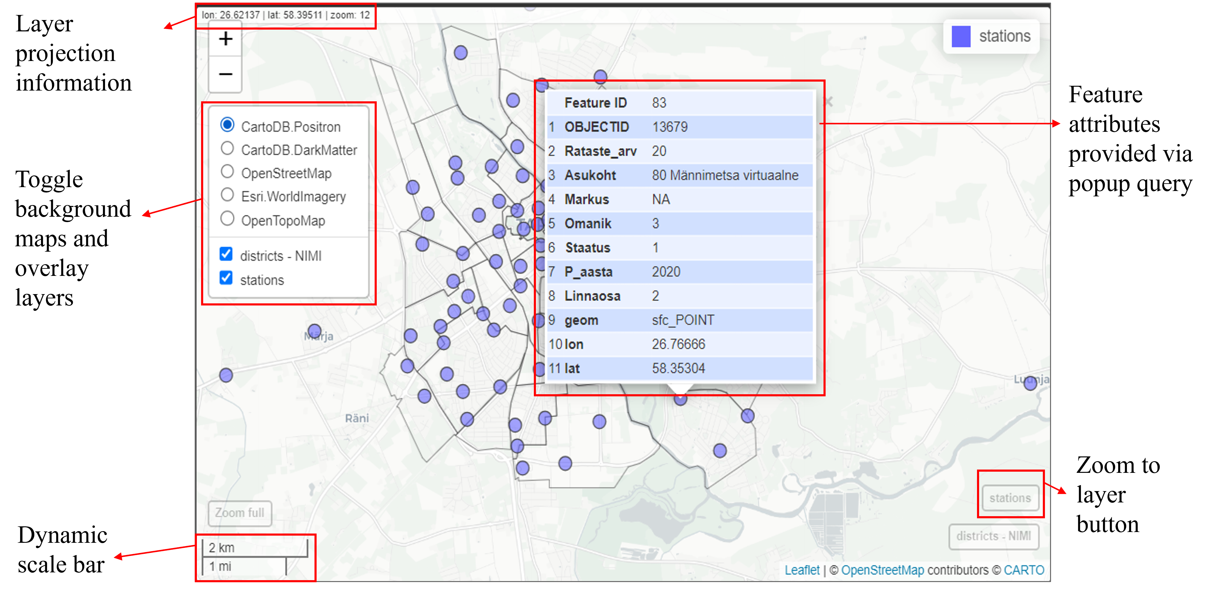
title = "Station density")If you are not satisfied with leaflet, the quickest way to create interactive maps in R may be with mapview. mapview uses the leaflet JavaScript library to render the output maps, which is user-friendly and has a lot of features. By default, it has some standard GIS functionality such as mouse position information, attribute queries (via pop-ups), scale bar, and zoom-to-layer buttons. Given that mapview always expects a spatial object (including sf and SpatRaster) as its first argument, it works well at the end of piped expressions. mapview layers are added to the function via the + operator (similar to ggplot2 or tmap). mapview provides automatic coloring of attributes via the zcol argument.
mapview(districts, zcol = "NIMI", legend = FALSE, alpha.regions = 0) +
mapview(stations) 
Although mapview is very convenient to very quickly inspect spatial data, it also be customized by adding different arguments such as col.regions to specify the color of regions or fill polygons, and alpha.regions to control the transparency or opacity of the regions, layer.name to rename a layer which appears on the legend, map.types to change background maps, and so forth.
The mapview package in R is also a valuable tool for generating graduated symbol maps of point data. Meaning, it allows customization of circle sizes based on the pop variable, accomplished through the use of the cex argument. In the example below, we utilize the Rataste_arv variable (bike count size) from the stations dataset as the popup variable to generate graduated symbol map.
## Graduated symbol map with mapview
mapview(
stations, cex = "Rataste_arv",
col.regions = "darkorange4",
alpha.region = 0.5,
layer.name = "Number of bikes")The leafsync package provides a possibility to create a multiple maps generated through mapview or leaflet in a grid and synchronise them. There are two functions for that: latticeview() and sync(). Meaning that if we zoom into one panel, all other panels will also zoom. It provides a very convenient way to compare multiple attributes of the same feature geometry set.
To demonstrate the lattice view, let’s generate two maps depicting Tartu bike stations — one using leaflet and another with mapview — and two maps focusing on Tartu districts — one displaying district layers and the other featuring centroids. Following this, we will utilize the sync() function to harmonize these four maps.
# Calculate centroids of the 'districts' sf object
dist_centro <- st_centroid(districts) Warning: st_centroid assumes attributes are constant over geometries# Create maps
m1 <- mapview(districts, zcol = "NIMI", layer.name = "Districts",legend = F)
m2 <- leaflet() %>% addTiles() %>% addCircles(data = stations)
m3 <- mapview(stations, zcol = "Rataste_arv", at = seq(5, 26, 5), legend = TRUE) #add legend
m4 <- mapview(dist_centro, zcol = "NIMI", layer.name = "Centroids", legend = F)
# Synchronize the four maps using leafsync
leafsync::sync(m1, m2, m3, m4, ncol = 2)We can also control the combination of panels by using list function. For example the next code synchronizes two pairs of maps: the first pair includes maps m1 and m4, while the second pair includes maps m2 and m3.
sync(list(m1, m2, m3, m4), sync = list(c(1, 4), c(2, 3)))Another option is to combine two maps on the same layer and incorporate a side-by-side slider for comparison, facilitated by the leaflet.extras2 package and the | (Unix pipe, not R pipe) character. The map slider enables horizontal movement to reveal either the left or right map version.
#Combine maps for comparison using slider
m1 | m39.4. Interactive time series plots
In this section, will work with the dataset related to COVID-19 infection cases in Estonia to generate interactive time series plots using plotly package. You can access this data from the Estonian Covid-19 open-data portal. The datasets are updated daily. You can easily downloaded the dataset using this link. Once it is downloaded, save it to your R workspace as .csv.
Let’s first import the data and check its structure. Please pay particular attention to the CountyEHAK column and ensure that all of its values start with 00. If you import it as .csv, excel might eliminate leading zeros from numeric values, which we need to retain for upcoming spatial join tasks.
# Read the data
covid19 <- read.csv("opendata_covid19_test_county_all.csv")
# Appends leading zeros to the "CountyEHAK" to match with
covid19$CountyEHAK <- str_pad(covid19$CountyEHAK, width = 4, side = "left", pad = "0")
# Convert StatisticsDate and LastStatisticsDate columns to Date format
covid19$LastStatisticsDate <- as.Date(covid19$LastStatisticsDate, format = "%Y-%m-%d")
covid19$StatisticsDate <- as.Date(covid19$StatisticsDate, format = "%Y-%m-%d")
# Inspect the data frame
glimpse(covid19)Rows: 47,260
Columns: 11
$ LastStatisticsDate <date> 2023-12-11, 2023-12-11, 2023-12-11, 2023-12-11, 20…
$ StatisticsDate <date> 2020-02-05, 2020-02-05, 2020-02-05, 2020-02-05, 20…
$ Country <chr> "Eesti", "Eesti", "Eesti", "Eesti", "Eesti", "Eesti…
$ CountryEHAK <int> 233, 233, 233, 233, 233, 233, 233, 233, 233, 233, 2…
$ County <chr> "Harju maakond", "Harju maakond", "Hiiu maakond", "…
$ CountyEHAK <chr> "0037", "0037", "0039", "0039", "0045", "0045", "00…
$ ResultValue <chr> "N", "P", "N", "P", "N", "P", "N", "P", "N", "P", "…
$ DailyTests <int> 1, 0, 0, 0, 0, 0, 0, 0, 0, 0, 0, 0, 0, 0, 0, 0, 0, …
$ TotalTests <int> 1, 0, 0, 0, 0, 0, 0, 0, 0, 0, 0, 0, 0, 0, 0, 0, 0, …
$ DailyCases <int> 0, 0, 0, 0, 0, 0, 0, 0, 0, 0, 0, 0, 0, 0, 0, 0, 0, …
$ TotalCases <int> 0, 0, 0, 0, 0, 0, 0, 0, 0, 0, 0, 0, 0, 0, 0, 0, 0, …Our data contains 11 variables. However, for our specific task, we are interested in focusing on the following essential variables:
StatisticsDate: the date for which the result is valid; County: name of the county (place of residence); CountyEHAK: EHAK code of the county (we need it for mapping!); ResultValue: test result (Negative or Positive); DailyCases: number of the new cases.
We need to keep only positive test results in ResultValue variable. We can utilize the filter function to extract the rows where the *ResultValue* column corresponds to the value *P*.
In the County column, all county names end with suffix *maakond*. To ensure that our data is in a tidy format, we can remove this suffix from the column. For some cases the county name is unknown (NA). Let’s delete those rows as well!
LastStatisticsDate StatisticsDate Country CountryEHAK County CountyEHAK
1 2023-12-11 2020-02-05 Eesti 233 Harju 0037
2 2023-12-11 2020-02-05 Eesti 233 Hiiu 0039
3 2023-12-11 2020-02-05 Eesti 233 Ida-Viru 0045
4 2023-12-11 2020-02-05 Eesti 233 Järva 0052
5 2023-12-11 2020-02-05 Eesti 233 Jõgeva 0050
6 2023-12-11 2020-02-05 Eesti 233 Lääne 0056
ResultValue DailyTests TotalTests DailyCases TotalCases
1 P 0 0 0 0
2 P 0 0 0 0
3 P 0 0 0 0
4 P 0 0 0 0
5 P 0 0 0 0
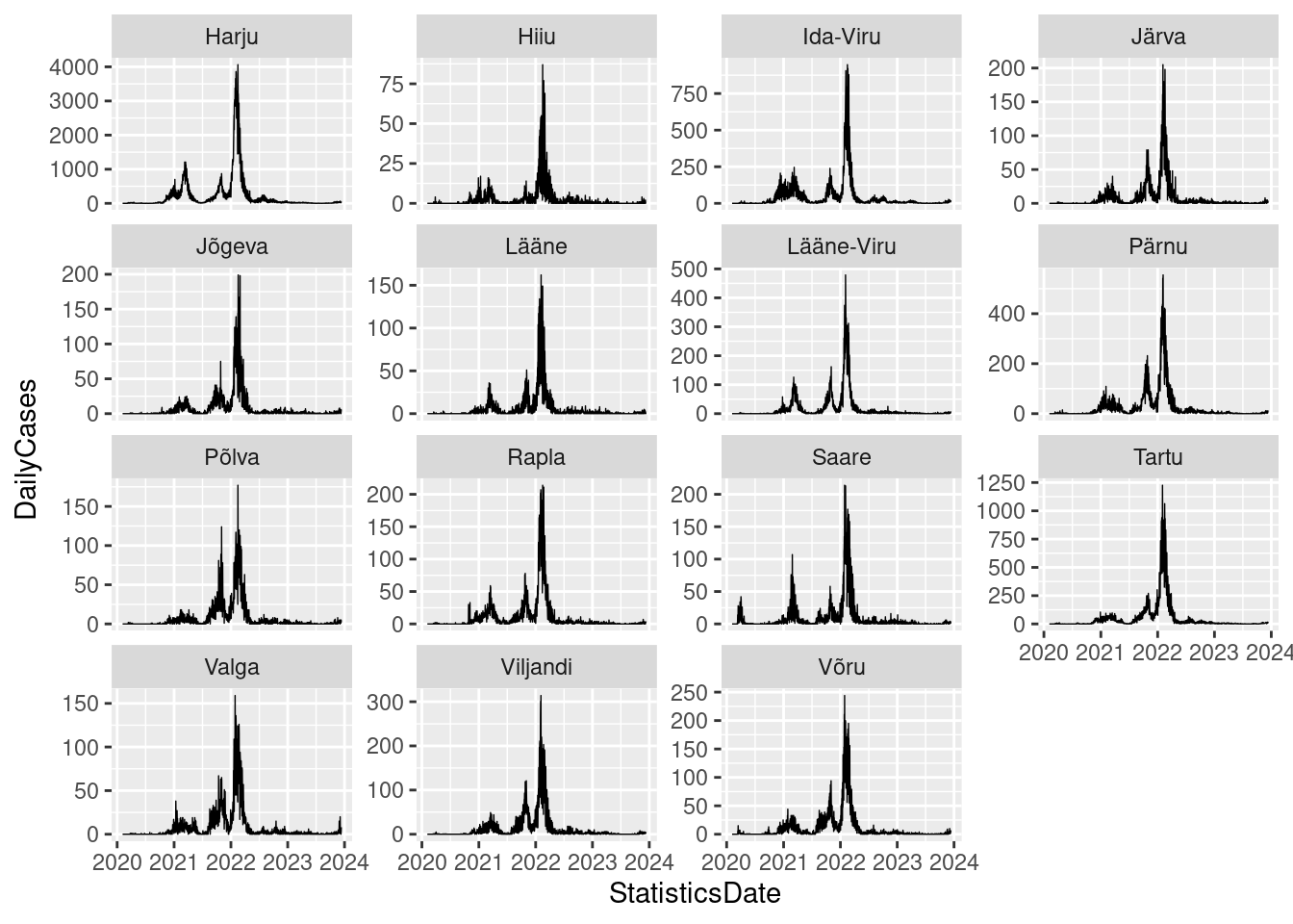
6 P 0 0 0 0Now, create a static visualization using ggplot2:
# Create a ggplot
gg_cov_cases <- ggplot()+
geom_line(data = covid19_new,
aes(x= StatisticsDate, y = DailyCases), size= .25)+
facet_wrap(vars(County), scale = "free_y") Warning: Using `size` aesthetic for lines was deprecated in ggplot2 3.4.0.
ℹ Please use `linewidth` instead.# Display the plot
gg_cov_cases
The nice thing of maps created with ggplot2 is that they can easily be given a level of interactivity when printed using the function ggplotly() from the plotly package. Let’s generate an interactive visualization using our ggplot object named gg_cov_cases.
plotly::ggplotly(gg_cov_cases)In the following example, we’ll focus on visualizing the COVID-19 case trends using only two counties, namely Tartu and Ida-Viru, from the covid19_new dataset. These counties share a relatively similar population size, each having approximately 145,000 residents.
# Filter the data for Tartu and Ida-Viru
covid19_tartu <- covid19_new %>%
filter(County == "Tartu" | County == "Ida-Viru")
# Create a ggplot
ggplot_tartu <- ggplot() +
geom_line(data = covid19_tartu,
aes(x = StatisticsDate, y = DailyCases, color = County), size= .25, alpha = .5) +
scale_colour_manual(values = c("blue", "red"))
# Convert the ggplot plot to an interactive plot
plotly::ggplotly(ggplot_tartu)Although plotly is a valuable tool, it does come with its some limitations. In specific scenarios, you might find the dygraphs package to be more suitable for creating interactive plots. dygraphs offers a range of features to enhance charting capabilities. With highly configurable axes and series display, including the option for a second Y-axis, it provides flexibility in customization.
The interactive elements, such as zooming, panning, and series/point highlighting, contribute to a dynamic user experience. Additional features include the display of upper/lower bars for prediction intervals, graph overlays like shaded regions and event lines, and point annotations. It’s crucial to be aware that dygraph requires time series data to be structured as an eXtensible Time Series (xts) format.
# Select only relevant variables
covid19_tartu2 <- covid19_tartu %>%
select(StatisticsDate, County, DailyCases)
# For dygraph the tabel should be in wide format
covid19_tartu_wide <- covid19_tartu2 %>%
pivot_wider(names_from = County,
values_from = DailyCases,
id_cols = StatisticsDate)
# Conversion to xts:
covid19_tartu_xts <- xts::xts(covid19_tartu_wide,
order.by = covid19_tartu_wide$StatisticsDate)
# In the xts format data, date is stored separately, so delete the StatisticsDate-column
covid19_tartu_xts$StatisticsDate <- NULL
#Create the dygraph
dygraph <- dygraph(covid19_tartu_xts) %>%
dySeries() %>% # Add series to the dygraph
dyRangeSelector() # Add a range selector to the dygraph
dygraphWhat about interactively visualizing the distribution of COVID-19 cases across Estonian counties? To achieve this, we will need to import a separate spatial layer for Estonian counties and subsequently merge this geographic information with the COVID-19 attribute data. Our focus will be on visualizing the number of positive cases only as of the most recent date.
# Select only relevant variables and latest cases
covid19_latest <- covid19_new %>%
select(CountyEHAK, DailyCases, StatisticsDate) %>%
filter(StatisticsDate == max(StatisticsDate))
# Data structure
glimpse(covid19_latest)Rows: 15
Columns: 3
$ CountyEHAK <chr> "0037", "0039", "0045", "0052", "0050", "0056", "0060",…
$ DailyCases <int> 52, 0, 21, 4, 6, 1, 8, 13, 2, 4, 4, 20, 8, 5, 7
$ StatisticsDate <date> 2023-12-11, 2023-12-11, 2023-12-11, 2023-12-11, 2023-12…Import the municipalities data introduced in lesson 3:
#Import data
municip <- st_read("../R_03/municipalities.gpkg")Reading layer `municipalities' from data source
`/home/geoadmin/dev/simply-general/teaching/geospatial_python_and_r/R_03/municipalities.gpkg'
using driver `GPKG'
Simple feature collection with 79 features and 5 fields
Geometry type: MULTIPOLYGON
Dimension: XY
Bounding box: xmin: 369033.8 ymin: 6377141 xmax: 739152.8 ymax: 6634019
Projected CRS: Estonian Coordinate System of 1997# Group the data by county
county <- municip %>% group_by(MNIMI, MKOOD) %>% summarize() %>% ungroup()`summarise()` has grouped output by 'MNIMI'. You can override using the
`.groups` argument.#Convert sfc_GEOMETRY to sfc_MULTIPOLYGON
county$geom <- st_cast(county$geom, "MULTIPOLYGON")
# Data structure
glimpse(county)Rows: 15
Columns: 3
$ MNIMI <chr> "Harju maakond", "Hiiu maakond", "Ida-Viru maakond", "Järva maak…
$ MKOOD <chr> "0037", "0039", "0045", "0052", "0050", "0056", "0060", "0068", …
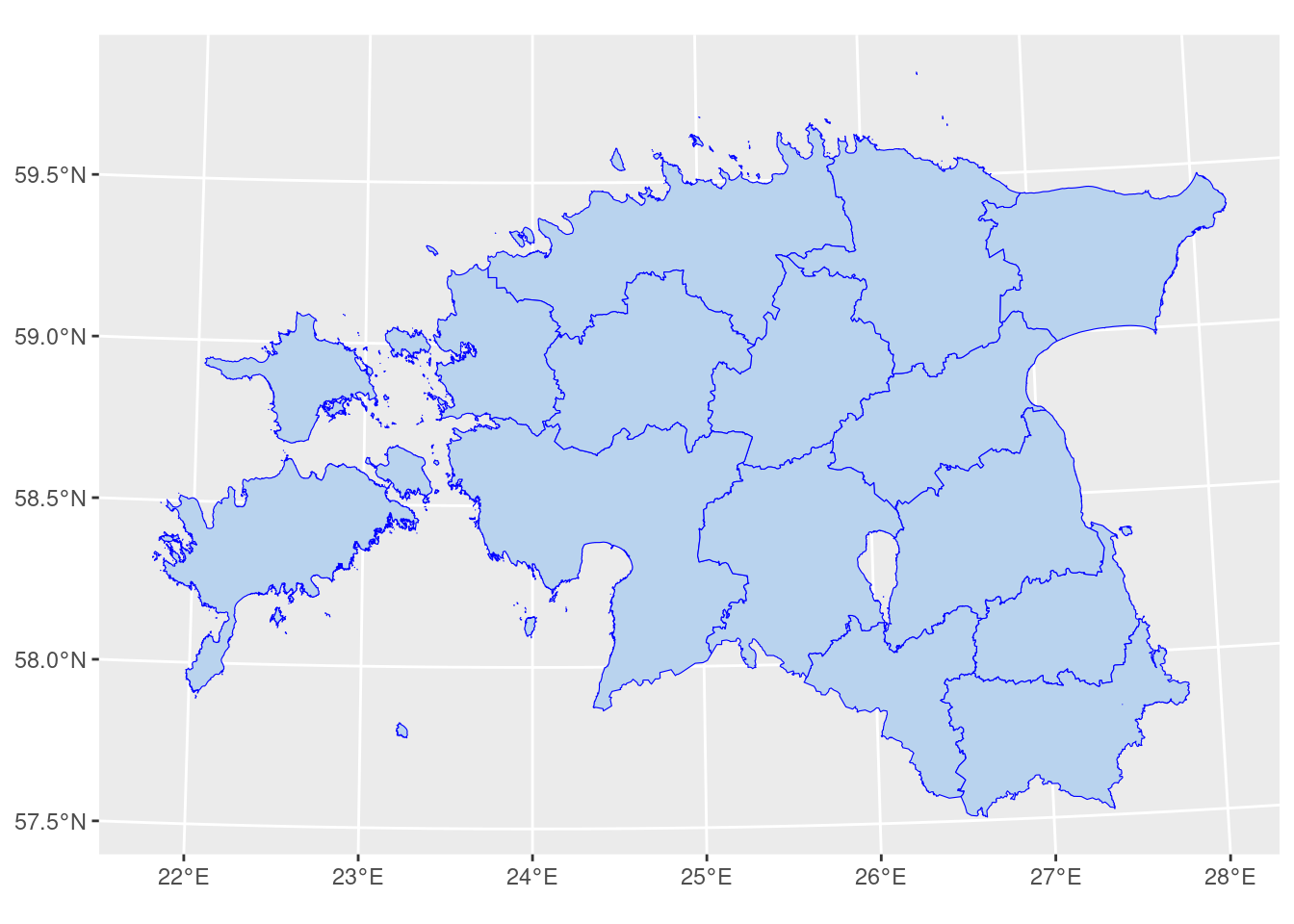
$ geom <MULTIPOLYGON [m]> MULTIPOLYGON (((551800.6 65..., MULTIPOLYGON (((418…Plot the counties:
ggplot()+
geom_sf(data = county, fill = "slategray2", col = "blue", size= .25)
We can now join the attributes from the covid19 dataset with the geographic polygons representing Estonian counties. As you know, performing an attribute join necessitates a shared key between the datasets. In our scenario, these keys are stored under separate variable names: MKOOD in the counties dataset and CountyEHAK in the COVID-19 dataset. Therefore, we use the expression c(“MKOOD” = “CountyEHAK”) to explicitly indicate which columns in the two datasets serve as matching keys during the left join operation.
#Attribute join
covid19_sf <- left_join(county, covid19_latest, by = c("MKOOD" = "CountyEHAK"))
head(covid19_sf)Simple feature collection with 6 features and 4 fields
Geometry type: MULTIPOLYGON
Dimension: XY
Bounding box: xmin: 387067 ymin: 6483179 xmax: 739152.8 ymax: 6618547
Projected CRS: Estonian Coordinate System of 1997
# A tibble: 6 × 5
MNIMI MKOOD geom DailyCases StatisticsDate
<chr> <chr> <MULTIPOLYGON [m]> <int> <date>
1 Harju maakond 0037 (((551800.6 6565734, 551475.… 52 2023-12-11
2 Hiiu maakond 0039 (((418048.7 6506295, 418045.… 0 2023-12-11
3 Ida-Viru maakond 0045 (((714892.5 6544213, 714886.… 21 2023-12-11
4 Järva maakond 0052 (((560687.8 6519693, 560642.… 4 2023-12-11
5 Jõgeva maakond 0050 (((601760.6 6498325, 601780.… 6 2023-12-11
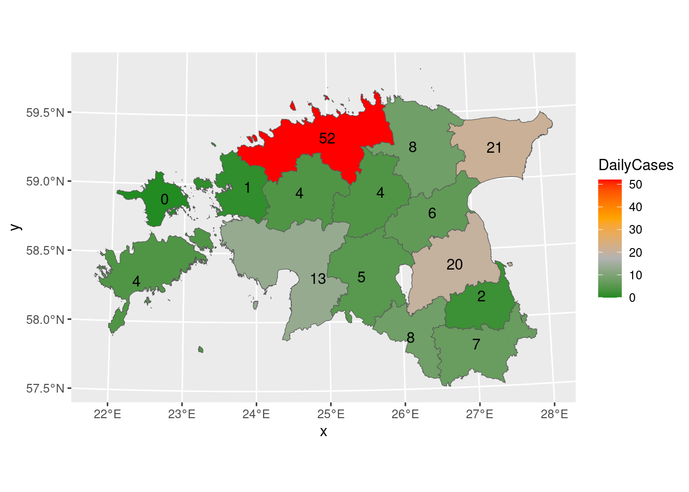
6 Lääne maakond 0056 (((457492.1 6534025, 457487.… 1 2023-12-11 Let’s create a static map for the combined data, which can subsequently be transformed into an interactive map. Including values as labels on the map can provide clear and concise information. The provided code produces a map in which the spatial elements are shaded according to the DailyCases variable, and textual labels representing daily cases are included on the map.
gg_covid19_sf <- ggplot()+
geom_sf(data = covid19_sf, aes(fill = DailyCases))+
geom_sf_text(data = covid19_sf, aes(label = DailyCases))+
scale_fill_gradientn(colours = c("forestgreen", "grey70", "orange", "red"))
gg_covid19_sf
Now, let’s try to create an interactive visualization using the plotly library. The next code converts a ggplot2 plot (gg_covid19_sf) into an interactive plotly plot using the ggplotly() function from the plotly package.
plotly::ggplotly(gg_covid19_sf)