library(tmap)
library(sf)
library(tidyverse)
library(lubridate)
library(knitr)
library(viridis)Lesson 7: Mobility analysis
Start the libraries!
(It’s recommendded is to keep/start all the used libraries in the beginning of session. This helps later to avoid conflicts between libraries)
7.1. Introduction to mobile data
It is characteristic to the modern network and information society that we meet data everywhere and very often the data is big. Big data is often a co-product of some other ICT (Information & Communication Technology) service: every usage of ICT produces some amount of data. This data describes the usage of certain services, but can also describe the behavior of the user (activity, location etc). Next we will go through some examples how different data sources can reveal spatio-temporal behavior of society and/or some smaller social group. Today, the mobile data collection is a very useful toolbox for mobility analysis. Hereby we try to “make friends” with several different datasets (mobile positioning, GPS-positioning, crimes etc). The main aim is to introduce the nature of mobile data, how it can be used in mobility studies.
7.2. GPS data collection with MobilityLog App
In Mobility Lab the mobility data, among other methods, is also collected with the help of special mobile phone application “MobilityLog”. MobilityLog is an Android application which is designed for long-term mobility tracking and social-network-related experiments. The app was developed in joint cooperation of the Computer Laboratory of the University of Cambridge and the Mobility Lab of the University of Tartu. MobilityLog tracks location with the help of GPS, WiFi access points, accelerometer, and mobile network cells. It also records other phone uses such as call events, battery level, screen activation, or alarm clock. It’s a powerful tool to monitor activities carried on by the phone user.
Thus, in addition to location information (GPS), “MobilityLog” can record other behavioral information. App sends the collected data to the servers of Mobility Lab in University of Tartu on a daily basis, where the quality of the received data is controlled. After the quality check, a set of algorithms start to calculate predefined parameters of respondent’s behavior.
Thus, the “MobilityLog” application can be used to monitor/sense the activity of phone user. Every respondent has an android phone where the data collection app is installed. In order to protect the respondents’ privacy, the data will be pseudonymised in the initial stage of data processing.
7.2.1. GPS-data
Current dataset containS three weeks of GPS data recorded during a trip to California. The data is recorded using MobilityLog. Dataset starts in 21-04-2018 and ends in 10-05-2018. All together it contains 197 375 GPS-points.
Our task is to put together initial overview about movement of one visitor in California.
7.3. Analysis of the MobilityLog GPS data
7.3.1. Data import and preparation for the analysis
In real world the preparation of data is very often one of the most annoying steps during the analysis process. Today we jump over most of the obstacles and import the pre prepared data directly from the Internet into R.
url <-  "http://aasa.ut.ee/Rspatial/data/usa_GPS.zip" # define the dataset address
download.file(url, "usa_GPS.zip") # download file
unzip("usa_GPS.zip") # unzip files
#file.remove("usa_GPS.zip") # tidy up by removing the zip file

gpsData <- read.csv2("gps_us.csv") # import data to R
glimpse(gpsData) # structure of imported file
Rows: 185,808
Columns: 17
$ user_id <int> 241, 241, 241, 241, 241, 241, 241, 241, 241, 241, 241, …
$ id <int> 646380266, 646380267, 646380268, 646380269, 646380270, …
$ restart <int> 2, 2, 2, 2, 2, 2, 2, 2, 2, 2, 2, 2, 2, 2, 2, 2, 2, 2, 2…
$ counter <dbl> 66718, 66720, 66723, 66730, 66732, 66734, 66736, 66738,…
$ time_system <dbl> 1.524345e+12, 1.524345e+12, 1.524345e+12, 1.524345e+12,…
$ time_gps <dbl> 1.524345e+12, 1.524345e+12, 1.524345e+12, 1.524345e+12,…
$ time_system_ts <chr> "2018-04-22 00:10:39", "2018-04-22 00:10:40", "2018-04-…
$ time_gps_ts <chr> "2018-04-22 00:10:36", "2018-04-22 00:10:37", "2018-04-…
$ accuracy <dbl> 12, 16, 16, 6, 4, 6, 6, 6, 4, 4, 6, 6, 6, 6, 6, 6, 6, 1…
$ altitude <dbl> -23.991000, -24.298600, -12.608500, -9.616940, -8.17016…
$ bearing <dbl> 165.957, NA, NA, NA, NA, NA, NA, NA, NA, NA, NA, NA, NA…
$ speed <dbl> 0.104187, NA, 0.000000, 0.000000, 0.000000, 0.000000, 0…
$ header_id <int> 226334354, 226334354, 226334354, 226334360, 226334360, …
$ series_id <int> 1042, 1042, 1042, 1042, 1042, 1042, 1042, 1042, 1042, 1…
$ year <int> 2018, 2018, 2018, 2018, 2018, 2018, 2018, 2018, 2018, 2…
$ X <dbl> -121.3842, -121.3842, -121.3842, -121.3842, -121.3843, …
$ Y <dbl> 38.64978, 38.64976, 38.64976, 38.64976, 38.64971, 38.64…With glimpse() we see that dataset contains 17 variables and has 185 808 rows. There are integer, double and date-time variables. To reduce the size of the dataset we keep only columns which are relevant for current analysis (time, accuracy, altitude, bearing, longitude[X], latitude[Y]):
gpsData <- gpsData %>%
  select(time_system_ts,
         accuracy,
         altitude,
         bearing,
         speed,
         X,
         Y)

gpsData %>%
  head()  # print the head of the table
time_system_ts accuracy altitude bearing speed X Y
1 2018-04-22 00:10:39 12 -23.99100 165.957 0.104187 -121.3842 38.64978
2 2018-04-22 00:10:40 16 -24.29860 NA NA -121.3842 38.64976
3 2018-04-22 00:10:41 16 -12.60850 NA 0.000000 -121.3842 38.64976
4 2018-04-22 00:10:42 6 -9.61694 NA 0.000000 -121.3842 38.64976
5 2018-04-22 00:10:43 4 -8.17016 NA 0.000000 -121.3843 38.64971
6 2018-04-22 00:10:44 6 -5.67983 NA 0.000000 -121.3843 38.64971Everything, except the column time_system_ts looks ok. Namely the time is stored as factor. To deal with dates, timestamps etc in R we can use library called lubridate. With help of this package we can convert timestamp column to date-time format:
gpsData <- gpsData %>%
  mutate(time_system_ts = ymd_hms(time_system_ts))

gpsData %>% head()
time_system_ts accuracy altitude bearing speed X Y
1 2018-04-22 00:10:39 12 -23.99100 165.957 0.104187 -121.3842 38.64978
2 2018-04-22 00:10:40 16 -24.29860 NA NA -121.3842 38.64976
3 2018-04-22 00:10:41 16 -12.60850 NA 0.000000 -121.3842 38.64976
4 2018-04-22 00:10:42 6 -9.61694 NA 0.000000 -121.3842 38.64976
5 2018-04-22 00:10:43 4 -8.17016 NA 0.000000 -121.3843 38.64971
6 2018-04-22 00:10:44 6 -5.67983 NA 0.000000 -121.3843 38.64971Now the date-time column is converted to POSIXct format. Red more about dates and times in R link
Before entering into the trouble we have to make one more step with date-time column (time_system_ts). Originally the data recorder (the smartphone with MobilityLog app) stored all locations in Estonian time zone (UTC +3). The time zone of California (UTC -7) differs from Estonian time zone 10 hours. This means we have to subtract 10 hours from the values in date-time column:
gpsData <- gpsData %>%
  mutate(time_system_ts = time_system_ts - hours(10))
Now the data should be ready for the analysis. Let’s try to summarise the data (when it starts, when it ends and how many GPS-points it contains)?
gpsData %>%
  summarise(start = min(time_system_ts),
            end = max(time_system_ts),
            'GPS points' = n()) %>%
kable()| start | end | GPS points |
|---|---|---|
| 2018-04-21 14:10:39 | 2018-05-10 13:56:51 | 185808 |
The data collection application MobilityLog is developed to save the battery of the smart phone as much as possible. For that reason the GPS-sensor is switched off every time the app realises that the phone is not moving. This means that dataset contains lot of gaps. Usually gaps in data refer to data collection problems, but in current case they contain significant information: where and when the respondent stopped during the trip?
To map the data gaps, we look at what altitude the passengers have been on their journey:
glimpse(gpsData) # check column namesRows: 185,808
Columns: 7
$ time_system_ts <dttm> 2018-04-21 14:10:39, 2018-04-21 14:10:40, 2018-04-21 1…
$ accuracy <dbl> 12, 16, 16, 6, 4, 6, 6, 6, 4, 4, 6, 6, 6, 6, 6, 6, 6, 1…
$ altitude <dbl> -23.991000, -24.298600, -12.608500, -9.616940, -8.17016…
$ bearing <dbl> 165.957, NA, NA, NA, NA, NA, NA, NA, NA, NA, NA, NA, NA…
$ speed <dbl> 0.104187, NA, 0.000000, 0.000000, 0.000000, 0.000000, 0…
$ X <dbl> -121.3842, -121.3842, -121.3842, -121.3842, -121.3843, …
$ Y <dbl> 38.64978, 38.64976, 38.64976, 38.64976, 38.64971, 38.64…ggplot()+
geom_point(data = gpsData, aes(x = time_system_ts, y = altitude), size = 0.25, col = "red")
From the plot we can see, that dataset covers time period from middle of the April to the middle of May. At first glance, it seems that the data has been collected properly for the entire period and there are no large data gaps.
Looks like there are a few gaps in data!? Suspicious… If we assume, that GPS records location after every second, then the dataset should contain 1.640772^{6} rows, but it is ca 10 times smaller. This means we have to be more clever to bring out the gaps. Currently it seems, that the horizontal axis is pressed together and gaps are hidden under the data points. One possibility is to create tile-plot, where the horizontal axis represents days and the vertical axis represents time. Additionally we can colour the data points according to the GPS-speed.
To do that, we have to calculate Date and time column. To avoid potential problems with time we calculate it in decimal scale where 0 is midnight, 12 is midday and 24 is midnight again:
gpsData <- gpsData %>%
  mutate(time_dec = hour(time_system_ts) + (minute(time_system_ts)/60),
                date = as.Date(time_system_ts))
And now the plot:
# first version:
# pay attention on subset() which filters out some gps-points (speed = 0)
ggplot()+
  geom_tile(data= subset(gpsData, speed > 0), aes(x=date, y=time_dec , fill=speed))
The first version wasn’t to beautiful. After some polishing (with theme() you can design the plot as you like!):
library(viridis)

ggplot()+
  theme(panel.background = element_rect(fill="black"),
        panel.grid.major = element_line(colour = "grey10"),
        panel.grid.minor = element_line(colour = "grey10"),
        plot.background = element_rect(fill="black"),
        legend.background = element_rect(fill="black"),
        legend.text = element_text(colour = "grey"),
        legend.title = element_text(colour = "grey"),
        axis.text = element_text(colour="grey"),
        axis.title = element_text(colour = "grey"),
        plot.title = element_text(colour="grey"))+ #theme() allows to change all the design elements of plot
  geom_tile(data= subset(gpsData, speed > 0), aes(x=date, y=time_dec , fill=speed))+ # the plot itself
  scale_fill_viridis_c(option = "plasma")+ #colour palette
  labs(title="Time in movement", x="date", y="time")+ #titles
  scale_y_continuous(breaks = seq(0, 24, 3))+ # change the time axis to better format
  guides(fill=F) # hide the legend
Warning: The `<scale>` argument of `guides()` cannot be `FALSE`. Use "none" instead as
of ggplot2 3.3.4.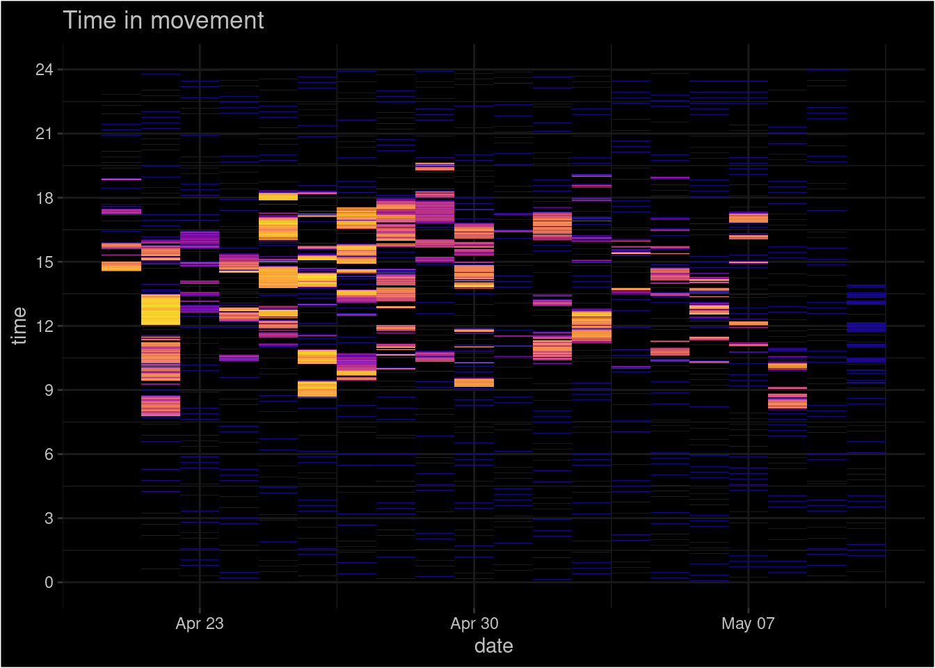
7.3.2. Save the plot!
There is no use of beautiful visualization if we can’t export it to our research papers and presentations. Saving the plot as raster or vector is easy. We use .png because .jpg had problems with Mac OS:
ggsave("file_name.png", units = "in", dpi = 300, height = 4, width = 6)How to export it as pdf?
7.3.3. Map the data!
GPS data obviously contains spatial information. We should study spatial patterns. Plot the coordinates:
ggplot()+
  geom_point(data = gpsData, aes(y = Y, x = X))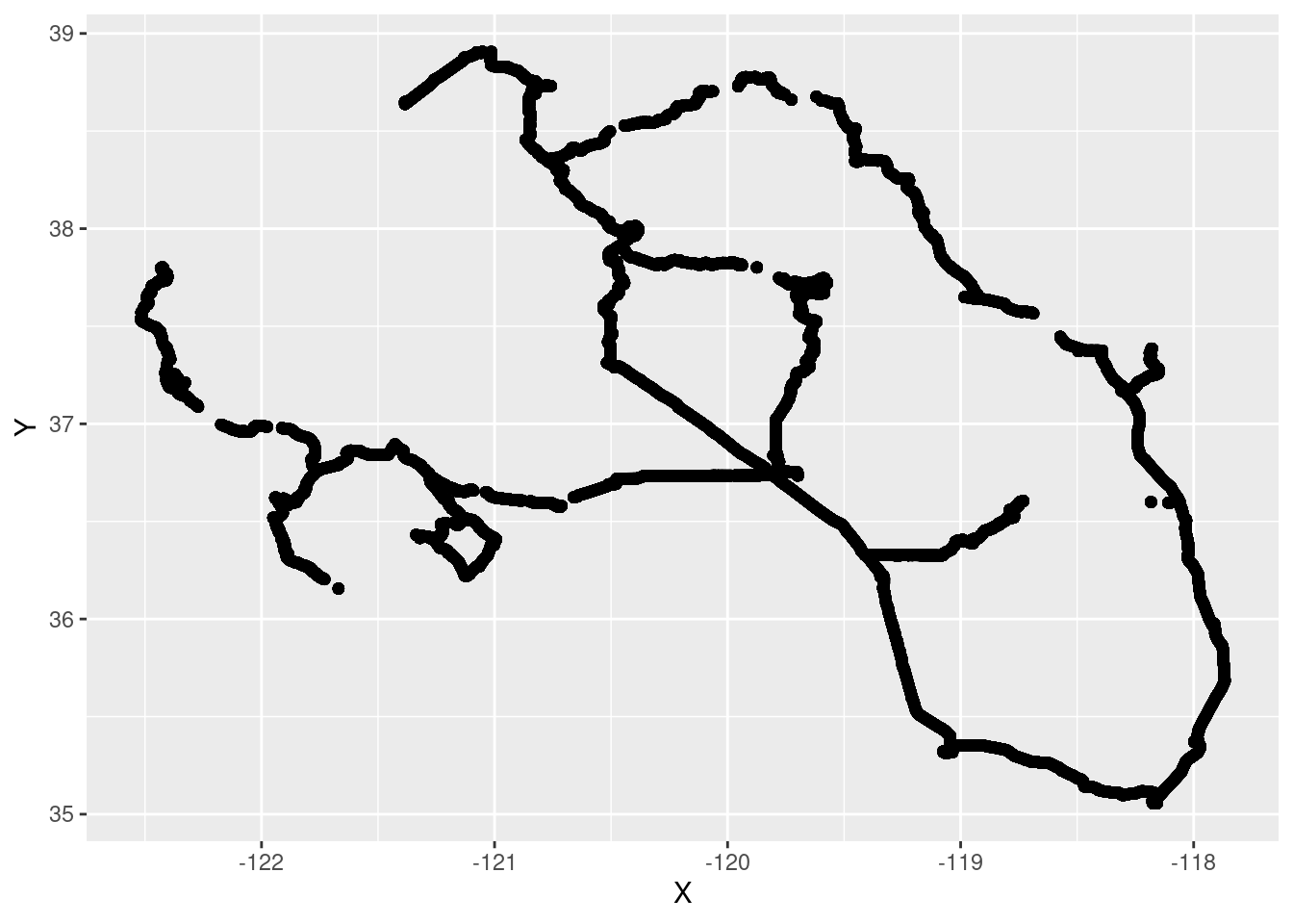
Plotted spatial data is not a map! Map needs spatial context. We need to use base map. One of the easiest solutions is to use package tmap.
First we have to convert the plain data table to spatial object. We use library sf for this:
gpsData_sf <- gpsData %>%
  st_as_sf(coords = c("X", "Y"), crs = 4326)
For the spatial context we can use tmap_mode("view"):
tmap_mode("view")

tm_shape(gpsData_sf)+
  tm_dots("magenta", size = .01)
Screenshot of the map:
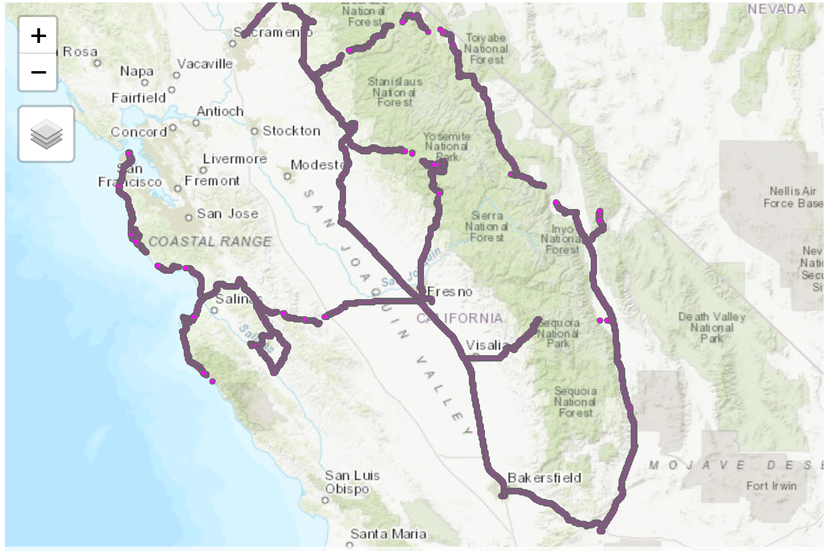
You can also use this link to directly access the interactive map from the web.
Where were the highest and lowest points visited during the trip?
For that we can run simple query:
trip_extremes <- gpsData_sf %>%
  filter(altitude == min(altitude) | altitude == max(altitude)) # "|" stands for "OR"

trip_extremes %>%
kable()| time_system_ts | accuracy | altitude | bearing | speed | time_dec | date | geometry |
|---|---|---|---|---|---|---|---|
| 2018-04-27 10:58:30 | 4 | 3073.550 | NA | 0.000000 | 10.966667 | 2018-04-27 | POINT (-118.1789 37.38543) |
| 2018-05-08 07:07:35 | 96 | -192.916 | 348.241 | 0.216682 | 7.116667 | 2018-05-08 | POINT (-122.3295 37.20981) |
# altitude -192 refers, that it is under the sea level; it's probably GPS-error (check the accuracy!)And now the map:
tmap_mode("view")tmap mode set to interactive viewingtm_shape(trip_extremes)+
tm_dots(col = "altitude", palette = c("blue", "red"))We should add more information on the map. For example: - What was the altitude? - When was the place visited? - Why this place is worth to visit? :)
# round the elevation:
trip_extremes <- trip_extremes %>%
  mutate(altitude = round(altitude,0))

tm_basemap("Esri.WorldTopoMap")+
tm_shape(trip_extremes)+
  tm_dots(col = "altitude", palette = c("blue", "red"), legend.show = F, size = .25, alpha = .7) +
  tm_text("altitude",
          bg.color = "white",
          bg.alpha = 1,
          just = "bottom", fontface =  "bold",
          xmod = 8) +
  tm_layout(title = "The highest and the lowest locations visited during the trip, m")
So much (little) about GPS-data. It was just a feather-light touch of possibilities…
7.4. Passive Mobile Positioning
Passive mobile positioning means, that we are using Call Detail Records (CDR) data. CDR is a dataset, which contains log-files collected by mobile network operators to monitor and keep track of billable calling services used by their clients. Such dataset that contains information about the phone call initiator (the unique and anonymous ID), time of calling activities as well as the location of the mobile antenna where the call activity was made, is an excellent source for analysing spatio-temporal behaviour of phone users.
CDR-data in the following example is stored in two separete files. One of them is the log-file off calling activities (cdr_example) and another contains spatial information about the mobile antennas (cdr_antennas).
First we import the log-files:
cdr_example <- read.csv2("http://aasa.ut.ee/Rspatial/data/cdr_example.csv", sep=";", dec = ".")

cdr_example %>%
  head()
time site_id.y pos_usr_id date
1 2008-04-01 08:40:45 264 John 2008-04-01
2 2008-04-01 08:56:34 264 John 2008-04-01
3 2008-04-01 09:08:27 348 John 2008-04-01
4 2008-04-01 09:11:19 215 John 2008-04-01
5 2008-04-01 09:15:50 215 John 2008-04-01
6 2008-04-01 09:22:31 148 John 2008-04-01At first glimpse everything looks ok! Only problem is that time is stored not as time but as character. Convert time to proper format and calculate date and time (hours) columns:
cdr_example <- cdr_example %>%
  mutate(time = ymd_hms(as.character(time)),
         date = as.Date(time),
         hour = hour(time),
         minute = minute(time))

glimpse(cdr_example)
Rows: 42,112
Columns: 6
$ time <dttm> 2008-04-01 08:40:45, 2008-04-01 08:56:34, 2008-04-01 09:08…
$ site_id.y <int> 264, 264, 348, 215, 215, 148, 498, 498, 498, 498, 498, 498,…
$ pos_usr_id <chr> "John", "John", "John", "John", "John", "John", "John", "Jo…
$ date <date> 2008-04-01, 2008-04-01, 2008-04-01, 2008-04-01, 2008-04-01…
$ hour <int> 8, 8, 9, 9, 9, 9, 10, 10, 16, 16, 16, 16, 17, 17, 8, 8, 9, …
$ minute <int> 40, 56, 8, 11, 15, 22, 31, 49, 31, 39, 41, 54, 6, 42, 56, 5…Now we import the table of antennas:
#cdr_antennas <- read.csv2("C:/ANTO/loengud/geopythonR/www/anto_cells_19102015.csv", dec = ".")
cdr_antennas <- read.csv2("http://aasa.ut.ee/Rspatial/data/sites.csv", sep = ";", dec = ",")

glimpse(cdr_antennas)
Rows: 1,117
Columns: 3
$ site_id <int> 351, 243, 601, 974, 667, 424, 269, 252, 187, 749, 1096, 133, 1…
$ lat <dbl> 57.74861, 59.08381, 59.40694, 59.38417, 58.38350, 58.05833, 58…
$ lon <dbl> 26.35027, 24.63264, 24.81722, 24.82553, 24.48503, 26.49500, 24…Easiest way to perform a quality check is to plot the data:
ggplot()+
  geom_point(data = cdr_antennas, aes(x = lon, y = lat))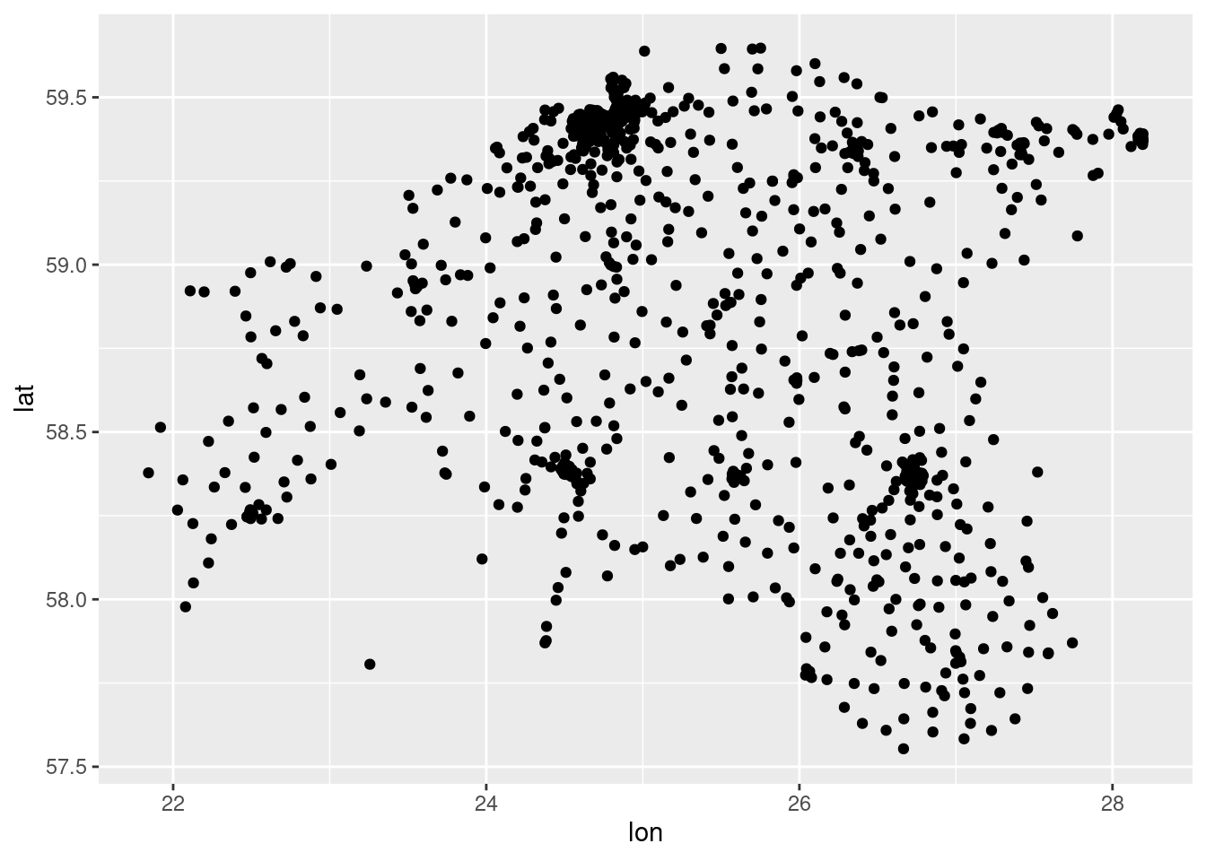
Now we have to put two tables together. This process is called joining. In the current case we use left_join which returns us all records from the left table (cdr_example), and the matched records from the right table (cdr_antennas). For that we have to define the key-column by which tables are joined. The result is NULL from the right side, if there is no match.
cdr_example2 <- left_join(cdr_example, cdr_antennas, by = c("site_id.y" = "site_id"))

cdr_example2 %>%
  head()
time site_id.y pos_usr_id date hour minute lat
1 2008-04-01 08:40:45 264 John 2008-04-01 8 40 58.78721
2 2008-04-01 08:56:34 264 John 2008-04-01 8 56 58.78721
3 2008-04-01 09:08:27 348 John 2008-04-01 9 8 58.66305
4 2008-04-01 09:11:19 215 John 2008-04-01 9 11 58.84897
5 2008-04-01 09:15:50 215 John 2008-04-01 9 15 58.84897
6 2008-04-01 09:22:31 148 John 2008-04-01 9 22 58.74500
lon
1 26.01778
2 26.01778
3 26.09499
4 26.29264
5 26.29264
6 26.39861Check are there any rows without coordinates(NA)! This means that location information is missing for those antennas. Filter them out!
nrow(cdr_example2)[1] 42112cdr_example2 <- cdr_example2 %>%
filter(!is.na(lat)) # is.na() finds all cells where value is NA (not available), !is.na() works vice versa
nrow(cdr_example2)[1] 42112How many rows where excluded?
7.4.1. Frequently visited places
glimpse(cdr_example2)Rows: 42,112
Columns: 8
$ time <dttm> 2008-04-01 08:40:45, 2008-04-01 08:56:34, 2008-04-01 09:08…
$ site_id.y <int> 264, 264, 348, 215, 215, 148, 498, 498, 498, 498, 498, 498,…
$ pos_usr_id <chr> "John", "John", "John", "John", "John", "John", "John", "Jo…
$ date <date> 2008-04-01, 2008-04-01, 2008-04-01, 2008-04-01, 2008-04-01…
$ hour <int> 8, 8, 9, 9, 9, 9, 10, 10, 16, 16, 16, 16, 17, 17, 8, 8, 9, …
$ minute <int> 40, 56, 8, 11, 15, 22, 31, 49, 31, 39, 41, 54, 6, 42, 56, 5…
$ lat <dbl> 58.78721, 58.78721, 58.66305, 58.84897, 58.84897, 58.74500,…
$ lon <dbl> 26.01778, 26.01778, 26.09499, 26.29264, 26.29264, 26.39861,…cdr_antenna_count <- cdr_example2 %>%
group_by(lat, lon) %>%
#summarise(n = n()) %>%
tally() %>% # difference between tally() and summarise(n = n())?
ungroup()
ggplot()+
geom_point(data = cdr_antenna_count, aes(x = lon, y = lat, size = n, alpha = n), colour = "red")
For spatial context we use the contours of Estonian counties. (check from previous sessions).
Import polygons as county from lesson 3.
county <- st_read("../R_03/municipalities.gpkg")Reading layer `municipalities' from data source
`/home/geoadmin/dev/simply-general/teaching/geospatial_python_and_r/R_03/municipalities.gpkg'
using driver `GPKG'
Simple feature collection with 79 features and 5 fields
Geometry type: MULTIPOLYGON
Dimension: XY
Bounding box: xmin: 369033.8 ymin: 6377141 xmax: 739152.8 ymax: 6634019
Projected CRS: Estonian Coordinate System of 1997# download.file("https://geoportaal.maaamet.ee/docs/haldus_asustus/maakond_shp.zip", destfile = "maakond_shp.zip")
# #maakond means county!
# unzip("maakond_shp.zip")
# county <- st_read("maakond_20231101.shp")Was the geolayer import successful?
# check CRS:
st_crs(county)
Coordinate Reference System:
User input: Estonian Coordinate System of 1997
wkt:
PROJCRS["Estonian Coordinate System of 1997",
BASEGEOGCRS["EST97",
DATUM["Estonia 1997",
ELLIPSOID["GRS 1980",6378137,298.257222101,
LENGTHUNIT["metre",1]]],
PRIMEM["Greenwich",0,
ANGLEUNIT["Degree",0.0174532925199433]]],
CONVERSION["unnamed",
METHOD["Lambert Conic Conformal (2SP)",
ID["EPSG",9802]],
PARAMETER["Latitude of false origin",57.5175539305556,
ANGLEUNIT["Degree",0.0174532925199433],
ID["EPSG",8821]],
PARAMETER["Longitude of false origin",24,
ANGLEUNIT["Degree",0.0174532925199433],
ID["EPSG",8822]],
PARAMETER["Latitude of 1st standard parallel",58,
ANGLEUNIT["Degree",0.0174532925199433],
ID["EPSG",8823]],
PARAMETER["Latitude of 2nd standard parallel",59.3333333333333,
ANGLEUNIT["Degree",0.0174532925199433],
ID["EPSG",8824]],
PARAMETER["Easting at false origin",500000,
LENGTHUNIT["metre",1],
ID["EPSG",8826]],
PARAMETER["Northing at false origin",6375000,
LENGTHUNIT["metre",1],
ID["EPSG",8827]]],
CS[Cartesian,2],
AXIS["easting",east,
ORDER[1],
LENGTHUNIT["metre",1]],
AXIS["northing",north,
ORDER[2],
LENGTHUNIT["metre",1]],
ID["EPSG",3301]]#Filter county
county <- county %>%
group_by(MNIMI) %>%
summarize() %>%
ungroup()
ggplot()+
geom_sf(data = county, colour = "white", fill = "grey80", size = 0.25)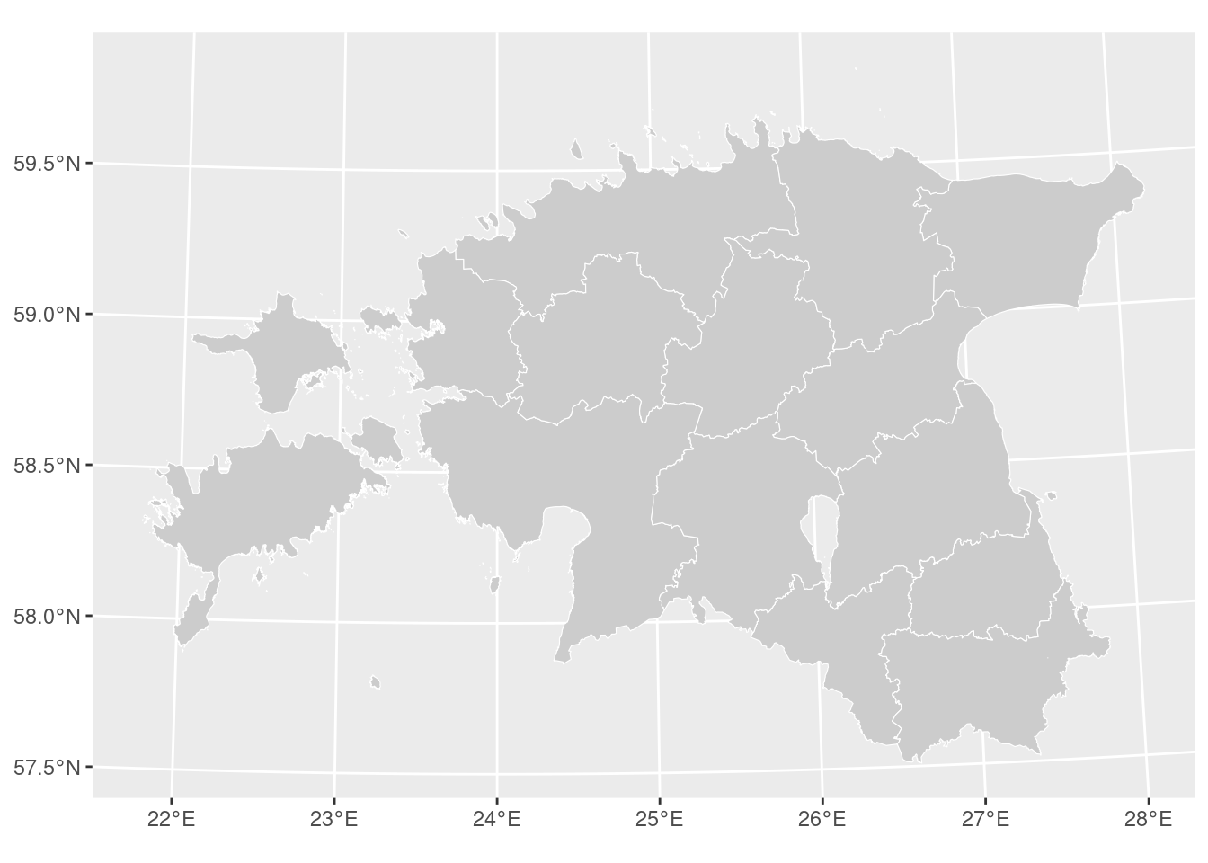
Nice!
Visualize frequently visited places (put together layer of Estonian counties and mobile positioning data):
ggplot()+
  theme_minimal()+
  geom_sf(data = county, colour = "white", fill= "grey80", size = 0.25)+
  geom_point(data = cdr_antenna_count, aes(x = lon, y = lat, size = n, alpha = n), colour = "red")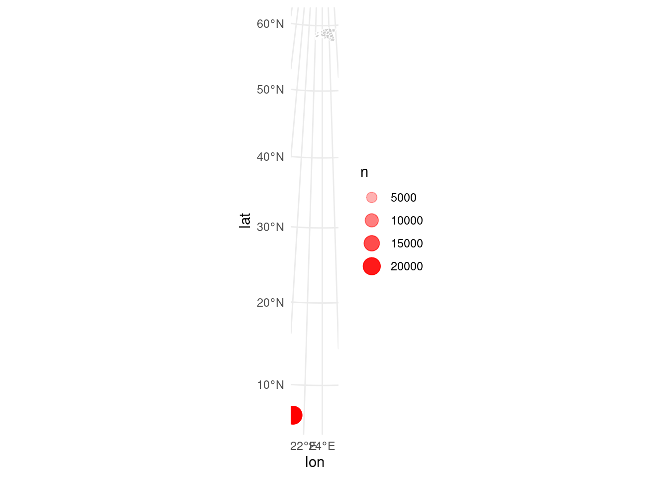
Problem! Can you figure out why?
Problem is that two datasets are in different coordinate reference system (CRS): borders of counties are in LEST-97 (epsg:3301) and mobile positioning data is in WGS84 (epsg:4326). Let’s use Estonian system. This means we have to convert CDR-data to the Estonian reference system:
glimpse(cdr_antennas)Rows: 1,117
Columns: 3
$ site_id <int> 351, 243, 601, 974, 667, 424, 269, 252, 187, 749, 1096, 133, 1…
$ lat <dbl> 57.74861, 59.08381, 59.40694, 59.38417, 58.38350, 58.05833, 58…
$ lon <dbl> 26.35027, 24.63264, 24.81722, 24.82553, 24.48503, 26.49500, 24…# convert plain table to spatial object:
cdr_antennas_wgs84_sf <- st_as_sf(cdr_antennas, coords = c("lon", "lat"), crs = 4326, remove = F)
# transform the antennas layer to Estonian CRS:
cdr_antennas_lest97_sf <- st_transform(cdr_antennas_wgs84_sf, 3301)
#check the table:
head(cdr_antennas_lest97_sf)Simple feature collection with 6 features and 3 fields
Geometry type: POINT
Dimension: XY
Bounding box: xmin: 528372 ymin: 6403187 xmax: 647260.9 ymax: 6585730
Projected CRS: Estonian Coordinate System of 1997
site_id lat lon geometry
1 351 57.74861 26.35027 POINT (639930.8 6403187)
2 243 59.08381 24.63264 POINT (536270.8 6549622)
3 601 59.40694 24.81722 POINT (546413.9 6585730)
4 974 59.38417 24.82553 POINT (546917.6 6583199)
5 667 58.38350 24.48503 POINT (528372 6471551)
6 424 58.05833 26.49500 POINT (647260.9 6437971)# lat/long columns are in WGS-84, geometry is in L-EST97
# add columns with LEST-97 coordinates as well!
cdr_antennas_lest97_sf <- cbind(cdr_antennas_lest97_sf, st_coordinates(cdr_antennas_lest97_sf))
# convert the result back to data frame:
cdr_antennas_lest97_df <- (cdr_antennas_lest97_sf) %>%
st_drop_geometry() %>%
as_tibble()
glimpse(cdr_antennas_lest97_df)Rows: 1,117
Columns: 5
$ site_id <int> 351, 243, 601, 974, 667, 424, 269, 252, 187, 749, 1096, 133, 1…
$ lat <dbl> 57.74861, 59.08381, 59.40694, 59.38417, 58.38350, 58.05833, 58…
$ lon <dbl> 26.35027, 24.63264, 24.81722, 24.82553, 24.48503, 26.49500, 24…
$ X <dbl> 639930.8, 536270.8, 546413.9, 546917.6, 528372.0, 647260.9, 54…
$ Y <dbl> 6403187, 6549622, 6585730, 6583199, 6471551, 6437971, 6535556,…# Join tables again:
cdr_example2 <- left_join(cdr_example, cdr_antennas_lest97_df, by = c("site_id.y" = "site_id"))
cdr_example2 %>%
head() time site_id.y pos_usr_id date hour minute lat
1 2008-04-01 08:40:45 264 John 2008-04-01 8 40 58.78721
2 2008-04-01 08:56:34 264 John 2008-04-01 8 56 58.78721
3 2008-04-01 09:08:27 348 John 2008-04-01 9 8 58.66305
4 2008-04-01 09:11:19 215 John 2008-04-01 9 11 58.84897
5 2008-04-01 09:15:50 215 John 2008-04-01 9 15 58.84897
6 2008-04-01 09:22:31 148 John 2008-04-01 9 22 58.74500
lon X Y
1 26.01778 616661.9 6518169
2 26.01778 616661.9 6518169
3 26.09499 621556.7 6504483
4 26.29264 632312.8 6525554
5 26.29264 632312.8 6525554
6 26.39861 638839.8 6514195# count calls by antennas:
cdr_antenna_count <- cdr_example2 %>%
group_by(site_id.y, X, Y) %>%
tally() %>%
ungroup()
glimpse(cdr_antenna_count)Rows: 651
Columns: 4
$ site_id.y <int> 3, 4, 5, 6, 7, 9, 10, 11, 12, 13, 14, 16, 17, 19, 20, 21, 22…
$ X <dbl> 527933.1, 581634.9, 591412.8, 550018.7, 507100.9, 677858.0, …
$ Y <dbl> 6567107, 6443624, 6573544, 6592009, 6484621, 6457624, 658023…
$ n <int> 11, 3, 34, 1, 2, 6, 3, 3, 3, 1, 1, 24, 153, 8, 5, 3, 1, 140,…# plot the map:
ggplot()+
#theme_minimal()+
theme_void()+
geom_sf(data = county, colour = "white", fill= "grey80", size = 0.25)+
geom_point(data = cdr_antenna_count, aes(x = X, y = Y, size=n, alpha=n), colour="red")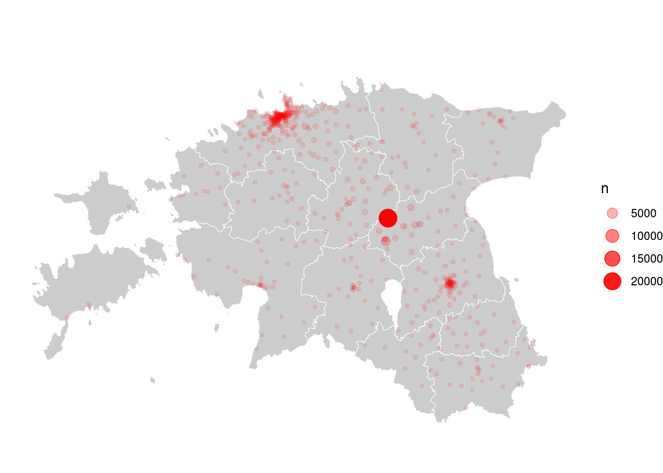
In general it’s ok, but plotting is quite slow. This is because counties layer is very detail and large. We can make it faster. For that we can generalize (simplify the map):
county_smpl <- st_simplify(county, preserveTopology = T, dTolerance = 200)Plot it again:
ggplot()+
  theme_minimal()+
  geom_sf(data = county_smpl, colour = "grey", fill= "snow", size = 0.25)+
  geom_point(data = cdr_antenna_count, aes(x = X, y = Y, size = n, alpha = n), colour = "red")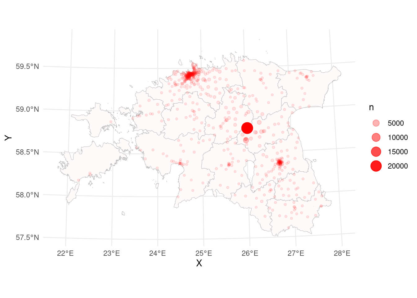
cdr_example2 %>%
  summarise(min_time = min(time), max_time = max(time)) %>%
kable()| min_time | max_time |
|---|---|
| 2008-01-01 01:20:41 | 2014-12-31 20:12:53 |
7.4.2. Find home and work location!
In mobility studies the location of home or working place of the respondent is crucial. Can we detect it from mobile positioning data as well?
We may assume, that home is the most important place for every person. This allows us to assume, that at home we use our mobile phones the most, and the working place is the second most important place (of course those assumptions are over simplified, but we don’t have too much time to dig deeper).
In the following query we count (n()) all calling activities grouping them by antennas. Afterwards we sort the result starting with the largest value (descending), finally the tables head is saved to new data frame:
cdr_example_aggrActivities <- cdr_example2 %>%
  group_by(site_id.y) %>%
  summarise(n = n()) %>%
  arrange(-n) %>%
  head()

cdr_example_aggrActivities %>%
kable()| site_id.y | n |
|---|---|
| 264 | 22444 |
| 498 | 2809 |
| 215 | 918 |
| 147 | 783 |
| 817 | 691 |
| 1161 | 537 |
According to the assumptions we defined earlier we can see from the results that antenna (site) 264 is the home location and antenna with id 498 is the working place. Where are they located in space? To answer that question we have to use the coordinates as well:
cdr_example_aggrActivities <- cdr_example2 %>%
  group_by(site_id.y, X, Y) %>%
  tally() %>%
  arrange(desc(n)) %>%
  head()

cdr_example_aggrActivities %>%
kable()| site_id.y | X | Y | n |
|---|---|---|---|
| 264 | 616661.9 | 6518169 | 22444 |
| 498 | 615088.8 | 6502337 | 2809 |
| 215 | 632312.8 | 6525554 | 918 |
| 147 | 635306.9 | 6513513 | 783 |
| 817 | 559703.7 | 6581428 | 691 |
| 1161 | 627174.9 | 6512670 | 537 |
And then we put possible home and work places on the map:
ggplot()+
  theme_minimal()+
  geom_sf(data = county_smpl, colour = "grey", fill = "snow", size = 0.25)+
  geom_point(data = cdr_example_aggrActivities[1,], aes(x = X, y = Y, colour = "home"), size = 2)+ # [1,] selects first row in table
  geom_point(data = cdr_example_aggrActivities[2,], aes(x = X, y = Y, colour = "work"), size = 2)+
  scale_colour_manual(values = c("orange", "dodgerblue"))
7.4.3. Visualize movement path
CDR-data is commonly used in mobility studies. The accuracy of the data doesn’t allow exactly the turn-by-turn analysis of movement, but it’s a priceless source to analyse commuting, tourism, migration etc patterns.
Again let’s check the column names. And then plot paths on the map.
glimpse(cdr_example2)Rows: 42,112
Columns: 10
$ time <dttm> 2008-04-01 08:40:45, 2008-04-01 08:56:34, 2008-04-01 09:08…
$ site_id.y <int> 264, 264, 348, 215, 215, 148, 498, 498, 498, 498, 498, 498,…
$ pos_usr_id <chr> "John", "John", "John", "John", "John", "John", "John", "Jo…
$ date <date> 2008-04-01, 2008-04-01, 2008-04-01, 2008-04-01, 2008-04-01…
$ hour <int> 8, 8, 9, 9, 9, 9, 10, 10, 16, 16, 16, 16, 17, 17, 8, 8, 9, …
$ minute <int> 40, 56, 8, 11, 15, 22, 31, 49, 31, 39, 41, 54, 6, 42, 56, 5…
$ lat <dbl> 58.78721, 58.78721, 58.66305, 58.84897, 58.84897, 58.74500,…
$ lon <dbl> 26.01778, 26.01778, 26.09499, 26.29264, 26.29264, 26.39861,…
$ X <dbl> 616661.9, 616661.9, 621556.7, 632312.8, 632312.8, 638839.8,…
$ Y <dbl> 6518169, 6518169, 6504483, 6525554, 6525554, 6514195, 65023…ggplot()+
geom_sf(data = county_smpl, colour = "grey", fill = "snow", size = 0.25)+
geom_path(data = cdr_example2, aes(x = X, y = Y), size = 0.2, col = "red")Warning: Using `size` aesthetic for lines was deprecated in ggplot2 3.4.0.
ℹ Please use `linewidth` instead.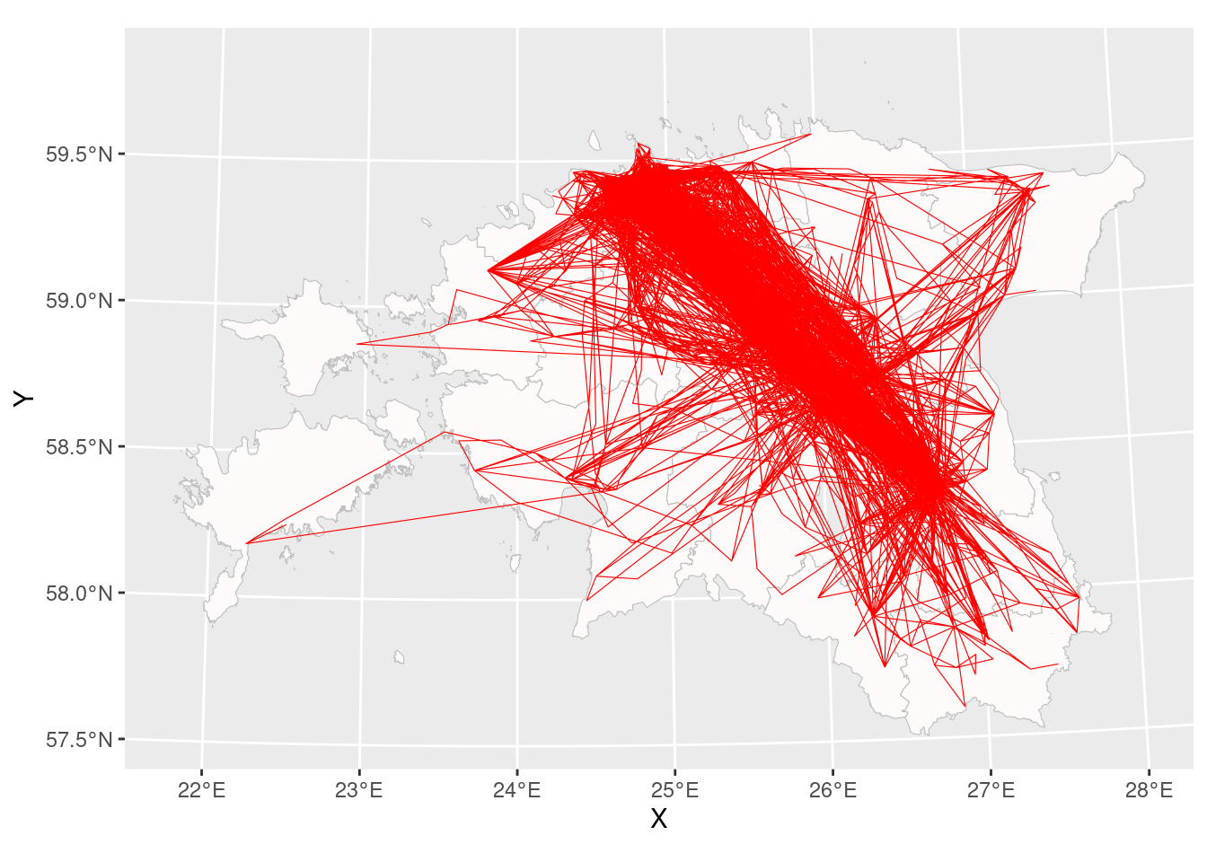
Results look like a plate full of spaghetti, it’s very hard to understand which places were visited more often and which places less often.
May changing the the transparency (alpha) value helps?
ggplot()+
  geom_path(data = cdr_example2, aes(x = X, y = Y), linewidth = 0.2, col = "red", alpha = 0.5)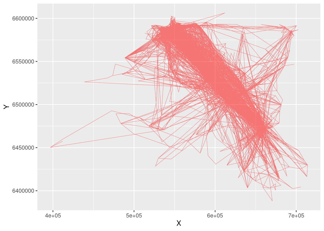
Nothing better… It’s because the path is created as a single line. But there is a solution to improve it!
We should draw separate line between every two location points! For that geom_segment can be used. To define the end of segment we use lead(), where we say that segment ends with a value on a next row:
ggplot()+
  geom_sf(data = county_smpl, colour = "grey", fill = "snow", size = 0.25)+
  geom_segment(data = cdr_example2, aes(x = X, xend = lead(X, 1), y = Y, yend = lead(Y, 1)), alpha = 0.05, size = 0.25)
Warning: Removed 1 rows containing missing values (`geom_segment()`).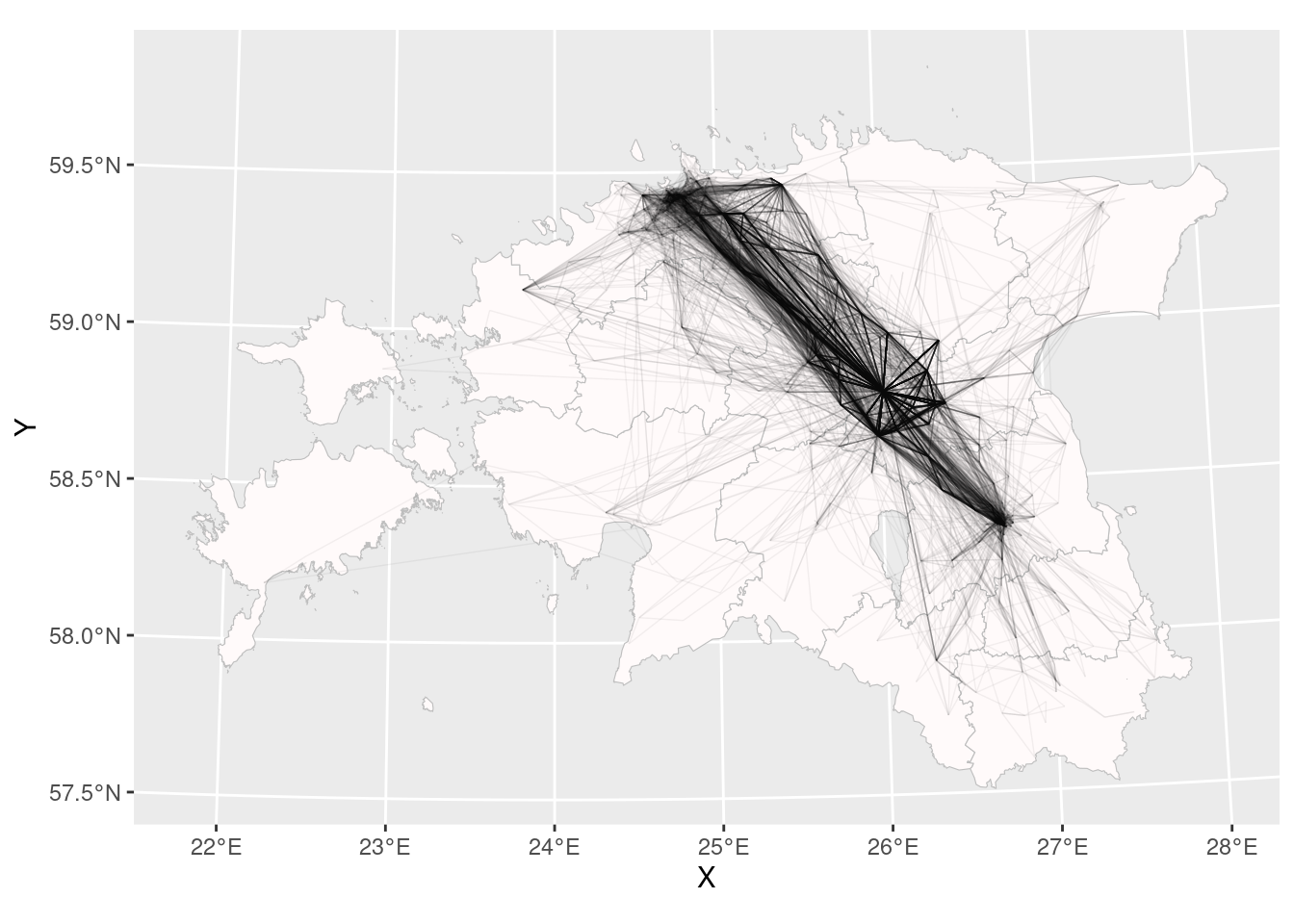
Or maybe curves?
ggplot()+
  geom_sf(data = county_smpl, colour = "grey", fill = "snow", size = 0.25)+
  geom_curve(data = cdr_example2, aes(x = X, xend = lead(X, 1), y = Y, yend = lead(Y, 1)), alpha = 0.05, size = 0.25, curvature = 0.15)
Error! Curve cannot start and end in same location!
# filter:
cdr_example3 <- cdr_example2 %>%
  filter(X != lead(X,1))

ggplot()+
  geom_sf(data = county_smpl, colour = "grey", fill = "snow", size = 0.25)+
  geom_curve(data = cdr_example3, aes(x = X, xend = lead(X, 1), y = Y, yend = lead(Y, 1)), alpha = 0.025, size = 0.25, curvature = 0.2, colour = "red4")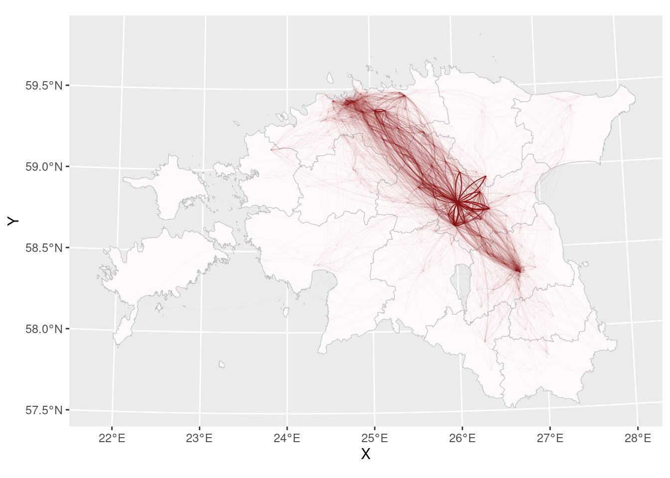
Pretty good!
Sometimes we want to use dark background for the thematic layers. We can define it manually in theme():
ggplot()+
  theme(panel.background = element_rect(fill = "black"),
        panel.grid = element_line(color = "grey20"))+
  geom_sf(data = county_smpl, colour = "grey20", fill = "grey10", size = 0.25)+
  geom_curve(data = cdr_example3, aes(x = X, xend = lead(X, 1), y = Y, yend = lead(Y, 1)), alpha = 0.01, size = 0.25, curvature = 0.2, colour = "cyan")
In case you don’t have time to develop your on ggplot2 theme, you can use some other dark theme from library(ggdark). Install it and yuse it:
library(ggdark)
ggplot()+
  dark_theme_void()+
  #dark_theme_grey(12)+ # 12 is the default font size
  geom_sf(data = county_smpl, colour = "grey20", fill = "grey10", size = 0.25)+
  geom_curve(data = cdr_example3, aes(x = X, xend = lead(X, 1), y = Y, yend = lead(Y, 1)), alpha = 0.01, size = 0.25, curvature = 0.2, colour = "cyan")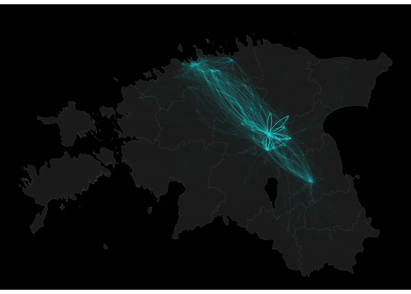
7.4.4. Points to lines
The previous map is quite attractive and informative. But lines and arcs are not geometrical objects but just the visualization in ggplot2. For proper spatial analysis, it has to be a real spatial object. It means we have to convert the sequence of points to lines. Let’s set ourselves the task of creating a separate path for every day.
We must remember that drawing a path or line means having at least two locations (points). It means we have to filter out the days where we have only one location record:
# create sf-object:
cdr_example3_sf <- cdr_example3 %>%
  st_as_sf(coords = c("X", "Y"), crs = 3301)

# select days with 1 location:
cdr_example3_sf_LINE_PTS <- cdr_example3_sf %>%
  st_drop_geometry() %>%
  group_by(date) %>%
  tally() %>%
  ungroup() %>%
  filter(n == 1)

# remove days with 1 location:
cdr_example3_sf_LINE <- anti_join(cdr_example3_sf, cdr_example3_sf_LINE_PTS)
And now, we can create the spatial paths:
cdr_example3_sf_LINE <- cdr_example3_sf_LINE %>%
  st_transform(4326) %>%
  group_by(pos_usr_id, date) %>%
  summarise(do_union = FALSE) %>%
  st_cast("LINESTRING")

cdr_example3_sf_LINE <- cdr_example3_sf_LINE %>%
  ungroup()
Plot it!
# tmap_mode("plot")  # In tutorial the static view is used to reduce the size of html output

tm_shape(cdr_example3_sf_LINE)+
  tm_lines("red")
If the spatial context is missing, use tmap_mode("view)!
On which day the person moved the most?
cdr_example3_sf_LINE$LN_day_mileage <- as.numeric(st_length(cdr_example3_sf_LINE)) / 1000

cdr_example3_sf_LINE %>%
  filter(LN_day_mileage == max(LN_day_mileage))
Simple feature collection with 1 feature and 3 fields
Geometry type: LINESTRING
Dimension: XY
Bounding box: xmin: 24.85 ymin: 58.66305 xmax: 26.39861 ymax: 59.45644
Geodetic CRS: WGS 84
# A tibble: 1 × 4
pos_usr_id date geometry LN_day_mileage
* <chr> <date> <LINESTRING [°]> <dbl>
1 John 2011-01-07 (25.89444 59.04027, 26.01778 58.78721, 2… 944.What was average everyday mobility?
Can you draw the histogram?
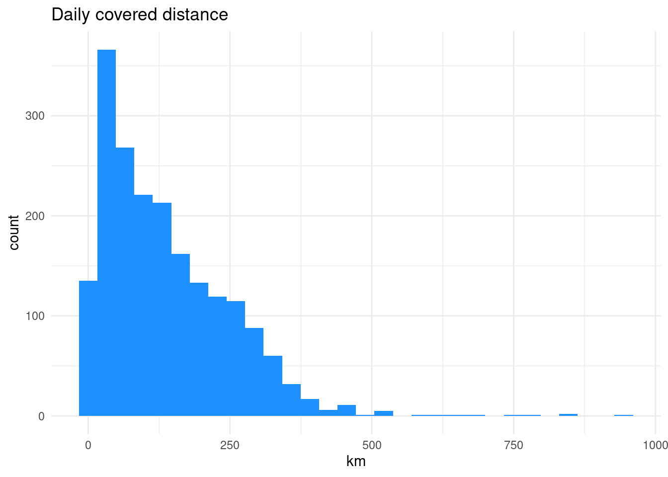
What can we see from this plot?
7.4.5. Monthly activity space
In addition to daily distance, activity spaces are also applied to describe daily movement patterns.
According to Wikipedia, the activity space designates the “set of places individuals encounter as a result of their routine activities in everyday life.”
There are several different approaches and geometries available to characterize the activity space Smith L, 2019:

In the current example, we look at how to calculate Minimum Convex Polygon (MCP):
cdr_example3_sf_MCP <- cdr_example3_sf %>%
  group_by(pos_usr_id, date) %>%
  summarise(geometry = st_combine( geometry ) ) %>%
  st_convex_hull() %>%
  ungroup()
Plot the output:
tm_shape(cdr_example3_sf_MCP)+
  tm_polygons("red", alpha = .1)
Calculate the area and perimeter of polygons:
cdr_example3_sf_MCP$MCP_area <- st_area(cdr_example3_sf_MCP)
cdr_example3_sf_MCP$MCP_perimeter <- st_perimeter(cdr_example3_sf_MCP)
To calculate perimeter, you have to install library lwgeom!!! (and don’t forget to start the library! :) )
What is the average activity space area in square kilometers? (Units!)
7.4.6. Temporal activity
CDR-data is not used only in mobility studies. It can give much more information about the phone carrier. If we assume that starting a phone call or sending a SMS is act of free will, then we can start to analyse the temporal behaviour of the phone user. For that let us also calculate the weekday names:
# R gives the weekdays in language defined in your computer settings

cdr_example2 <- cdr_example2 %>%
  mutate(wday = lubridate::wday(time, abbr = T, label = T))

glimpse(cdr_example2)
Rows: 42,112
Columns: 11
$ time <dttm> 2008-04-01 08:40:45, 2008-04-01 08:56:34, 2008-04-01 09:08…
$ site_id.y <int> 264, 264, 348, 215, 215, 148, 498, 498, 498, 498, 498, 498,…
$ pos_usr_id <chr> "John", "John", "John", "John", "John", "John", "John", "Jo…
$ date <date> 2008-04-01, 2008-04-01, 2008-04-01, 2008-04-01, 2008-04-01…
$ hour <int> 8, 8, 9, 9, 9, 9, 10, 10, 16, 16, 16, 16, 17, 17, 8, 8, 9, …
$ minute <int> 40, 56, 8, 11, 15, 22, 31, 49, 31, 39, 41, 54, 6, 42, 56, 5…
$ lat <dbl> 58.78721, 58.78721, 58.66305, 58.84897, 58.84897, 58.74500,…
$ lon <dbl> 26.01778, 26.01778, 26.09499, 26.29264, 26.29264, 26.39861,…
$ X <dbl> 616661.9, 616661.9, 621556.7, 632312.8, 632312.8, 638839.8,…
$ Y <dbl> 6518169, 6518169, 6504483, 6525554, 6525554, 6514195, 65023…
$ wday <ord> Tue, Tue, Tue, Tue, Tue, Tue, Tue, Tue, Tue, Tue, Tue, Tue,…# list weekdays:
cdr_example2 %>%
distinct(wday) wday
1 Tue
2 Wed
3 Thu
4 Fri
5 Sat
6 Sun
7 Mon# reorder them:
cdr_example2$wday <- factor(cdr_example2$wday, c("Mon", "Tue", "Wed", "Thu", "Fri", "Sat", "Sun"))Diurnal activity
We want to analyse the temporal activity of phone user. Make a graph to show the diurnal activity during the week. Let’s calculate some calling time percentiles and add them to plot (we may assume that an active day starts if 10% of calls are made; midday arrives if 50% calls are made and evening starts if 90% calls are made):
# calculate time in decimal format:
cdr_example2 <- cdr_example2 %>%
  mutate(time_dec = hour + (minute / 60))

glimpse(cdr_example2)
Rows: 42,112
Columns: 12
$ time <dttm> 2008-04-01 08:40:45, 2008-04-01 08:56:34, 2008-04-01 09:08…
$ site_id.y <int> 264, 264, 348, 215, 215, 148, 498, 498, 498, 498, 498, 498,…
$ pos_usr_id <chr> "John", "John", "John", "John", "John", "John", "John", "Jo…
$ date <date> 2008-04-01, 2008-04-01, 2008-04-01, 2008-04-01, 2008-04-01…
$ hour <int> 8, 8, 9, 9, 9, 9, 10, 10, 16, 16, 16, 16, 17, 17, 8, 8, 9, …
$ minute <int> 40, 56, 8, 11, 15, 22, 31, 49, 31, 39, 41, 54, 6, 42, 56, 5…
$ lat <dbl> 58.78721, 58.78721, 58.66305, 58.84897, 58.84897, 58.74500,…
$ lon <dbl> 26.01778, 26.01778, 26.09499, 26.29264, 26.29264, 26.39861,…
$ X <dbl> 616661.9, 616661.9, 621556.7, 632312.8, 632312.8, 638839.8,…
$ Y <dbl> 6518169, 6518169, 6504483, 6525554, 6525554, 6514195, 65023…
$ wday <ord> Tue, Tue, Tue, Tue, Tue, Tue, Tue, Tue, Tue, Tue, Tue, Tue,…
$ time_dec <dbl> 8.666667, 8.933333, 9.133333, 9.183333, 9.250000, 9.366667,…cdr_quart <- cdr_example2 %>%
group_by(wday) %>%
summarise(q1 = quantile(time_dec, 0.10),
q2 = quantile(time_dec, 0.5),
q3 = quantile(time_dec, 0.90)) %>%
ungroup()Aggregate and count by hour
A more traditional way is to count calling activities by hour:
glimpse(cdr_example2)Rows: 42,112
Columns: 12
$ time <dttm> 2008-04-01 08:40:45, 2008-04-01 08:56:34, 2008-04-01 09:08…
$ site_id.y <int> 264, 264, 348, 215, 215, 148, 498, 498, 498, 498, 498, 498,…
$ pos_usr_id <chr> "John", "John", "John", "John", "John", "John", "John", "Jo…
$ date <date> 2008-04-01, 2008-04-01, 2008-04-01, 2008-04-01, 2008-04-01…
$ hour <int> 8, 8, 9, 9, 9, 9, 10, 10, 16, 16, 16, 16, 17, 17, 8, 8, 9, …
$ minute <int> 40, 56, 8, 11, 15, 22, 31, 49, 31, 39, 41, 54, 6, 42, 56, 5…
$ lat <dbl> 58.78721, 58.78721, 58.66305, 58.84897, 58.84897, 58.74500,…
$ lon <dbl> 26.01778, 26.01778, 26.09499, 26.29264, 26.29264, 26.39861,…
$ X <dbl> 616661.9, 616661.9, 621556.7, 632312.8, 632312.8, 638839.8,…
$ Y <dbl> 6518169, 6518169, 6504483, 6525554, 6525554, 6514195, 65023…
$ wday <ord> Tue, Tue, Tue, Tue, Tue, Tue, Tue, Tue, Tue, Tue, Tue, Tue,…
$ time_dec <dbl> 8.666667, 8.933333, 9.133333, 9.183333, 9.250000, 9.366667,…cdr_example_hourAggr <- cdr_example2 %>%
group_by(wday, hour) %>%
summarise(n=n()) %>%
ungroup()`summarise()` has grouped output by 'wday'. You can override using the
`.groups` argument.ggplot()+
geom_line(data = cdr_example_hourAggr, aes(x=hour, y=n, group=wday, colour=as.factor(wday)))+
facet_wrap(~wday)+
scale_colour_manual(values = c("dodgerblue", "steelblue", "blue", "navyblue", "purple", "orange", "red"))+
scale_x_continuous(breaks = seq(0, 24, 3))+
labs(y="time, hh:mm", colour = "day")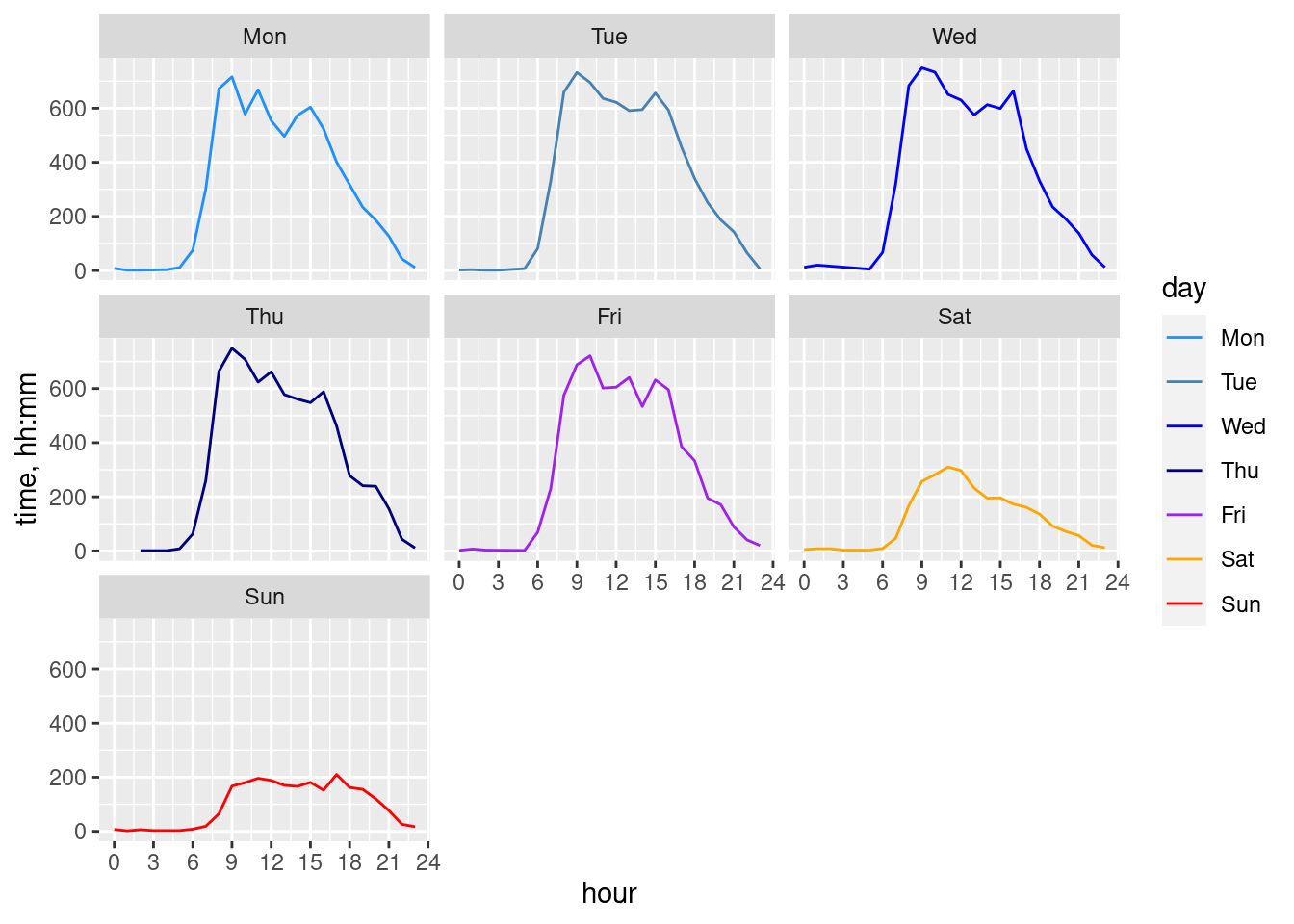
Temporal activity at home/work
#Home antenna:
cdr_example_aggrActivities[1,]
# A tibble: 1 × 4
# Groups: site_id.y, X [1]
site_id.y X Y n
<int> <dbl> <dbl> <int>
1 264 616662. 6518169. 22444#workplace antenna
cdr_example_aggrActivities[2,]# A tibble: 1 × 4
# Groups: site_id.y, X [1]
site_id.y X Y n
<int> <dbl> <dbl> <int>
1 498 615089. 6502337. 2809# Why we used '[]'?
cdr_example_H <- cdr_example2 %>%
filter(site_id.y == cdr_example_aggrActivities$site_id.y[1])
cdr_example_W <- cdr_example2 %>%
filter(site_id.y == cdr_example_aggrActivities$site_id.y[2])
cdr_example_H_timeAggr <- cdr_example_H %>%
group_by(wday, hour) %>%
summarise(n = n()) %>%
ungroup()
cdr_example_W_timeAggr <- cdr_example_W %>%
group_by(wday, hour) %>%
summarise(n = n()) %>%
ungroup()
ggplot()+
geom_line(data = cdr_example_H_timeAggr, aes(x=hour, y=n, colour="home"))+
geom_line(data = cdr_example_W_timeAggr, aes(x=hour, y=n, colour="work"))+
scale_x_continuous(breaks = seq(0, 24, 3))+
facet_wrap(~wday)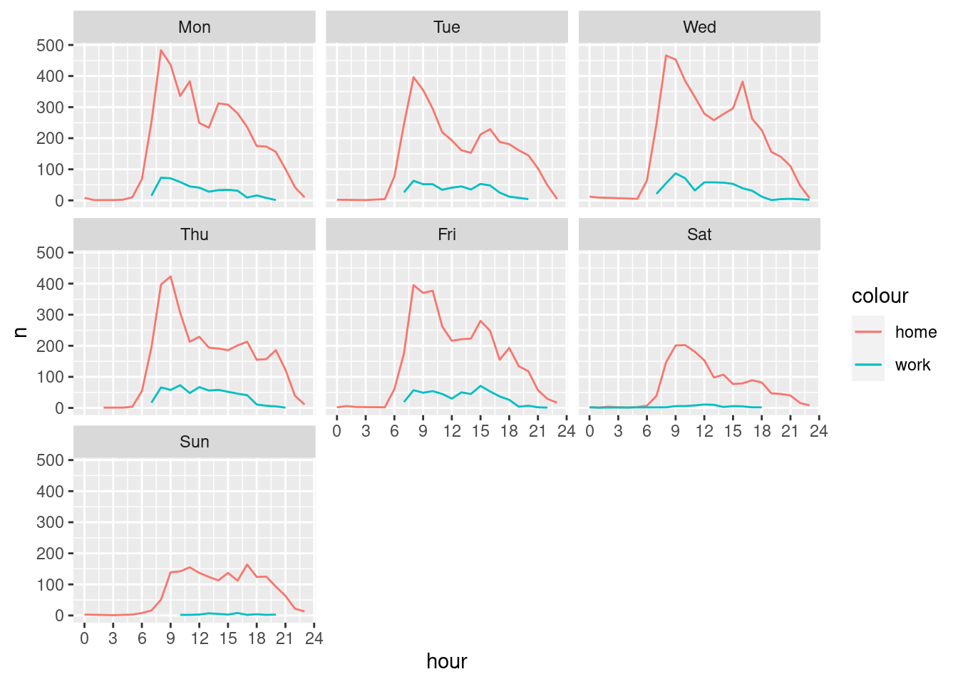
What you think, was the definition of home and work locations successful?
