import geopandas as gpd
import matplotlib.pyplot as plt
import os
%matplotlib inline
# Filepaths
folder = "../files/data/L6"
grid_fp = os.path.join(folder, "population_square_km.shp")
roads_fp = os.path.join(folder, "roads.shp")
schools_fp = os.path.join(folder, "schools_tartu.shp")
# Read files
grid = gpd.read_file(grid_fp)
roads = gpd.read_file(roads_fp)
schools = gpd.read_file(schools_fp)Static maps with matplotlib
Download datasets
Before we start you need to download (and then extract) the dataset zip-package used during this lesson from this link.
You should have following Shapefiles in the Data folder:
- population_square_km.shp
- schools_tartu.shp
- roads.shp
population_square_km.shp.xml  schools_tartu.cpg
population_square_km.shx      schools_tartu.csv
roads.cpg                     schools_tartu.dbf
roads.dbf                     schools_tartu.prj
L6.zip                        roads.prj                     schools_tartu.sbn
roads.sbn                     schools_tartu.sbx
roads.sbx                     schools_tartu.shp             schools5.csv
population_square_km.cpg      roads.shp                     schools_tartu.shp.xml
population_square_km.dbf      roads.shp.xml                 schools_tartu.shx
population_square_km.prj      roads.shx                     schools_tartu.txt.xml
population_square_km.sbn
population_square_km.sbx
population_square_km.shp
Static maps in Geopandas
We have already seen during the previous lessons quite many examples how to create static maps using Geopandas.
Thus, we won’t spend too much time repeating making such maps but let’s create one with more layers on it.
Let’s create a static neighbourhood map with roads and schools line on it and population density as a background.
First, we need to read the data.
Then, we need to be sure that the files are in the same coordinate system. Let’s use the crs of our travel time grid.
gridCRS = grid.crs
roads['geometry'] = roads['geometry'].to_crs(crs=gridCRS)
schools['geometry'] = schools['geometry'].to_crs(crs=gridCRS)
Let’s check the histogram first:
# Plot
grid.hist(column="Population", bins=10)
# Add title
plt.title("Amount of population km2 Tartumaa histogram")
plt.ylabel('Population', fontsize='x-large')
plt.tight_layout()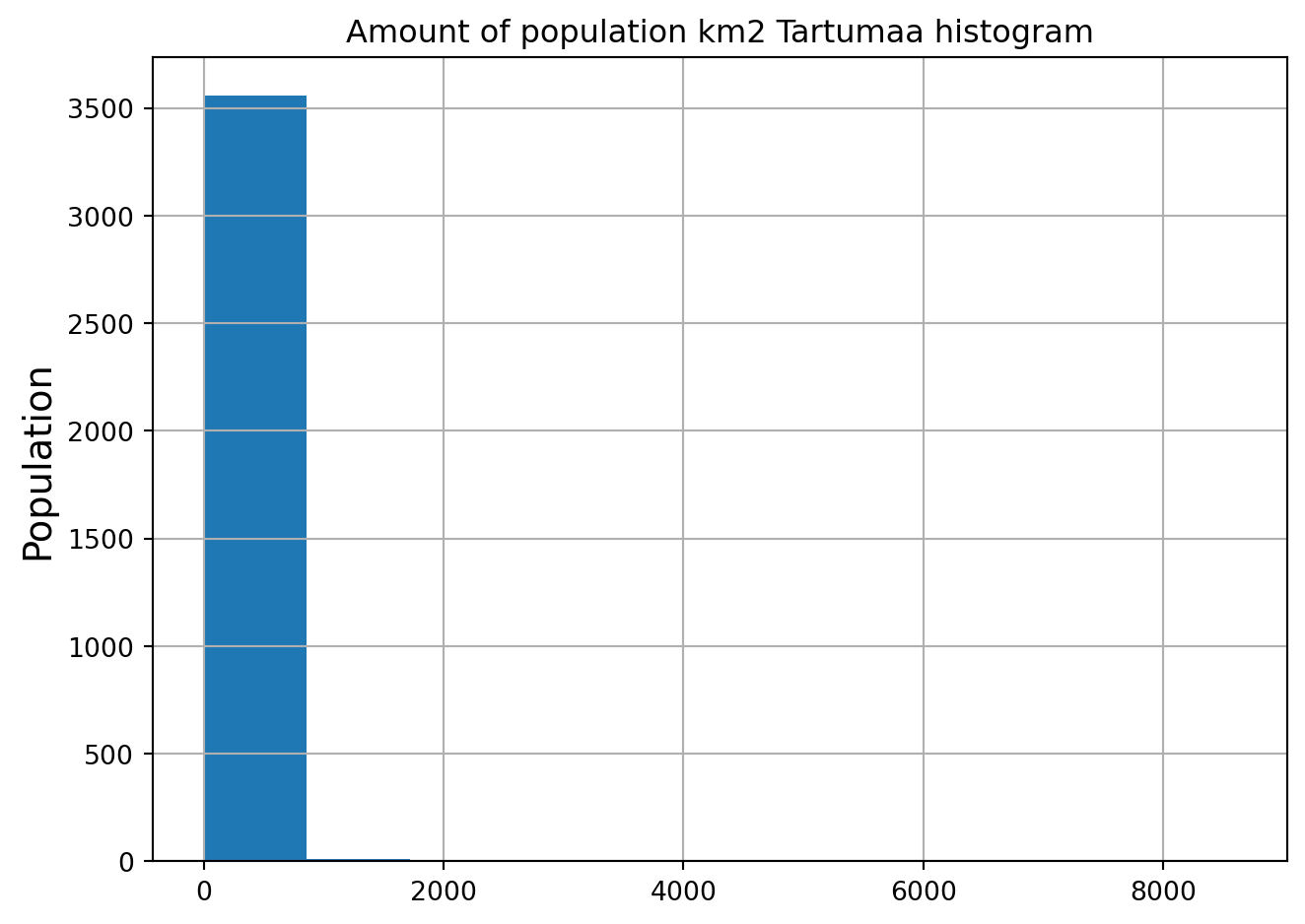
This don’t look very clear. Let’s improve the styling of the plot a bit and also look at the log-transformed distribution:
# we use numpy to log transform
import numpy as np

# Plot the original histogram
plt.figure(figsize=(9, 4))
plt.subplot(1, 2, 1)
plt.hist(grid['Population'], bins=50, alpha=0.3, color="red")
plt.ylabel('Population', fontsize='x-large')
plt.title("Original Data")

# The data has very strong positive skew and in order to better see what is happening in the data, we can use log-transform
# Plot the log-transformed histogram
plt.subplot(1, 2, 2)
plt.hist(np.log1p(grid['Population']), bins=50, alpha=0.3)  # np.log1p(x) is log(1 + x)
plt.ylabel('Population', fontsize='x-large')
plt.title("Log-Transformed Data")

plt.tight_layout()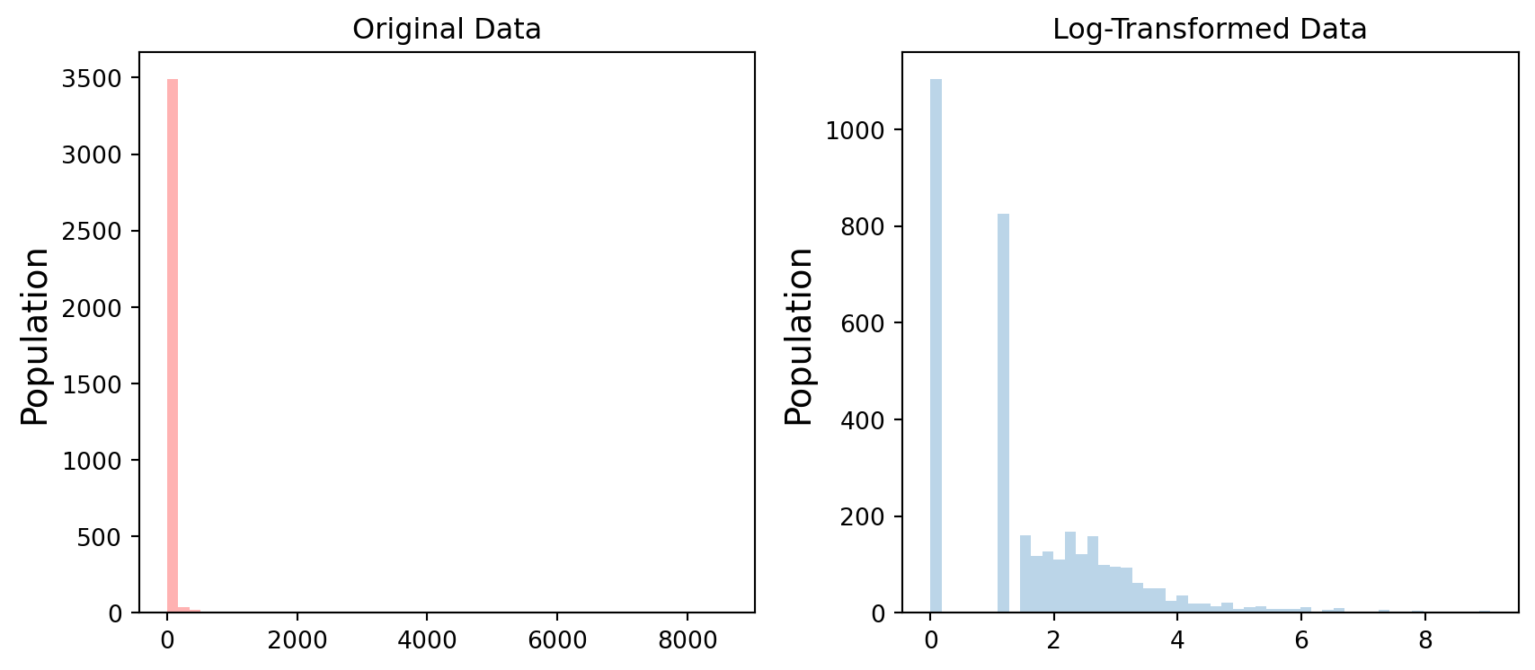
Finally we can make a visualization using the .plot() -function in Geopandas. The .plot() function takes all the matplotlib parameters where appropriate. For example we can adjust various parameters
axif used, then can indicate a joint plot axes onto which to plot, used to plot several times (several layers etc) into the same plot (using the same axes, i.e. x and y coords)columnwhich dataframe column to plotlinewidthif feature with an outline, or being a line feature then line widthmarkersizesize of point/marker element to plotcolorcolour for the layers/feature to plotcmapcolormaps (cmap - parameter)alphatransparency 0-1legendTrue/False show the legendschemeone of 3 basic classification schemes (“quantiles”, “equal_interval”, “fisher_jenks”), beyond that use PySAL explicitlyknumber of classes for above scheme if used.vminindicate a minimal value from the data column to be considered when plotting (also affects the classification scheme), can be used to “normalise” several plots where the data values don’t aligh exactlyvmaxindicate a maximal value from the data column to be considered when plotting (also affects the classification scheme), can be used to “normalise” several plots where the data values don’t aligh exactly
import matplotlib.lines as mlines

fig, ax = plt.subplots(figsize=(9, 7))

# Visualize the population density into 5 classes using "Quantiles" classification scheme
# Add also a little bit of transparency with `alpha` parameter
# (ranges from 0 to 1 where 0 is fully transparent and 1 has no transparency)

grid.plot(column="Population", ax=ax, linewidth=0.03, cmap="Reds", scheme="quantiles", k=5, alpha=0.8, legend=True)


# Add roads on top of the grid
# (use ax parameter to define the map on top of which the second items are plotted)
# use the zorder to define the order of the layers.
#Try to remove zorder from roads and schools and see what happens

roads.plot(ax=ax, color="grey", linewidth=1.5, zorder=2)

# Add schools on top of the previous map
schools.plot(ax=ax, marker='o', color="black", edgecolor="white", linewidth=0.7, markersize=14.0, zorder=3)

# Remove the empty white-space around the axes
plt.title("Population in Tartumaa in relation to schools and major roads")

# Create legend line for roads
gray_line = mlines.Line2D([], [], color='gray', label='Roads', linewidth=1)

# Create legend marker for schools
black_marker = mlines.Line2D([], [], color='black', marker='o', linestyle='None', markersize=4,
                             markeredgecolor='white', markeredgewidth=1, label='Schools')

# add annotations example (some "gymnasium" aka highschools names only, because too crowded)
for idx, row in schools.iterrows():
    if "gümnaasium" in row['name'].lower() and not "Tartu linn" in row['Aadress']:
        # take only first part of the name
        label = row['name'].split(" ")[0]
        plt.text(row['X']+700, row['y']+700, label, size=10, color='black', bbox=dict(boxstyle='round', pad=0, fc='white', ec='none'), zorder=5)


# Combine legend elements
legend_elements = list(ax.get_legend().legend_handles) + [gray_line, black_marker]
legend_labels = [t.get_text() for t in ax.get_legend().texts] + ['Roads', 'Schools']

# Add the combined legend with bottom right position
ax.legend(legend_elements, legend_labels, loc='lower right')

ax.set_ylabel('Northing in EPSG:3301 Estonian grid (metres)')
ax.set_xlabel('Easting in EPSG:3301 Estonian grid (metres)')

plt.tight_layout()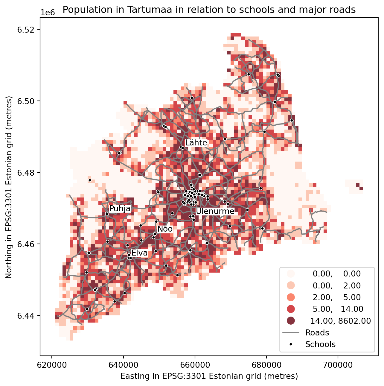
outfp = "static_map.png"
plt.savefig(outfp, dpi=300)
This kind of approach can be used really effectively to produce large quantities of nice looking maps (though this example of ours isn’t that pretty yet, but it could be) which is one of the most useful aspects of coding and what makes it so important to learn how to code.
Special plots types with Geoplot
https://residentmario.github.io/geoplot/gallery/index.html
Tip
From the website:
Geoplot is a high-level Python geospatial plotting library designed for data scientists and geospatial analysts that just want to get things done. It is an extension to cartopy and matplotlib which makes mapping easy.
We might have to install additional packages.
micromamba install -c conda-forge contextily geoplotGeoplot provides a few handy plot types, that would be very complicated to manually describe in matplotlib. In the following some examples are shown, that use data from the earlier lessons.
Using web tile layer as background and mapclassify directly
We want to create a choropleth plot and use one of those shiny web basemaps in a static plot.
Then of course we want to provide a reclassified visualisation of our polygon data, in this case the population in administrative units. Let’s load the dataset and, again, convert that column into numbers.
import geopandas as gpd
import matplotlib.pyplot as plt
import pandas as pd

fp = "../files/data/L4/population_admin_units.shp"

acc = gpd.read_file(fp)
acc['pop_int'] = acc['population'].apply(pd.to_numeric, errors='coerce').dropna()
acc_wgs84 = acc.to_crs(4326)
Now let’s import a couple useful helpers here and get going with Geoplot, which ties these things nicely together:
For the background layer we can use a small package, named contextily that provides that functionality. For the classification we use of course mapclassify.
https://contextily.readthedocs.io/en/latest/
import geoplot as gplt
import geoplot.crs as gcrs

import mapclassify as mc

import contextily as ctx
The Geoplot library works a bit different in that way, that it takes over the axes object. We sort of have to pass it around downstream:
# receive the **ax** object from a ``geoplot gplt.*`` function
ax = gplt.webmap(df=acc_wgs84, projection=gcrs.WebMercator(), zoom=8, provider=ctx.providers.CartoDB.Positron, figsize=(10,8))

# create classifier
scheme = mc.FisherJenks(acc_wgs84[['pop_int']], k=5)

# create choropleth plot, inserting the classifieras scheme and the ax object like we are used to
gplt.choropleth(
    acc_wgs84, hue='pop_int', projection=gcrs.WebMercator(),
    edgecolor='white', linewidth=1, alpha=0.7,
    cmap='viridis', legend=True,
    ax=ax,
    scheme=scheme
)

# set a title
plt.title("Population per municipality", fontsize=20)
Text(0.5, 1.0, 'Population per municipality')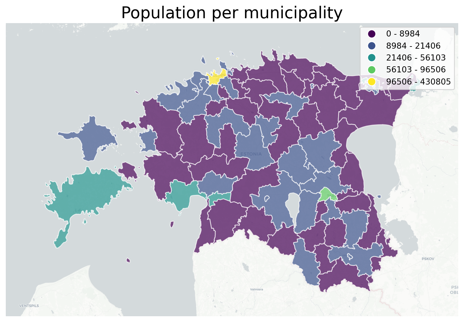
GeoPlot cartogram, using a variable as scale for size of polygon
I’d like to demonstrate the cartographic method of a cartogram.
A cartogram distorts (grows or shrinks) polygons on a map according to the magnitude of some input data. A basic cartogram specifies data, a projection, and a scale parameter.
https://residentmario.github.io/geoplot/api_reference.html
Here I also show, that you can have a dark background, is a option to set in matplotlib. Strong colors and contrasts work well on a dark background.
# set dark background for matplotlib-based plots
plt.style.use('dark_background')

# again, we need to take the ax object with us to the next plot
# we also reuse the scheme mc classifier
# hue tells from which column to take the value
ax = gplt.cartogram(
    acc_wgs84, scale='pop_int', projection=gcrs.AlbersEqualArea(),
    legend=True, legend_kwargs={'bbox_to_anchor': (1, 0.9)}, legend_var='hue',
    hue='pop_int',
    scheme=scheme,
    cmap='viridis',
    limits=(0.5, 1),
    figsize=(9, 7)
)
# for comparison we also plot the original size boundaries
gplt.polyplot(acc_wgs84, facecolor='white', edgecolor='white', alpha=0.8, ax=ax)

plt.title("Population per municipality as cartogram", fontsize=20)
Text(0.5, 1.0, 'Population per municipality as cartogram')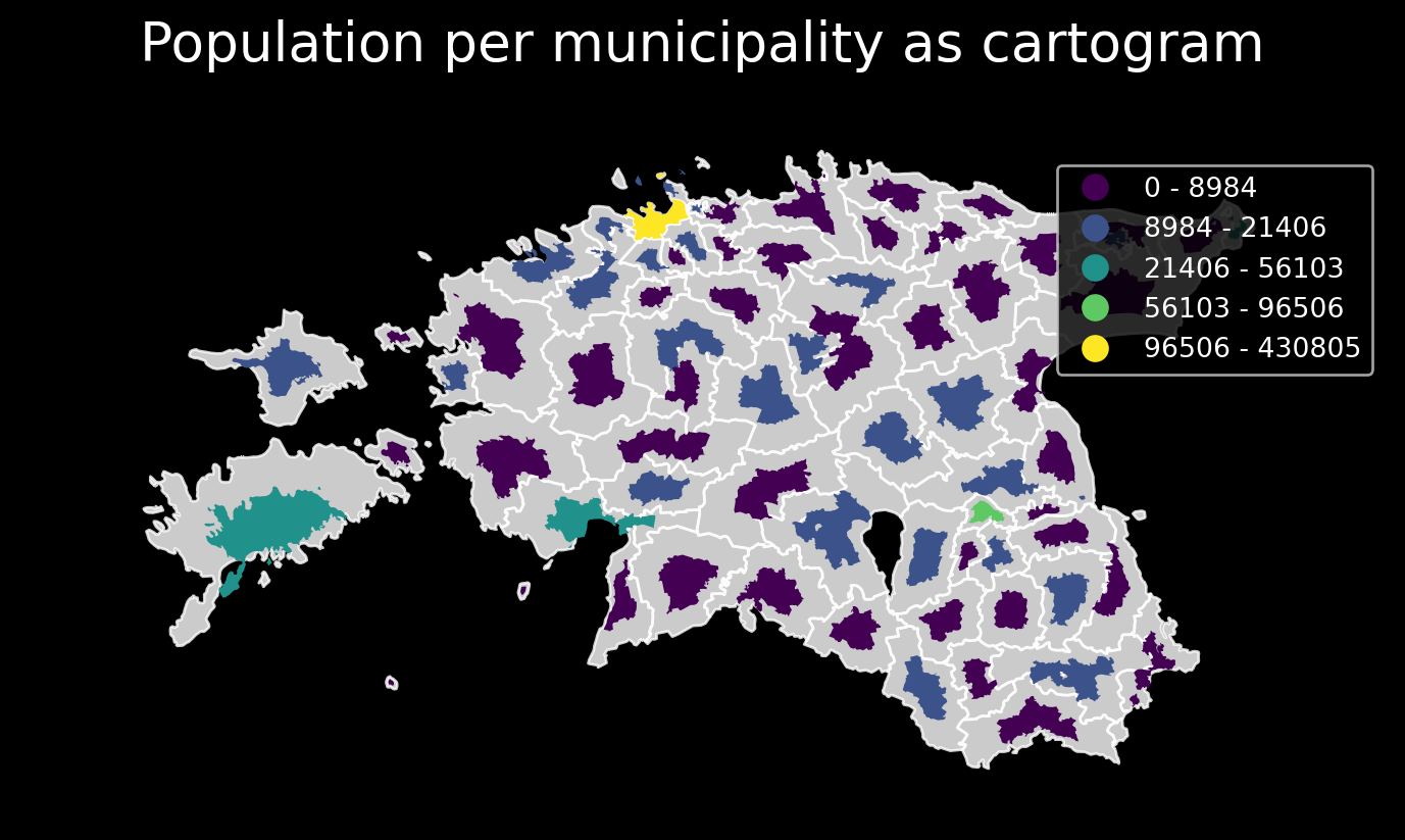
GeoPlot making a static KDE plot as contour or filled
Geoplot provides a variety of practical use-case-based plot types. The last one I’d like to show here is the KDEplot.
Kernel density estimation (KDE) is a technique that non-parameterically estimates a distribution function for a sample of point observations. It is not a heatmap as such, as we don’t scale based on parameter values from the point data, but only the number of points close together. KDEs are a popular tool for analyzing data distributions.
A basic kdeplot takes pointwise data as input. For spatial context, let’s also plot an underlying basemap. For completeness we also set title and save the plot.
https://residentmario.github.io/geoplot/api_reference.html
# reset the background to default / white again
plt.style.use('default')
The underlying webmap plot function has a few limitations, for example that it interpretes geomtries as WGS84 rto calculate extent etc. Also, the webmap only plots tiles in WebMercator projection. So we reproject the data to WGS84.
import geopandas as gpd

# porijogi_sub_catchments
catchments_fp = "../files/data/L3/porijogi_sub_catchments.geojson"
catchments = gpd.read_file(catchments_fp, driver='GeoJSON')

# protected species under class 3 monitoring sightings
species_fp = "../files/data/L3/category_3_species_porijogi.gpkg"
species_data = gpd.read_file(species_fp, layer='category_3_species_porijogi', driver='GPKG')

c4 = catchments.to_crs(4326)
s4 = species_data.to_crs(4326)
/usr/lib64/python3.13/site-packages/pyogrio/raw.py:198: RuntimeWarning: driver GeoJSON does not support open option DRIVER
return ogr_read(
/usr/lib64/python3.13/site-packages/pyogrio/raw.py:198: RuntimeWarning: driver GPKG does not support open option DRIVER
return ogr_read(Now we build up the whole plot example. We can initialize our matplotlib plt handle, but not the ax object. As you see, we have to take the ax object from each function and pass it to the next. With the plt handle we have the context to save the image to a file.
fig = plt.figure()

proj = gcrs.WebMercator()

ax = gplt.webmap(df=gpd.overlay(c4, s4, how='union'), projection=proj,
    zoom=10, provider=ctx.providers.CartoDB.Voyager,
    figsize=(9, 7))

ax = gplt.pointplot(s4, projection=proj, color='green', edgecolor='white',  linewidth=0.5, alpha=0.8, ax=ax)

ax = gplt.kdeplot(s4, projection=proj, cmap='YlOrRd', fill=False, linewidths=5, alpha=0.7, ax=ax)

ax.set_title("Distribution of recorded specimen in south Tartu county", fontsize=18)

plt.tight_layout()
# plt.savefig("species-kde.png", bbox_inches='tight')
<Figure size 640x480 with 0 Axes>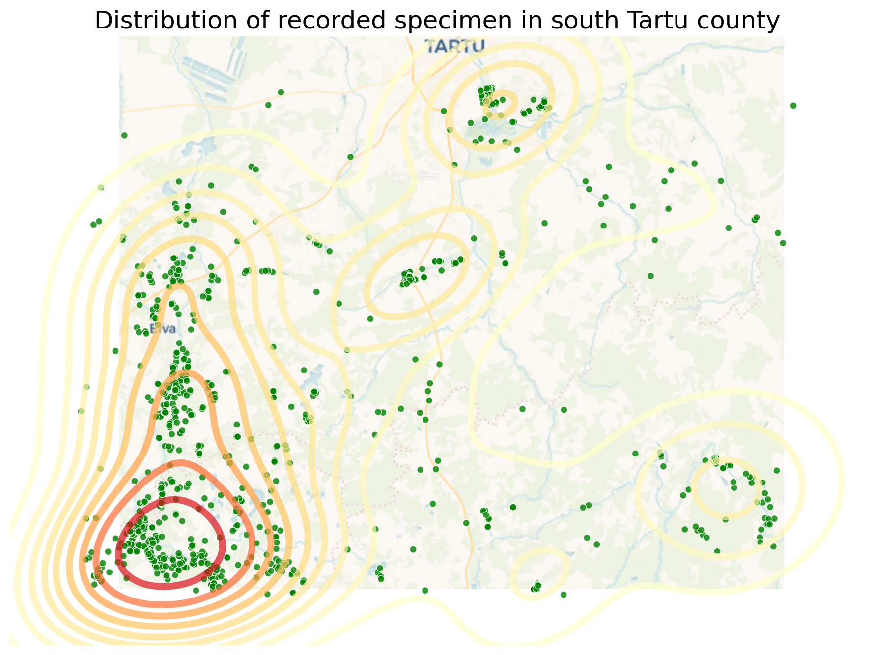
The KDEplot function provides a fill parameter, that allows us to switch between contour lines and filled contours.
proj = gcrs.AlbersEqualArea()

ax = gplt.pointplot(s4, projection=proj, color='green', edgecolor='white',  linewidth=0.5, alpha=0.8, figsize=(9,7))

ax = gplt.polyplot(c4, projection=proj, edgecolor='black',  linewidth=2, alpha=0.7, ax=ax)

ax = gplt.kdeplot(s4, projection=proj, cmap='YlOrRd', fill=True, alpha=0.7, ax=ax)

ax.set_title("Distribution of recorded specimen in south Tartu county", fontsize=18)

plt.tight_layout()
# plt.savefig("species-kde-shaded.png", bbox_inches='tight')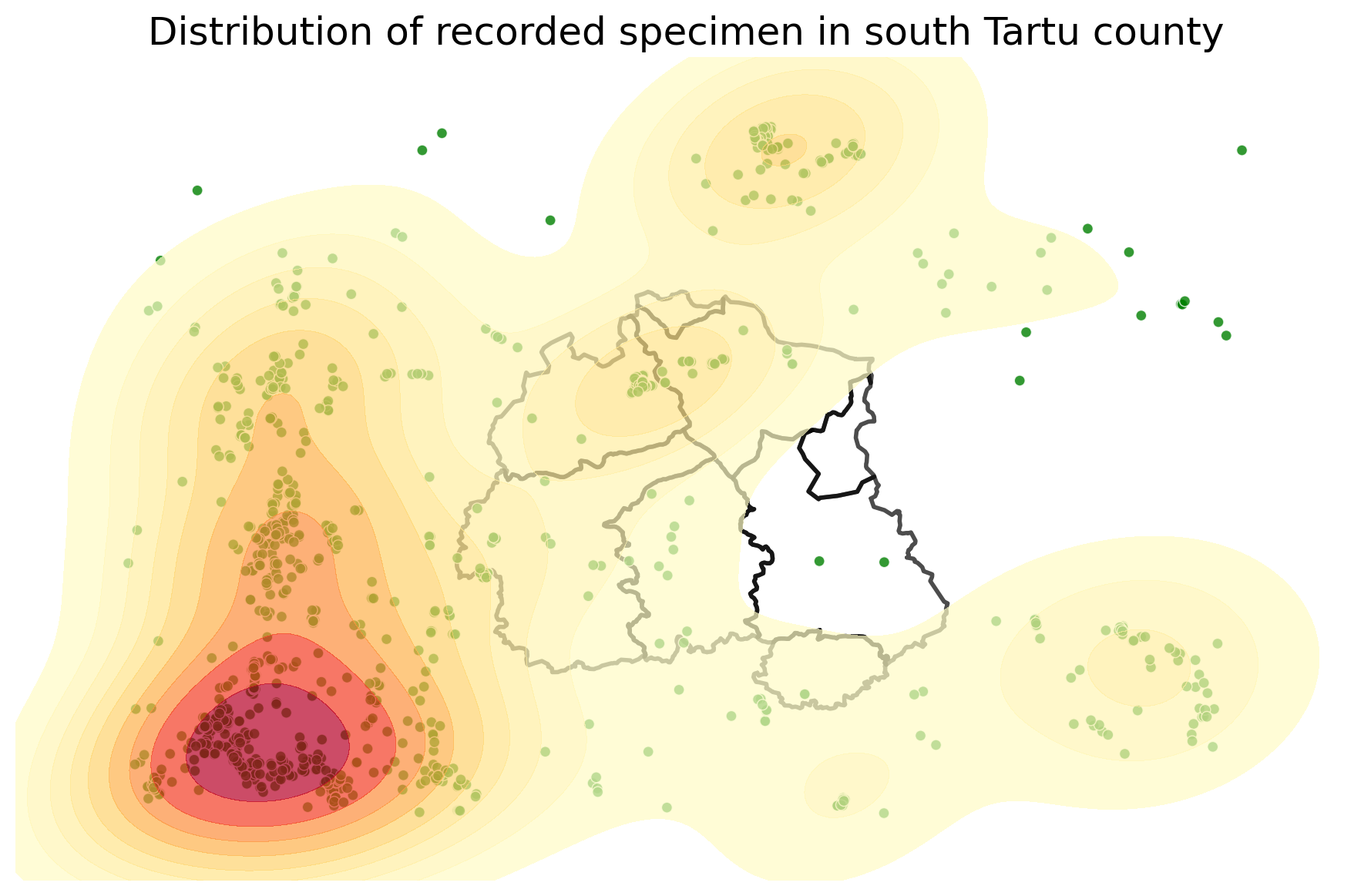
Task:
Try to change your plotting parameters, colors and colormaps and see how your results change! Change the order of plotting the layers and vector plotting criteria and see how they change the results.
Download the notebook:
Launch in the web/MyBinder:
![]()
![]()