import numpy as np
import pandas as pd
import geopandas as gpd
# import pysal -> typically you now import directly mapclassify or pointpats or esda ...
import libpysal as lp
import esda
import os
import seaborn as sns
import contextily
import matplotlib.pyplot as plt
from shapely.geometry import Point
from shapely.geometry import Polygon
from sklearn.cluster import DBSCAN
import cartopy.crs as ccrs
%matplotlib inlinePoint pattern analysis
Point pattern analysis is a set of statistical techniques used to study the spatial distribution of point events. It aims to determine if points are clustered, dispersed, or randomly distributed, and to identify the factors influencing their spatial arrangement. It’s used in diverse fields like ecology, epidemiology, criminology, and geography to analyze phenomena like disease outbreaks, crime hotspots, or species distributions.
Three main methods:
- Centrography
- Density based metrics
- Distance based metrics
We will use Tartu bike system GPS data for the analysis. The data originates from Tartu City Government and landscape fire data from Estonian Rescue Board
Download a Zipfile here.
points = pd.read_csv('rattaringluse_gps_valjavote_final.csv', encoding='utf8')
points.head(3)| cyclenumber | time_stamp | second | unix_epoch | X | Y | date | time | |
|---|---|---|---|---|---|---|---|---|
| 0 | 2045 | 19/07/2019 07:02 | 0 | 1563519770 | 26.720922 | 58.380096 | 19/07/2019 | 07:02:50 |
| 1 | 2045 | 19/07/2019 07:41 | 0 | 1563522110 | 26.720424 | 58.380070 | 19/07/2019 | 07:41:50 |
| 2 | 2045 | 19/07/2019 08:11 | 0 | 1563523880 | 26.720045 | 58.380042 | 19/07/2019 | 08:11:20 |
len(points)5379We will check how many unique different bikes’ points are in the dataset.
# Get unique cycle numbers
unique_cycles = points['cyclenumber'].unique().tolist()

# Get the count of unique cycle numbers
num_unique_cycles = len(unique_cycles)

# Print the results
print(f"Unique cycle numbers: {unique_cycles}")
print(f"Number of unique cycle numbers: {num_unique_cycles}")
Unique cycle numbers: [2045, 2056, 2058, 2064, 2068, 2070, 2090, 2093, 2098, 2103, 2104, 2119, 2124, 2126, 2128, 2145, 2154, 2166, 2169, 2171, 2172, 2174, 2178, 2185, 2199, 2207, 2209, 2211, 2220, 2227, 2229, 2232, 2233, 2239, 2246, 2259, 2260, 2267, 2275, 2306, 2321, 2324, 2329, 2344, 2352, 2356, 2365, 2380, 2394, 2396, 2417, 2423, 2428, 2432, 2433, 2446, 2448, 2454, 2458, 2468, 2478, 2485, 2494, 2495, 2504, 2516, 2522, 2524, 2526, 2528, 2545, 2564, 2566, 2580, 2586, 2602, 2608, 2609, 2613, 2616, 2620, 2625, 2641, 2645, 2646, 2655, 2662, 2665, 2672, 2684, 2687, 2711, 2735, 2740, 2742, 2749, 2752, 2784]
Number of unique cycle numbers: 98Now, we can check the time period for the dataset. The time is in column unix_epoch. Unix time is a date and time representation widely used in computing. It measures time by the number of non-leap seconds that have elapsed since 00:00:00 UTC on 1 January 1970 (Wiki).
# Calculate duration in hours
duration = (points['unix_epoch'].max() - points['unix_epoch'].min())/ (60 * 60)

# Print the result
print(f"Duration (hours): {duration}")
Duration (hours): 1.9944444444444445# Make geometry column from X and Y columns
def create_geometry_from_xy(df, x_col='x', y_col='y', crs="EPSG:4326"):
try:
geometry = [Point(xy) for xy in zip(df[x_col], df[y_col])]
gdf = gpd.GeoDataFrame(df, geometry=geometry, crs=crs)
return gdf
except KeyError as e:
print(f"Error: Column '{e.args[0]}' not found in DataFrame.")
return None
except Exception as e:
print(f"An unexpected error occurred: {e}")
return Nonebike_points = create_geometry_from_xy(points, x_col='X', y_col='Y', crs="EPSG:4326")
bike_points.head(3)| cyclenumber | time_stamp | second | unix_epoch | X | Y | date | time | geometry | |
|---|---|---|---|---|---|---|---|---|---|
| 0 | 2045 | 19/07/2019 07:02 | 0 | 1563519770 | 26.720922 | 58.380096 | 19/07/2019 | 07:02:50 | POINT (26.72092 58.3801) |
| 1 | 2045 | 19/07/2019 07:41 | 0 | 1563522110 | 26.720424 | 58.380070 | 19/07/2019 | 07:41:50 | POINT (26.72042 58.38007) |
| 2 | 2045 | 19/07/2019 08:11 | 0 | 1563523880 | 26.720045 | 58.380042 | 19/07/2019 | 08:11:20 | POINT (26.72005 58.38004) |
bike_points.plot(marker='o', color="red", markersize=1.0)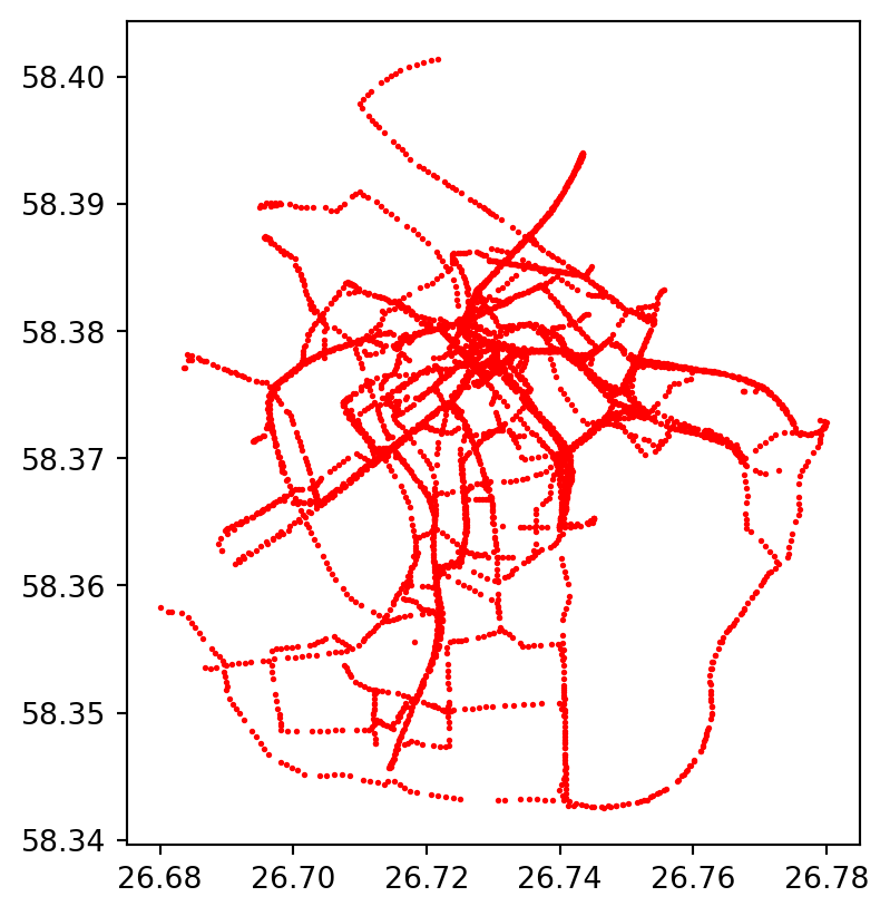
#Lets plot the gps points of each bike with different color

unique_cycles = bike_points['cyclenumber'].unique()
norm = plt.Normalize(vmin=bike_points['cyclenumber'].min(), vmax=bike_points['cyclenumber'].max())

fig, ax = plt.subplots(1, 1)

for cycle in unique_cycles:
    cycle_points = bike_points[bike_points['cyclenumber'] == cycle]
    color = plt.cm.tab20(norm(cycle))
    cycle_points.plot(ax=ax, marker='o', color=color, markersize=1.0, label=f'Cycle {cycle}')
#ax.legend(title='cyclenumber')
plt.show()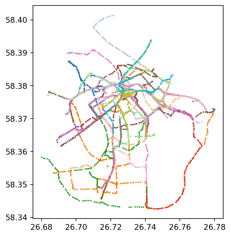
Centrography
Centrography is a set of spatial statistical techniques used to describe the central tendency and dispersion of point patterns or geographic distributions. It provides quantitative measures of central tendency and dispersion:
Mean center: The average location of the points.
Median center: The point that minimizes the total distance to all other points.
Standard deviational ellipse: A representation of the spatial spread and orientation of the points.
We will first calculate mean and median center of the gps points.
from pointpats import centrography
from matplotlib.patches import Ellipse

#calculate spatial mean and median of the points
mean_center = centrography.mean_center(bike_points[["X", "Y"]])
med_center = centrography.euclidean_median(bike_points[["X", "Y"]])

print ("Mean center is", mean_center)
print ("Median center is", med_center)
Mean center is [26.72938143 58.37326066]
Median center is [26.72919961 58.37584394]In point pattern analysis, the standard deviational ellipse (SDE) provides a visual and statistical representation of the spatial dispersion and orientation of a set of points. The size of the ellipse indicates the overall spread of the point pattern. A larger ellipse signifies greater dispersion, while a smaller ellipse suggests a more concentrated pattern. The angle of the ellipse’s major axis reveals the primary direction or orientation of the point distribution. It shows the trend or elongation of the pattern
# calculate standard ellipse
major, minor, rotation = centrography.ellipse(bike_points[["X", "Y"]])
# Create the base for the figure - subplots and size
fig, ax = plt.subplots(1, figsize=(10, 10))
ax.set_aspect('equal') #this important to keep the proportions of the projected map correct!
# Plot bike points
ax.scatter(bike_points["X"], bike_points["Y"], s=0.2)
ax.scatter(*mean_center, color="red", marker="D", label="Mean center", zorder=2)
ax.scatter(
*med_center, marker="*", color="purple", label="Median center", zorder=2
)
# Construct the standard ellipse using matplotlib
ellipse = Ellipse(
xy=mean_center, # center the ellipse to the mean center
width=major * 2, # centrography.ellipse gives only half of the axis and we need to multiply with 2
height=minor * 2,
angle=np.rad2deg(rotation), # Centrography gives angle in radians. Convert radians to degrees
facecolor="darkred",
edgecolor="darkred",
linewidth=2,
linestyle="-.",
alpha=0.3,
label="Standard ellipse",
zorder=1,
)
ax.add_patch(ellipse)
ax.legend()
# Add basemap
contextily.add_basemap(
ax,
crs="EPSG:4326",
source=contextily.providers.CartoDB.Voyager
)
plt.show()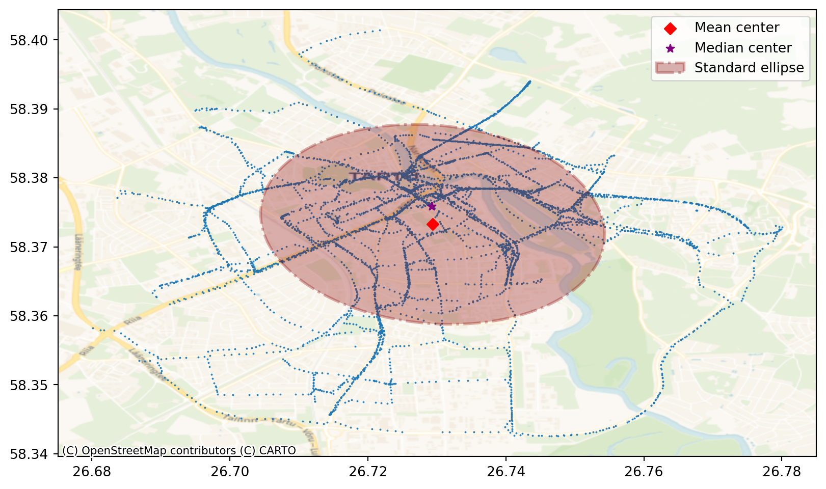
Convex hull is the smallest convex polygon that encloses all the points in a dataset. It effectively creates a “boundary” around the point distribution, showing the outermost extent of the pattern. It’s used to define and visualise the spatial extent but also provides a way to identify outliers. Points on the hull are the most extreme, potentially highlighting outliers.
Let’s compare two different bikes’ convex hulls. First we have to extract two different bikes from the initial dataframe. Let’s choose bikes number 2735 and 2524
#Extract bike number 2375 data
bike_1 = bike_points[bike_points['cyclenumber'] == 2735]
coords_1 = bike_1[["X", "Y"]].values

#Extract bike number 2119 data
bike_2 = bike_points[bike_points['cyclenumber'] == 2119]
coords_2 = bike_2[["X", "Y"]].values
Next we need to calculate coordinates of the convex hulls based on the bikes’ coordinates. For that we can use centrography.hull method.
#calculate convex hull coordinates for bike 2735
convex_hull_coords1 = centrography.hull(coords_1)

#calculate convex hull coordinates for bike 2524
convex_hull_coords2 = centrography.hull(coords_2)
Even more accurate way to represent the shape of a point cloud is alpha shape. An alpha shape provides a way to create more detailed and potentially concave boundaries around a point cloud. Alpha shape can have concave parts while convex hull can’t. In fact, every convex hull is an alpha shape, but not every alpha shape is a convex hull.
#calculate aplha shapes for bikes 2735 and 2119
alpha_shape1 = lp.cg.alpha_shape_auto(coords_1)
alpha_shape2 = lp.cg.alpha_shape_auto(coords_2)
Let’s add alpha shapes and convext hulls together with the bikes’ gps points to the map.
fig, ax = plt.subplots(1, figsize=(10, 10))
ax.set_aspect('equal')
# Add bike 2735 gps points
ax.scatter(
    *coords_1.T, color="blue", marker=".", label="Bike 2735"
)

# Add bike 2119 gps points
ax.scatter(
    *coords_2.T, color="red", marker=".", label="Bike 2119"
)

# Add bike 2735 alpha shape
gpd.GeoSeries(
    [alpha_shape1]
).plot(
    ax=ax,
    edgecolor="blue",
    facecolor="blue",
    alpha=0.1,
    label="Alpha shape of bike 2735"
)


# Add bike 2735 convex hull
ax.add_patch(
    plt.Polygon(
        convex_hull_coords1,
        closed=True,
        edgecolor="blue",
        facecolor="none",
        linestyle="--",
        linewidth=1,
        label="Convex Hull"
    )
)

# Add bike 2119 alpha shape
gpd.GeoSeries(
    [alpha_shape2]
).plot(
    ax=ax,
    edgecolor="red",
    facecolor="red",
    alpha=0.1,
    label="Alpha shape of bike 2119",
)
# Add bike 2119 convex hull
ax.add_patch(
    plt.Polygon(
        convex_hull_coords2,
        closed=True,
        edgecolor="red",
        facecolor="none",
        linestyle="--",
        linewidth=1,
        label="Convex Hull2"
    )
)
# Add basemap
contextily.add_basemap(
    ax, source=contextily.providers.CartoDB.Voyager,
    crs="EPSG:4326"
)
plt.legend()
/tmp/ipykernel_426/3967103221.py:65: UserWarning: Legend does not support handles for PatchCollection instances.
See: https://matplotlib.org/stable/tutorials/intermediate/legend_guide.html#implementing-a-custom-legend-handler
plt.legend()
Visually, we can see that these two convex hulls don’t overlap. To be sure, let’s check with intersect.
#make shapely polygons from the convex hull coordinates
p1 = Polygon(convex_hull_coords1)
p2 = Polygon(convex_hull_coords2)

#test intersection
print(p1.intersects(p2))FalseDensity based metrics
Density based techniques characterize the pattern in terms of its distribution in the study area. The two most commonly used density-based measures are quadrat density and kernel density.
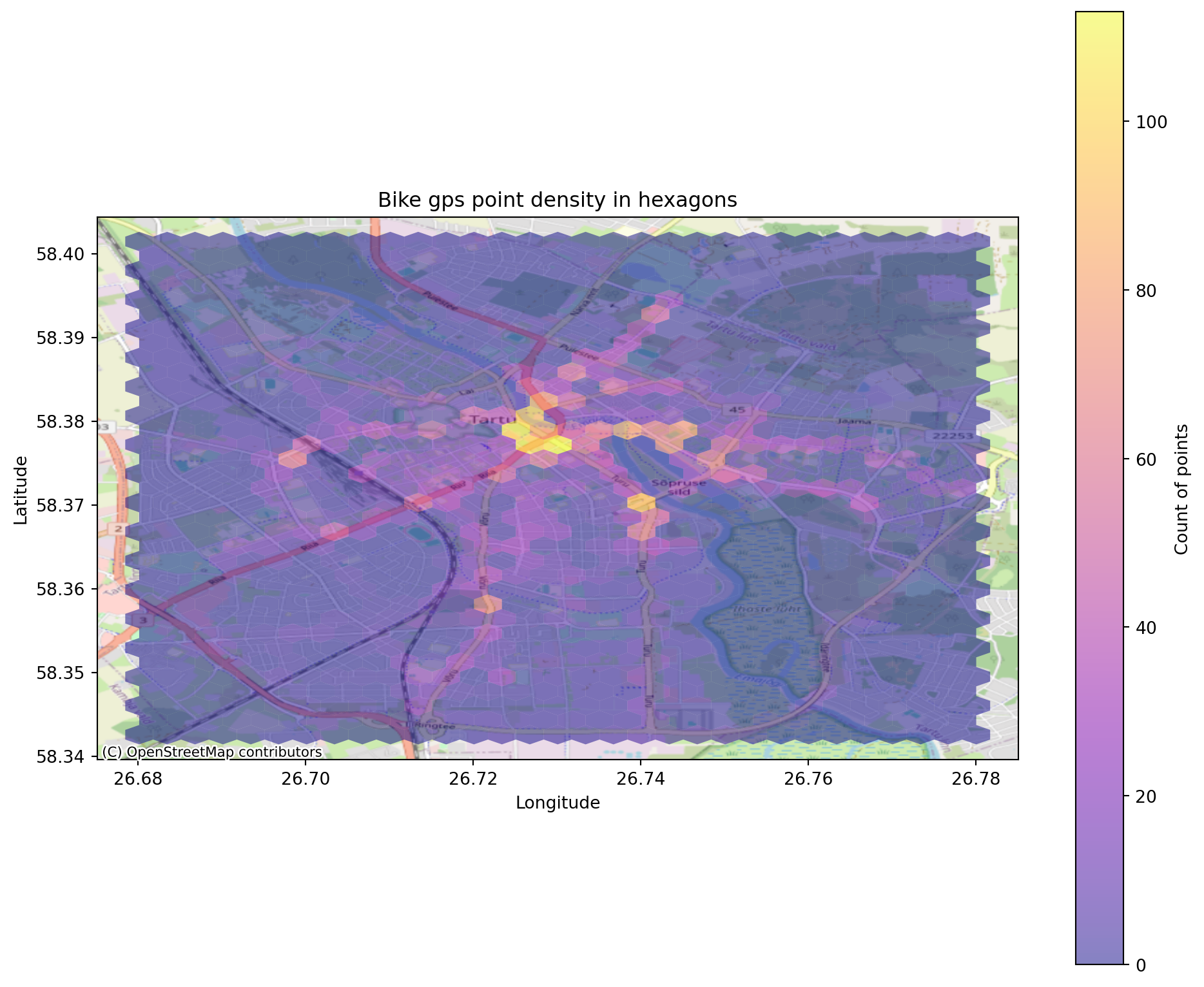
Quadrat density
the study area is divided into smaller sub-regions (i.e., quadrats), and then the point density is computed for each sub-region by dividing the number of points in each quadrat by the quadrat’s area. Quadrats can take on many different shapes such as hexagons and triangles. Lets create a hexagon binning for the gps points.
fig, ax = plt.subplots(1, figsize=(12,10))
ax.set_aspect('equal')
X = bike_points['X']
Y = bike_points['Y']

hex= ax.hexbin(X,
               Y,
               gridsize=30, #sets the size of the hexagons. Try to change it
               cmap='plasma',
               alpha=0.5,
               linewidths=0)

plt.colorbar(hex,label='Count of points')
plt.title('Bike gps point density in hexagons')
plt.xlabel('Longitude')
plt.ylabel('Latitude')


# Add basemap
contextily.add_basemap(
    ax, source=contextily.providers.OpenStreetMap.Mapnik,
    crs="EPSG:4326"
)
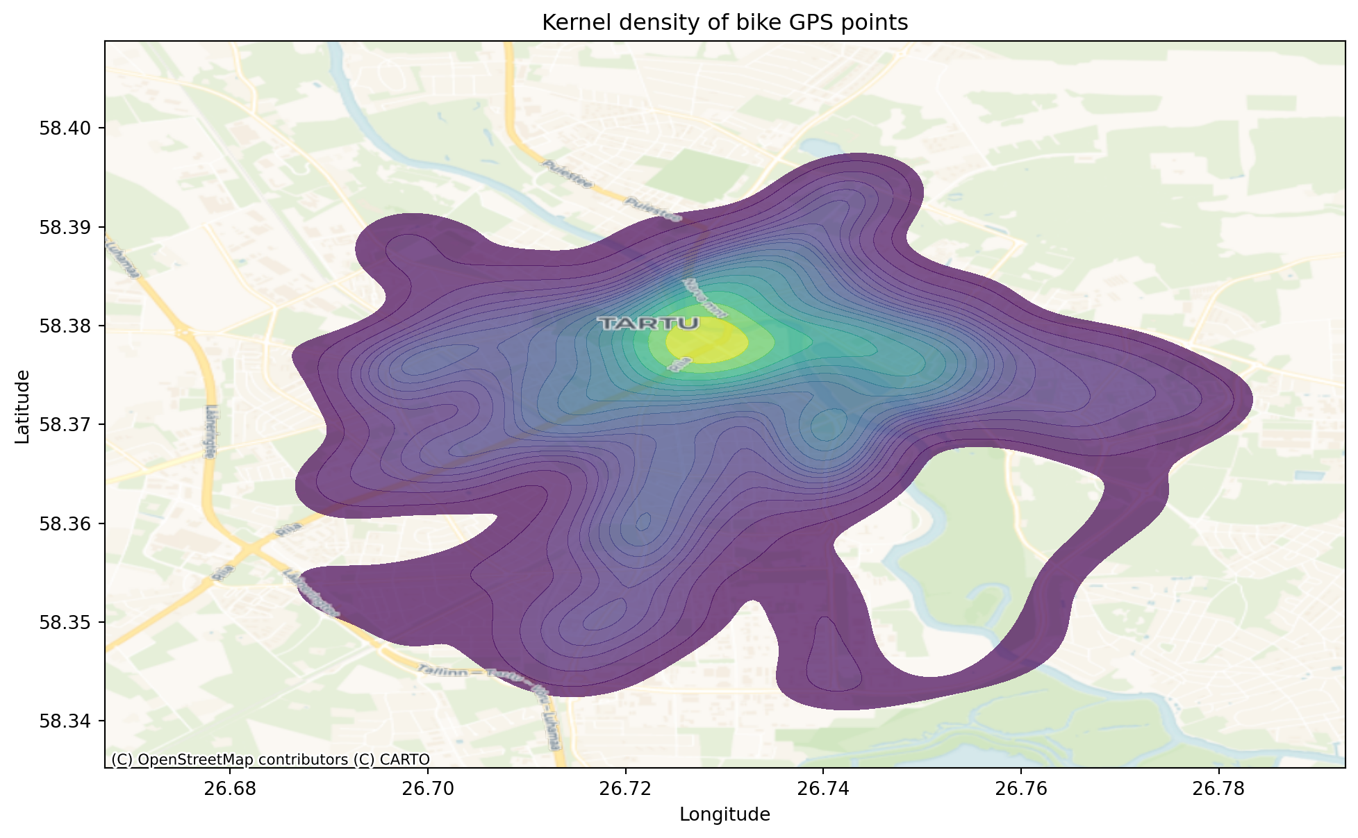
Kernel density
Kernel density uses a moving window, which is defined by a kernel. The kernel density approach generates a grid of density values whose cell size is smaller than the kernel window. Each cell is assigned the density value computed for the kernel window centered on that cell. Instead of binning data into discrete bins like hexagons, KDE (Kernel Density Estimation) plots create a smooth, continuous curve representing the data’s estimated probability density. Common kernels include the Gaussian (normal) kernel. A kernel is placed over each data point, and these kernels are summed to create the overall density estimate. KDE plots provide a smoother representation of the data’s distribution compared to quadrats, which can be affected by the choice of bin size. This smoothness can reveal underlying patterns that might be obscured in quadrats.
Let’s create kernel density estimation for our bike points. For this, we will use seaborn.kdeplot.
fig, ax = plt.subplots(1, figsize=(12,10))
ax.set_aspect('equal')

# fig, ax = plt.subplots(1, figsize=(12,10))

sns.kdeplot(
    x=bike_points['X'],
    y=bike_points['Y'],
    fill=True,
    cmap='viridis',
    levels=20, #Number of contour levels or values to draw contours at. Try to change this value.
    alpha=0.7,
    ax=ax
)
plt.title('Kernel density of bike GPS points')
plt.xlabel('Longitude')
plt.ylabel('Latitude')

# Add basemap
contextily.add_basemap(
    ax, source=contextily.providers.CartoDB.Voyager,
    crs="EPSG:4326"
)

#Add additional basemap consisting only labels. As the KDE covers some relevant information like labels, we can add another layer consisting only of labels.
contextily.add_basemap(
    ax, source=contextily.providers.CartoDB.PositronOnlyLabels,
    crs="EPSG:4326"
)
DBSCAN
DBSCAN (Density-Based Spatial Clustering of Applications with Noise) is a clustering algorithm that groups points that are closely packed together (points with many nearby neighbours), marking as outliers points that lie alone in low-density regions (whose nearest neighbours are too far away). This algorithm is good for data which contains clusters of similar density.
Two most essential parameters in DBSCAN are eps and min_samples.
eps(epsilon) determines how close points need to be considered “neighbours.” When DBSCAN examines a point, it checks all other points within a distance of eps from that point. eps essentially controls the “reach” or “spread” of clusters. A small eps value will lead to fewer points being considered neighbours, smaller and denser clusters and more points being classified as noise (outliers).
min_samples specifies the minimum number of points that must be within a point’s eps neighbourhood for that point to be considered a core point. It sets a density threshold. A point must have at least min_samples neighbours within the eps radius to be considered part of a dense region. A small min_samples value will lead to more points being classified as core points and less dense clusters being formed.
DBSCAN identifies: 1) Core points - A point is classified as a “core point” if it has at least min_samples points within its eps neighbourhood. They form the core of the clusters. 2) Non-core points or norder points - are data points that are within the eps neighbourhood of core points, but it they don’t have min_samples points within their own eps neighbourhood. Border points are considered part of a cluster but are not as central as core points. 3) Noise points - A noise point is a data point that is neither a core nor a border point. Points within each other’s eps neighbourhoods are considered part of the same cluster.
#data_points = bike_points.to_crs(epsg=3301)
#find clusters for the bike points
db = DBSCAN(eps=0.001, min_samples=30).fit(bike_points[["X", "Y"]]) #Try to change eps and min_samples values
labels = db.labels_

# Number of clusters in labels, ignoring noise if present.
n_clusters_ = len(set(labels)) - (1 if -1 in labels else 0)
n_noise_ = list(labels).count(-1)

print("Estimated number of clusters: %d" % n_clusters_)
print("Estimated number of noise points: %d" % n_noise_)
Estimated number of clusters: 19
Estimated number of noise points: 2896bike_points| cyclenumber | time_stamp | second | unix_epoch | X | Y | date | time | geometry | |
|---|---|---|---|---|---|---|---|---|---|
| 0 | 2045 | 19/07/2019 07:02 | 0 | 1563519770 | 26.720922 | 58.380096 | 19/07/2019 | 07:02:50 | POINT (26.72092 58.3801) |
| 1 | 2045 | 19/07/2019 07:41 | 0 | 1563522110 | 26.720424 | 58.380070 | 19/07/2019 | 07:41:50 | POINT (26.72042 58.38007) |
| 2 | 2045 | 19/07/2019 08:11 | 0 | 1563523880 | 26.720045 | 58.380042 | 19/07/2019 | 08:11:20 | POINT (26.72005 58.38004) |
| 3 | 2045 | 19/07/2019 08:11 | 0 | 1563523890 | 26.719941 | 58.380027 | 19/07/2019 | 08:11:30 | POINT (26.71994 58.38003) |
| 4 | 2045 | 19/07/2019 08:11 | 0 | 1563523900 | 26.719004 | 58.379858 | 19/07/2019 | 08:11:40 | POINT (26.719 58.37986) |
| ... | ... | ... | ... | ... | ... | ... | ... | ... | ... |
| 5374 | 2784 | 19/07/2019 08:47 | 0 | 1563526050 | 26.721271 | 58.375757 | 19/07/2019 | 08:47:30 | POINT (26.72127 58.37576) |
| 5375 | 2784 | 19/07/2019 08:47 | 0 | 1563526060 | 26.721718 | 58.376008 | 19/07/2019 | 08:47:40 | POINT (26.72172 58.37601) |
| 5376 | 2784 | 19/07/2019 08:47 | 0 | 1563526070 | 26.722585 | 58.376385 | 19/07/2019 | 08:47:50 | POINT (26.72259 58.37638) |
| 5377 | 2784 | 19/07/2019 08:48 | 0 | 1563526090 | 26.724580 | 58.377187 | 19/07/2019 | 08:48:10 | POINT (26.72458 58.37719) |
| 5378 | 2784 | 19/07/2019 08:48 | 0 | 1563526100 | 26.725410 | 58.377520 | 19/07/2019 | 08:48:20 | POINT (26.72541 58.37752) |
5379 rows × 9 columns
We can see that there are 19 clusters and a lot of noise points. Let’s plot them.
fig, ax = plt.subplots(1, figsize=(12,7))
ax.set_aspect('equal')
unique_labels = set(labels)
core_samples_mask = np.zeros_like(labels, dtype=bool)
core_samples_mask[db.core_sample_indices_] = True


colors = [plt.cm.Paired(each) for each in np.linspace(0, 1, len(unique_labels))]
for k, col in zip(unique_labels, colors):
    if k == -1:
        # Black used for noise.
        col = [0, 0, 0, 1]

    class_member_mask = labels == k

    #plotting clusters
    xy = bike_points[class_member_mask & core_samples_mask]
    ax.plot(
        xy.loc[:, "X"],
        xy.loc[:, "Y"],
        "o",
        markerfacecolor=tuple(col),
        markeredgecolor="black",
        markersize=7,
        markeredgewidth=0.5,
        zorder=2
    )
    #plotting noise
    xy = bike_points[class_member_mask & ~core_samples_mask]
    ax.plot(
        xy.loc[:, "X"],
        xy.loc[:, "Y"],
        "o",
        markerfacecolor=tuple(col),
        markeredgecolor="black",
        markersize=2,
        markeredgewidth=0.5,
        zorder=1
    )


# Add basemap
contextily.add_basemap(
    ax, source=contextily.providers.CartoDB.Voyager,
    crs="EPSG:4326"
)

plt.title(f"Estimated number of bike GPS point clusters: {n_clusters_}")
Text(0.5, 1.0, 'Estimated number of bike GPS point clusters: 19')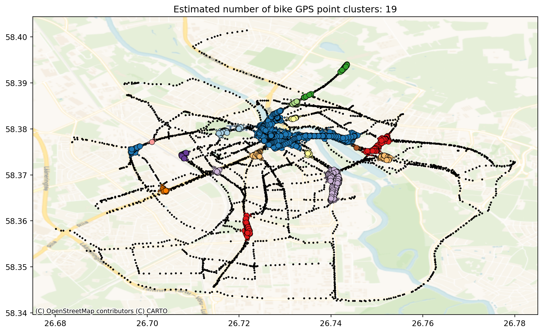
Core samples (large dots) and non-core samples (small dots) are color-coded according to the assigned cluster. Samples tagged as noise are represented in black.
We can see that the bike data is not the easiest to find clusters because there is high connectivity along the bike trails and not very clear clustering exists. Let’s try another dataset for DBSCAN clustering. Let’s use OpenStreetMap data set to map the shops of Tartu and see if there is any clustering.
import osmnx as ox

# Get place boundary related to the place name as a geodataframe
place_name = 'Tartu'
area = ox.geocode_to_gdf(place_name)

area.plot()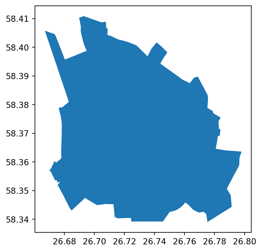
# Extract shops from the OSM dataset
tags = {'shop': True}
shops = ox.features_from_place('Tartu', tags)
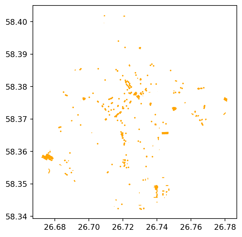
shops.plot(color='orange', markersize=1)
shops.head(5)| geometry | addr:city | addr:country | addr:housenumber | addr:postcode | addr:street | check_date | name | opening_hours | ... | fuel:lpg | fuel:taxfree_diesel | fuel:adblue | shower | old_addr:street | communication:mobile_phone | service | layer | air_conditioning | toilets:wheelchair | |||
|---|---|---|---|---|---|---|---|---|---|---|---|---|---|---|---|---|---|---|---|---|---|---|
| element | id | |||||||||||||||||||||
| node | 266921299 | POINT (26.67666 58.35805) | Tartu | EE | 75 | 50501 | Ringtee | 2024-08-11 | info@lounakeskus.com | Lõunakeskus | Mo-Su 10:00-21:00 | ... | NaN | NaN | NaN | NaN | NaN | NaN | NaN | NaN | NaN | NaN |
| 322906403 | POINT (26.73024 58.38247) | Tartu | NaN | 20 | 50603 | Raatuse | NaN | NaN | Raatuse Selver ABC | Mo-Su 09:00-22:00 | ... | NaN | NaN | NaN | NaN | NaN | NaN | NaN | NaN | NaN | NaN | |
| 331179287 | POINT (26.71956 58.36477) | Tartu | EE | 55f | NaN | Võru | 2024-07-02 | NaN | Maxima XX | Mo-Su 08:00-22:00 | ... | NaN | NaN | NaN | NaN | NaN | NaN | NaN | NaN | NaN | NaN | |
| 354470712 | POINT (26.71226 58.37624) | Tartu | NaN | 20 | 50409 | J. Kuperjanovi | 2022-12-22 | NaN | Alko Feenoks | Mo-Su 10:00-22:00 | ... | NaN | NaN | NaN | NaN | NaN | NaN | NaN | NaN | NaN | NaN | |
| 361134472 | POINT (26.73618 58.37472) | Tartu | NaN | 14 | NaN | Turu | 2023-01-04 | NaN | Maxima XX | Mo-Su 08:00-22:00 | ... | NaN | NaN | NaN | NaN | NaN | NaN | NaN | NaN | NaN | NaN |
5 rows × 147 columns
This time we will transform the WGS84 data to Estonian CRS
#reproject the shops data to Estonian crs
proj = shops.to_crs(epsg=3301)
proj.head(3)| geometry | addr:city | addr:country | addr:housenumber | addr:postcode | addr:street | check_date | name | opening_hours | ... | fuel:lpg | fuel:taxfree_diesel | fuel:adblue | shower | old_addr:street | communication:mobile_phone | service | layer | air_conditioning | toilets:wheelchair | |||
|---|---|---|---|---|---|---|---|---|---|---|---|---|---|---|---|---|---|---|---|---|---|---|
| element | id | |||||||||||||||||||||
| node | 266921299 | POINT (656645.839 6471739.365) | Tartu | EE | 75 | 50501 | Ringtee | 2024-08-11 | info@lounakeskus.com | Lõunakeskus | Mo-Su 10:00-21:00 | ... | NaN | NaN | NaN | NaN | NaN | NaN | NaN | NaN | NaN | NaN |
| 322906403 | POINT (659668.71 6474583.027) | Tartu | NaN | 20 | 50603 | Raatuse | NaN | NaN | Raatuse Selver ABC | Mo-Su 09:00-22:00 | ... | NaN | NaN | NaN | NaN | NaN | NaN | NaN | NaN | NaN | NaN | |
| 331179287 | POINT (659124.663 6472588.706) | Tartu | EE | 55f | NaN | Võru | 2024-07-02 | NaN | Maxima XX | Mo-Su 08:00-22:00 | ... | NaN | NaN | NaN | NaN | NaN | NaN | NaN | NaN | NaN | NaN |
3 rows × 147 columns
#make geometry for the data
shop_points = proj[proj['geometry'].apply(lambda geom: isinstance(geom, Point))].copy()
shop_points['x'] = shop_points['geometry'].x
shop_points['y'] = shop_points['geometry'].y
shop_points.head(3)| geometry | addr:city | addr:country | addr:housenumber | addr:postcode | addr:street | check_date | name | opening_hours | ... | fuel:adblue | shower | old_addr:street | communication:mobile_phone | service | layer | air_conditioning | toilets:wheelchair | x | y | |||
|---|---|---|---|---|---|---|---|---|---|---|---|---|---|---|---|---|---|---|---|---|---|---|
| element | id | |||||||||||||||||||||
| node | 266921299 | POINT (656645.839 6471739.365) | Tartu | EE | 75 | 50501 | Ringtee | 2024-08-11 | info@lounakeskus.com | Lõunakeskus | Mo-Su 10:00-21:00 | ... | NaN | NaN | NaN | NaN | NaN | NaN | NaN | NaN | 656645.838896 | 6.471739e+06 |
| 322906403 | POINT (659668.71 6474583.027) | Tartu | NaN | 20 | 50603 | Raatuse | NaN | NaN | Raatuse Selver ABC | Mo-Su 09:00-22:00 | ... | NaN | NaN | NaN | NaN | NaN | NaN | NaN | NaN | 659668.709600 | 6.474583e+06 | |
| 331179287 | POINT (659124.663 6472588.706) | Tartu | EE | 55f | NaN | Võru | 2024-07-02 | NaN | Maxima XX | Mo-Su 08:00-22:00 | ... | NaN | NaN | NaN | NaN | NaN | NaN | NaN | NaN | 659124.662764 | 6.472589e+06 |
3 rows × 149 columns
As the coordinates change significantly then the eps need to be increased also significantly.
db = DBSCAN(eps=500, min_samples=10).fit(shop_points[["x", "y"]]) #Try to change eps and min_samples values
labels = db.labels_

# Number of clusters in labels, ignoring noise if present.
n_clusters_ = len(set(labels)) - (1 if -1 in labels else 0)
n_noise_ = list(labels).count(-1)

print("Estimated number of clusters: %d" % n_clusters_)
print("Estimated number of noise points: %d" % n_noise_)
Estimated number of clusters: 6
Estimated number of noise points: 47fig, ax = plt.subplots(1, figsize=(12,7))
ax.set_aspect('equal')
unique_labels = set(labels)
core_samples_mask = np.zeros_like(labels, dtype=bool)
core_samples_mask[db.core_sample_indices_] = True
colors = [plt.cm.Spectral(each) for each in np.linspace(0, 1, len(unique_labels))]
for k, col in zip(unique_labels, colors):
if k == -1:
# Black used for noise.
col = [0, 0, 0, 1]
class_member_mask = labels == k
xy = shop_points[class_member_mask & core_samples_mask]
ax.plot(
xy.loc[:, "x"],
xy.loc[:, "y"],
"o",
markerfacecolor=tuple(col),
markeredgecolor="black",
markersize=10,
markeredgewidth=0.5
)
xy = shop_points[class_member_mask & ~core_samples_mask]
ax.plot(
xy.loc[:, "x"],
xy.loc[:, "y"],
"o",
markerfacecolor=tuple(col),
markeredgecolor="black",
markersize=4,
markeredgewidth=0.5
)
# Add basemap
contextily.add_basemap(
ax, source=contextily.providers.CartoDB.Voyager,
crs="EPSG:3301"
)
plt.title(f"Estimated number of clusters: {n_clusters_}")Text(0.5, 1.0, 'Estimated number of clusters: 6')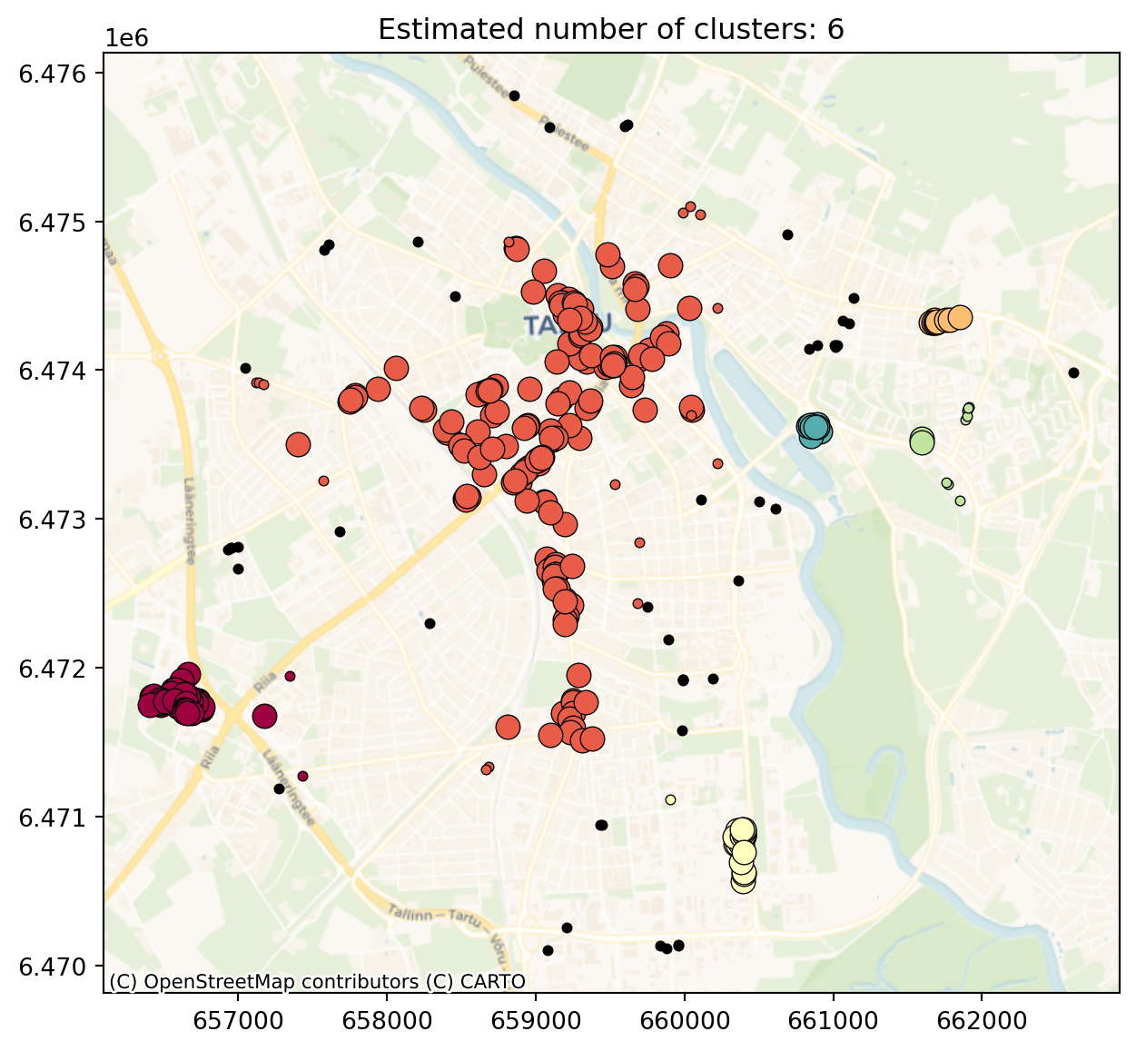
Distance based metrics
In the distance based methods, the interest lies in how the points are distributed relative to one another as opposed to how the points are distributed relative to the study extent. We will look into following methods: nearest neighbour distance (NND), G function and hotspot analysis.
For distance based metrics, we will use the landscape fires dataset.
from pointpats import PointPattern
from pointpats import distance_statistics

fires = gpd.read_file("est-wild_fires.shp")
fires.head(3)| sundmuse_n | sundmuse_k | tulekahju_ | sundmuse_a | mis_poles | wgs_latitu | wgs_longit | maakond | kov | korgem_ast | ... | likvideeri | viimase_re | sundmuse_1 | valjasoidu | valjasoitn | annulleeri | kohal_ress | x | y | geometry | |
|---|---|---|---|---|---|---|---|---|---|---|---|---|---|---|---|---|---|---|---|---|---|
| 0 | 2166474 | 2021-04-25 | Metsa-ja maastikutulekahju | Kulu | Kogutud kuhilad väljaspool rajatisi | 58.946 | 23.538 | Lääne maakond | Haapsalu linn | PAASTE_1A | ... | None | 2021-04-25 13:06:47 | 00:13:42 | 1 | 1.0 | NaN | 1.0 | 473406.543225 | 6.534192e+06 | POINT (473406.543 6534192.248) |
| 1 | 2166232 | 2021-04-25 | Metsa-ja maastikutulekahju | Mets/maastik | None | 59.395 | 27.281 | Ida-Viru maakond | Kohtla-Järve linn | PAASTE_1 | ... | 2021-04-25 09:20:13 | 2021-04-25 09:30:26 | 02:09:11 | 2 | 2.0 | NaN | 2.0 | 686340.270306 | 6.588675e+06 | POINT (686340.27 6588675.282) |
| 2 | 2165241 | 2021-04-23 | Metsa-ja maastikutulekahju | Mets/maastik | None | 59.318 | 24.229 | Harju maakond | Lääne-Harju vald | PAASTE_2 | ... | None | 2021-04-23 22:31:33 | 00:33:50 | 8 | 6.0 | 6.0 | 2.0 | 513040.214259 | 6.575561e+06 | POINT (513040.214 6575561.392) |
3 rows × 25 columns
Let’s plot the landscape fires.
fig, ax = plt.subplots(1, figsize=(12,7))
ax.set_aspect('equal')

#ax.plot(color='orange', markersize=1)
ax.scatter(fires["x"], fires["y"], s=1, color="red")
# Add basemap
contextily.add_basemap(
    ax, source=contextily.providers.CartoDB.Voyager,
    crs="EPSG:3301"
)
plt.title("Landscape fires")
Text(0.5, 1.0, 'Landscape fires')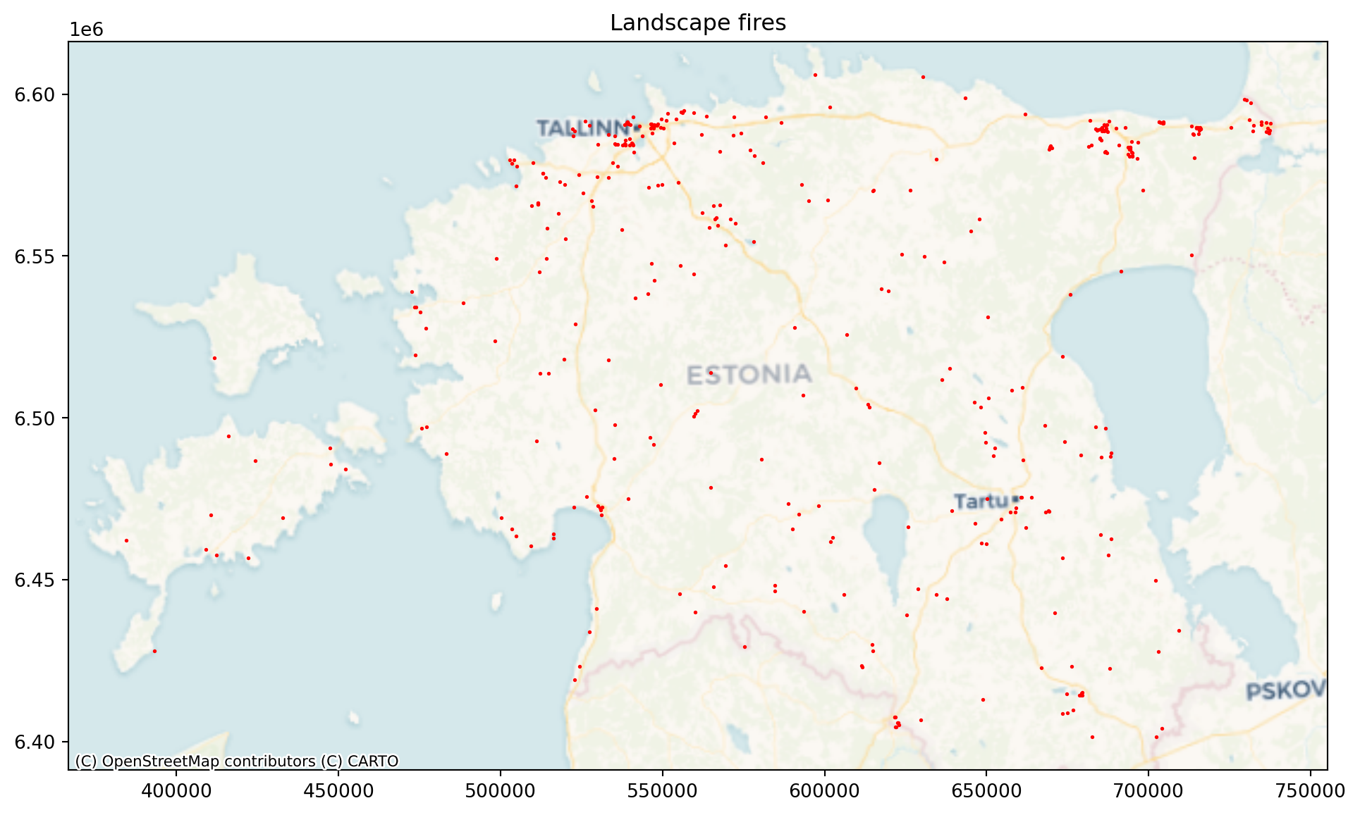
Nearest-Neighbor Distance (NND) is the distance between a point and its closest neighboring point. NND is also known as the first-order nearest neighbor. In addition, distance can be calculated for the kth nearest neighbor, which is called the kth-order NN or KNN. The mean of NND between all point pairs is used as a global indicator to measure the overall pattern of a point set.
To calculate NND, we need to firstly make our shop_points x and y from the geodataframe as PointPattern object that pysal can use.
pp = PointPattern(fires[["x", "y"]])

#calculate mean nearest neighbour of the whole study area
pp.mean_nndnp.float64(3847.449077094534)On average, the each fire has its nearest neighbour in 3847m.
G-function The G-function, also known as the nearest neighbour distance distribution function, is a spatial point pattern analysis tool that describes the distribution of distances from each point in a dataset to its nearest neighbour. It’s used to assess whether a point pattern is clustered, dispersed (regular), or random. The G-function calculates the cumulative distribution of nearest neighbour distances, which tells you the proportion of points that have a nearest neighbour within a certain distance. In other words, G(r) is the probability that a randomly chosen point has its nearest neighbour within a distance r.
By comparing the observed G-function to a theoretical G-function (under the assumption of complete spatial randomness, CSR), you can infer the spatial pattern of your points. Under CSR, the points are assumed to be randomly and independently distributed.
Clustered: If the observed G-function is above the expected G-function under CSR, it suggests that the points are clustered. This means that, on average, points are closer to their nearest neighbours than expected by chance.
Dispersed: If the observed G-function is below the expected G-function under CSR, it suggests that the points are dispersed or regularly spaced. This means that, on average, points are farther from their nearest neighbours than expected by chance.
g_test = distance_statistics.g_test(
    (fires[["x", "y"]]), #refer to the points' coordinates to which to calculate distances
    keep_simulations=True  #this simulates CSR
)

print(g_test)
GtestResult(support=array([ 0. , 1845.7772965 , 3691.554593 , 5537.3318895 ,
7383.109186 , 9228.88648249, 11074.66377899, 12920.44107549,
14766.21837199, 16611.99566849, 18457.77296499, 20303.55026149,
22149.32755799, 23995.10485449, 25840.88215099, 27686.65944748,
29532.43674398, 31378.21404048, 33223.99133698, 35069.76863348]), statistic=array([0. , 0.50251256, 0.66834171, 0.76633166, 0.82663317,
0.87688442, 0.89949749, 0.92713568, 0.94974874, 0.96733668,
0.9798995 , 0.98743719, 0.98994975, 0.99246231, 0.99748744,
0.99748744, 0.99748744, 0.99748744, 0.99748744, 1. ]), pvalue=array([0.000e+00, 1.000e-04, 1.000e-04, 1.000e-04, 1.000e-04, 1.000e-04,
2.680e-02, 2.831e-01, 1.720e-02, 2.000e-03, 9.000e-04, 9.000e-04,
1.000e-04, 2.000e-04, 4.200e-03, 6.000e-04, 3.000e-04, 1.000e-04,
0.000e+00, 0.000e+00]), simulations=array([[0. , 0.08291457, 0.23869347, ..., 1. , 1. ,
1. ],
[0. , 0.06281407, 0.20351759, ..., 1. , 1. ,
1. ],
[0. , 0.04522613, 0.19346734, ..., 1. , 1. ,
1. ],
...,
[0. , 0.06030151, 0.19346734, ..., 1. , 1. ,
1. ],
[0. , 0.04522613, 0.20854271, ..., 1. , 1. ,
1. ],
[0. , 0.04522613, 0.18844221, ..., 1. , 1. ,
1. ]], shape=(9999, 20)))fig, ax = plt.subplots(1, figsize=(10,7))
# plot the observed pattern's G function
ax.plot(
g_test.support,
g_test.statistic,
label="observed",
color="red",
zorder=3
)
# Plot all the simulations with very fine lines
ax.plot(
g_test.support,
g_test.simulations.T,
color="lightgray",
alpha=0.01,
zorder=2
)
# Plot the median of simulations
ax.plot(
g_test.support,
np.median(g_test.simulations, axis=0),
color="black",
label="median simulation",
zorder=1
)
# Add labels to axes and figure title
ax.set_xlabel("Distance (m)")
ax.set_ylabel("Proportion of points that have a nearest neighbour \nwithin this distance")
ax.legend()
ax.set_xlim(0, 20000)
ax.set_title("Ripley's $G(d)$ function for landscape fires")
plt.show()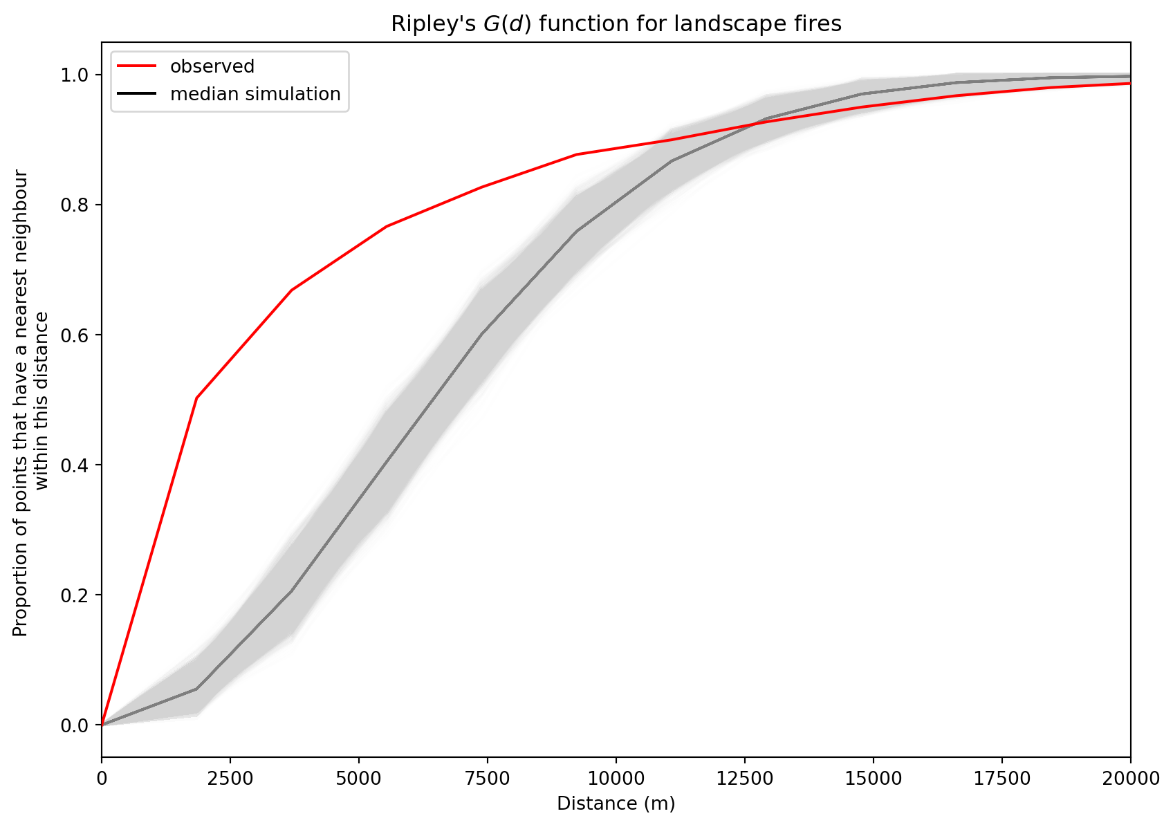
Our G-function analysis shows that the fire points are clustered until around 12000m neighbourhood and further away they are rather dispersed. That can be also see in visual inspection as they form clusters around cities and further away there are large areas without almost any fires or only few fires.
Hotspot analysis is a spatial statistical technique used to identify clusters of high or low values within a geographic dataset. The difference with other clustering methods is that it also takes into account the data attribute value, i.e. if the attribute value is high or low, and clusters high and low values. It uses Getis-Ord Gi* statistic to identify clusters. It calculates a z-score for each feature in a dataset, indicating whether it is part of a statistically significant hotspot or coldspot. Hotspots are areas where high values cluster, and coldspots are areas where low values cluster.
Hotspot analysis needs one attribute value, and we will use ‘valjasoitn’ for that purpose. ‘valjasoitn’ shows how many Rescue Board resources were actually deployed to the event, which shows the magnitude of the event indirectly. The higher the number, the bigger the fire.
import esda
# lp is still libpysal from above

# Create a spatial weights matrix
w = lp.weights.DistanceBand.from_dataframe(fires, threshold=30000) # 1000 is an example distance. Adjust as needed.

# Perform Getis-Ord Gi* analysis
gi = esda.G_Local(fires['valjasoitn'], w)

# Add Gi* results to the GeoDataFrame
fires['Gi_zscore'] = gi.z_sim
fires['Gi_pvalue'] = gi.p_sim

# Classify hotspots and coldspots and add them to the dataframe
fires['hotspot'] = ['hotspot' if z > 1.96 and p < 0.05 else 'coldspot' if z < -1.96 and p < 0.05 else 'not significant' for z, p in zip(fires['Gi_zscore'], fires['Gi_pvalue'])]

fires.head()
/usr/local/lib/python3.13/site-packages/libpysal/weights/util.py:826: UserWarning: The weights matrix is not fully connected:
There are 2 disconnected components.
There is 1 island with id: 68.
w = W(neighbors, weights, ids, **kwargs)
/usr/local/lib/python3.13/site-packages/libpysal/weights/distance.py:844: UserWarning: The weights matrix is not fully connected:
There are 2 disconnected components.
There is 1 island with id: 68.
W.__init__(
/usr/local/lib/python3.13/site-packages/esda/getisord.py:527: RuntimeWarning: invalid value encountered in divide
z_scores = (statistic - expected_value) / np.sqrt(expected_variance)('WARNING: ', 68, ' is an island (no neighbors)')/usr/local/lib/python3.13/site-packages/esda/getisord.py:450: RuntimeWarning: invalid value encountered in divide
self.z_sim = (self.Gs - self.EG_sim) / self.seG_sim| sundmuse_n | sundmuse_k | tulekahju_ | sundmuse_a | mis_poles | wgs_latitu | wgs_longit | maakond | kov | korgem_ast | ... | valjasoidu | valjasoitn | annulleeri | kohal_ress | x | y | geometry | Gi_zscore | Gi_pvalue | hotspot | |
|---|---|---|---|---|---|---|---|---|---|---|---|---|---|---|---|---|---|---|---|---|---|
| 0 | 2166474 | 2021-04-25 | Metsa-ja maastikutulekahju | Kulu | Kogutud kuhilad väljaspool rajatisi | 58.946 | 23.538 | Lääne maakond | Haapsalu linn | PAASTE_1A | ... | 1 | 1.0 | NaN | 1.0 | 473406.543225 | 6.534192e+06 | POINT (473406.543 6534192.248) | 3.487929 | 0.002 | hotspot |
| 1 | 2166232 | 2021-04-25 | Metsa-ja maastikutulekahju | Mets/maastik | None | 59.395 | 27.281 | Ida-Viru maakond | Kohtla-Järve linn | PAASTE_1 | ... | 2 | 2.0 | NaN | 2.0 | 686340.270306 | 6.588675e+06 | POINT (686340.27 6588675.282) | 0.678703 | 0.240 | not significant |
| 2 | 2165241 | 2021-04-23 | Metsa-ja maastikutulekahju | Mets/maastik | None | 59.318 | 24.229 | Harju maakond | Lääne-Harju vald | PAASTE_2 | ... | 8 | 6.0 | 6.0 | 2.0 | 513040.214259 | 6.575561e+06 | POINT (513040.214 6575561.392) | -2.604398 | 0.004 | coldspot |
| 3 | 2164552 | 2021-04-22 | Metsa-ja maastikutulekahju | Kulu | Kogutud kuhilad väljaspool rajatisi | 58.881 | 25.572 | Järva maakond | Paide linn | PAASTE_1 | ... | 3 | 3.0 | 1.0 | 2.0 | 590648.922000 | 6.527923e+06 | POINT (590648.922 6527922.759) | 0.394463 | 0.325 | not significant |
| 4 | 2164378 | 2021-04-22 | Metsa-ja maastikutulekahju | Kulu | Kulu | 59.360 | 26.986 | Ida-Viru maakond | Lüganuse vald | PAASTE_1 | ... | 2 | 2.0 | NaN | 2.0 | 669771.246017 | 6.583997e+06 | POINT (669771.246 6583997.357) | 0.410972 | 0.325 | not significant |
5 rows × 28 columns
# Plot hotspots and coldspots
fig, ax = plt.subplots(1, 1, figsize=(10, 10))
ax.set_aspect('equal')

hotspots = fires[fires['hotspot'] == 'hotspot']
coldspots = fires[fires['hotspot'] == 'coldspot']
not_significant = fires[fires['hotspot'] == 'not significant']

hotspots.plot(ax=ax, color='red', marker='o', label='Hotspots', markersize=15, zorder=3)
coldspots.plot(ax=ax, color='blue', marker='o', label='Coldspots', markersize=15, zorder=2)
not_significant.plot(ax=ax, color='lightgray', marker='o', label='Not Significant', markersize=14, zorder=1)

ax.set_title(f"Hotspots and Coldspots of landscape fires")
ax.legend()

# Add basemap
contextily.add_basemap(
    ax, source=contextily.providers.CartoDB.Voyager,
    crs="EPSG:3301"
)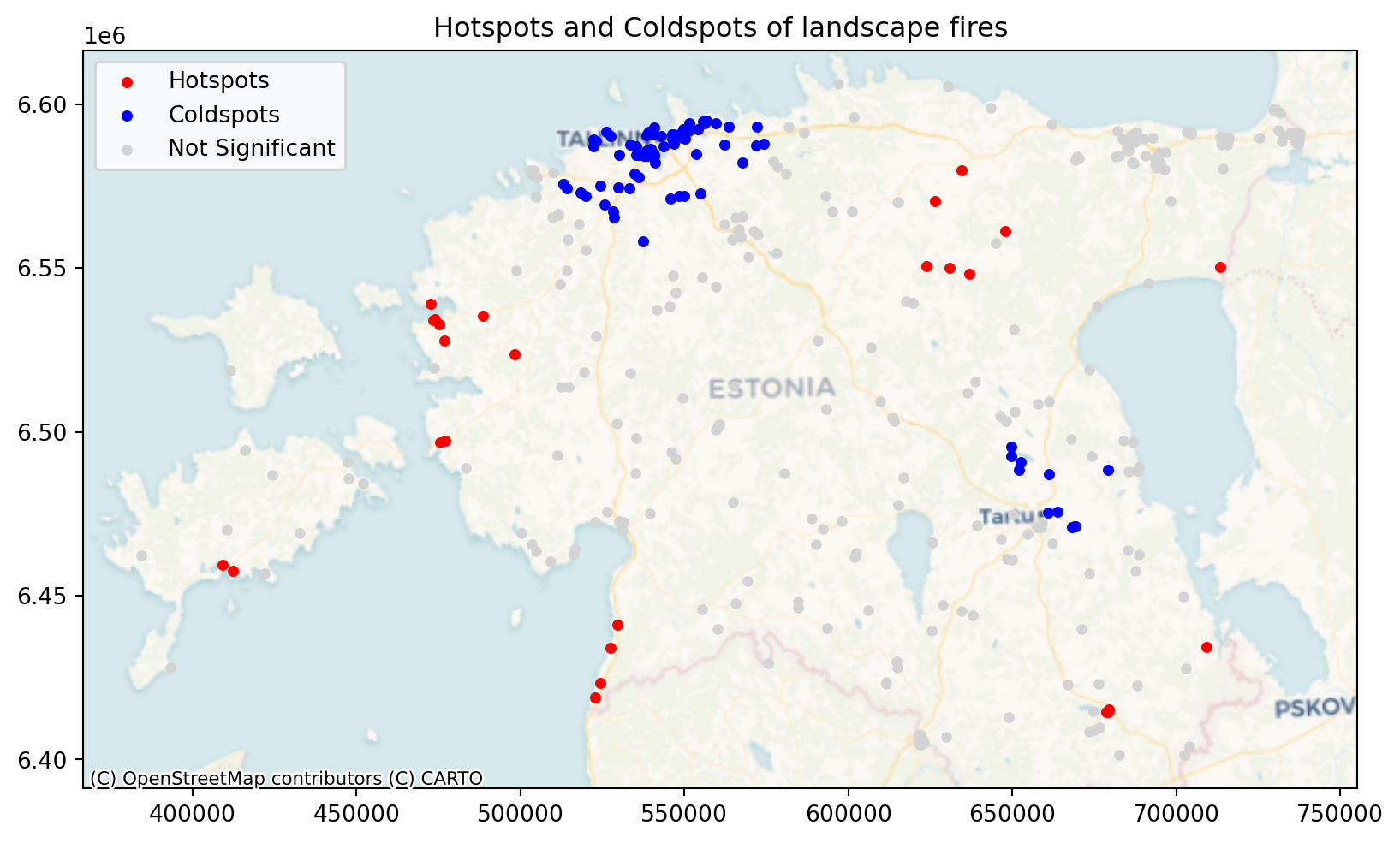
We see from the results that there are cldspots around Tartu and Tallinn which means that there is aggregation of small fire incidents. At the same time there are larger fire incidents further away from the cities that makes sense as there is also more fuel for the fire and more likely that the fire gets big before it is discovered.